A landing page that caters to user experience means a higher conversion rate. We wrote this blog to remind marketers of the importance of creating optimized, user friendly landing pages to improve their conversion rates. Here’s what you’ll find in this post:
1) Landing page creation tips
2) Landing page conversion rate optimization basics
3) Landing page examples you can recreate
Landing Page Creation Tips
There are some landing page creation tips that are universal. Let’s start off this blog by pointing out three of them.
Strike a balance between simplicity and creativity
You can still be creative without reinventing the wheel. Do what works, but also test out something new periodically. Be smart about how you phrase your call to action (CTA) button, stick with a solid background color if possible, and use clear, large, relevant images/graphics. People are easily overwhelmed and miss information on a landing page that’s too crowded or wordy. Less is oftentimes a lot more.
Choose the right platform to create landing pages that convert
Choosing the right platform is not the same process for every business. Some people overthink which landing page builder they should use, and then lose sight of the big picture. If you do the necessary research to figure out the message and visuals you want for your landing page, it’s almost impossible to pick the “wrong” landing page builder to create it.
The landing page builder you choose does not matter as much as the knowledge of the people using it. The fanciest, most original templates and fonts are still not going to counteract the landing page copy and design needing to be consistent with the original form filled out or link clicked.
Create landing pages with user experience in mind
Your ideal customer who ends up on your landing page needs to feel compelled to follow through with the task, purchase, etc. once they make it there. Otherwise, the point of creating and optimizing the perfect landing page will be lost.
Ask yourself, where are the users coming from before they land on this page? Provide them with what they need to see, read, etc. as a result. The benefits of a landing page that resonates with its intended audience and serves their needs will outweigh the cost of high quality design.
Landing Page Conversion Rate Optimization Basics
Before we wrap up this blog, we want to define and explain some tips about conversion rate optimization (CRO) that can help your landing pages be more successful.
What is Conversion Rate Optimization?
Conversion Rate Optimization is the process of improving your landing pages with the best performance and making them even better. Even if your landing pages are performing well, chances are there are easy ways you can make them even more effective. You might need to change a few words of your copy, switch the color or size of your CTA button, or update an image or two.
How to A/B test your landing pages
A/B testing means comparing the success of your original version of your landing page (Version A) and your variation of that landing page (Version B). There are free and paid tools you can use for A/B testing, but the most basic A/B tests you can run yourself. The amount of time and effort you invest in figuring out how to optimize your landing pages through testing pays off.
How to determine the effectiveness of your Conversion Rate Optimization efforts
There’s no shortcut for CRO frequent testing, accurate measurement, and conscientious analysis. Christopher Nolan, Growth Manager at the ecommerce platform BigCommerce pointed out in an interview with KlientBoost that diligent measurement and analysis is truly the only way to inform decisions about landing pages.
Landing Page Examples That Convert
Take a look at 12 great landing page examples that are attainable for your team to recreate using the majority of standard landing page builders.
Some of the landing pages you’ll see in the examples we chose offer a free download in order to increase list growth, promote exclusive offerings, or simply encourage someone to make a purchase. Regardless of your landing page’s offer or CTA button, the goal is to eliminate ambivalence and nudge someone to take action as quickly as possible.
Great Jones
The layout and color scheme of this ad are visually appealing, with a design that’s intended to draw the eyes to the newsletter sign-up box. Not every company needs to use a friendly, colloquial tone, but it’s perfectly on-brand in this case.
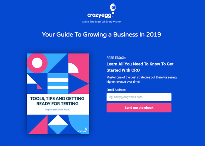
Crazy Egg Website Optimization
This lead generation landing page is perfect for not overwhelming people or asking them for too much. By asking for the bare minimum amount of information (their email address only), the landing page makes it easier for the user to follow through with their decision to download the ebook. The simple color palette doesn’t distract the user from the goal of the page: to download the ebook.
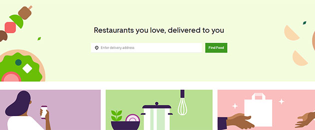
UberEats
The whimsical, bright graphics and smart use of white space in the design of this landing page makes it seem like a no brainer for someone to enter their delivery address.
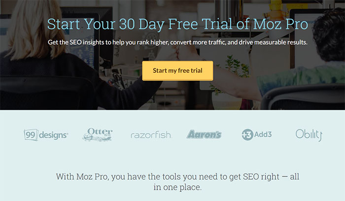
Moz
The CTA is brightly colored and placed front and center to encourage people to take the next step and fill out a form to activate a free trial.
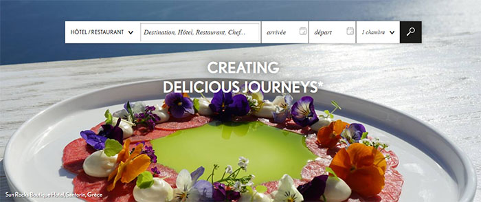
Relais & Châteaux
This landing page keeps it simple with just two main elements: an inviting, high quality photo and a specialized search engine to find restaurants and/or hotels that are a part of the Relais & Châteaux luxury brand.
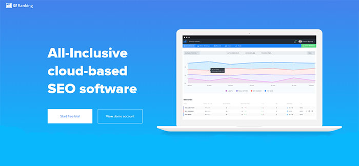
SE Ranking
This colorful and simple landing page is ideal for a software suite like SE Ranking. The two options for CTA buttons were smart to include.
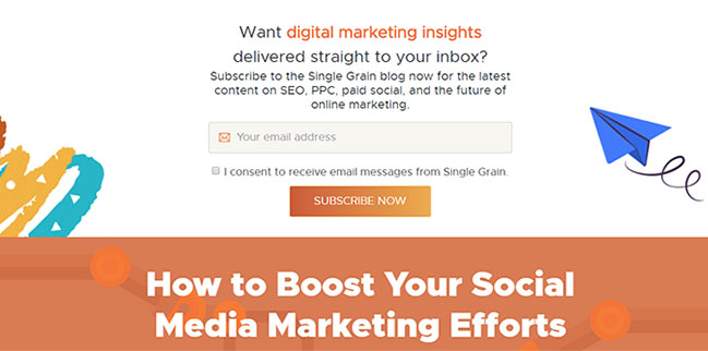
Single Grain
This email sign up landing page has the perfect mix of colorful graphics and white space, and only asks for someone’s email address to keep it simple. Note the checkbox Single Grain created as an extra assurance that people were willing to opt in.
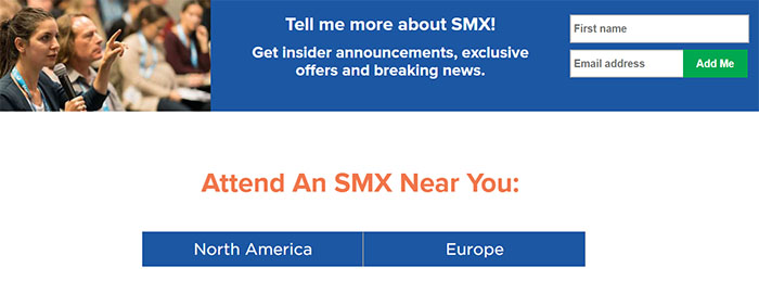
SMX Conferences
This landing page gives people the choice to sign up for email updates, or to just search for the next conference coming up in their region. There’s nothing fancy about this landing page, but it proves that sometimes less is more.
Tatango
This is a prime example of only using the essential elements necessary to create an effective landing page. It’s smart that Tatango made the CTA button the only pop of colors on the page to bring people’s attention to it right away.
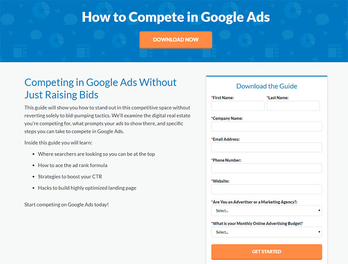
WordStream
Although we have been heavily emphasizing the advantages of keeping a landing page short and sweet, WordStream offers an example of a lead generation landing page that works even though it has a lengthy form and no images. What WordStream does well with this landing page is that it provides users with exactly what they want to know. In this case, that means details on the ebook they’re about to download to help them make sure they actually want to download it.
GettingGrowth
This landing page is what people see after they click on a Google Display Ad. This example shows that as long as you describe what the landing page is offering in a clear, simple, and desirable way, you might not need graphics or loud colors.
G2
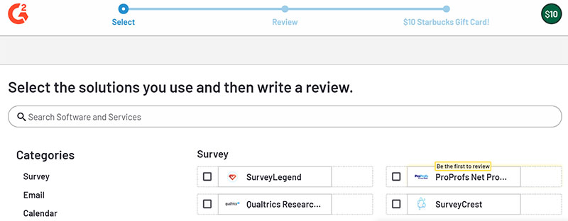
This is an example of a landing page with the intention of getting someone to complete a specific task (in this case, write a review to earn a $10 Starbucks gift card). It’s smart that the page includes a timeline showing the user’s completion progress to remind them how close they are to their free coffee. No one wants to complete a seemingly endless survey.
Wrapping It Up…
The key is to keep an open mind and to frequently review and update your landing pages based on what your customers respond to the best. Would you want us to create an ebook of 100 landing page examples for inspiration like we compiled for our blog about Facebook Ads? Let us know!
