BEHAVIORAL EMAILS
It’s important to understand your customers’ behavior in order to send them emails that resonate. Emails under this category account for human consumer behavior and are often automated and targeted messages based on how your contacts interact with your website, social media, previous campaigns and purchases, time since interaction, and more.
Table of Contents:
- Abandoned Shopping Cart Emails
- Review Request Emails
- “You Might Also Like” Emails
- Survey Emails
- Milestone Emails
- Social Proof Emails
- Social/Community Activism Emails
- Customer Retention Emails
Abandoned Shopping Cart Email Examples
Fewer than 4% of consumers arriving from desktop browsers follow through with their purchases, and the number of buyers is even lower for tablet and smartphone users (3% and 1%, respectively).
Marketers have a responsibility to mitigate this downward trend with smart and strategic email marketing.
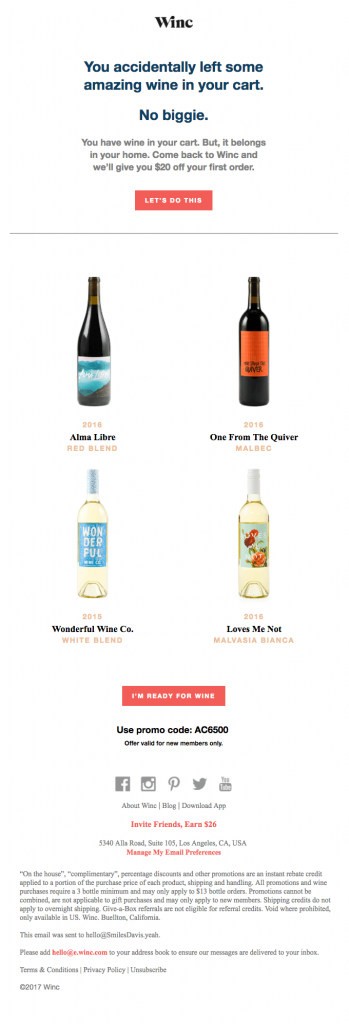
Winc
This is a perfect example of a re-engagement email. Not only is it funny and enjoyable to read, but Winc also offers a nice discount for following through with the purchase.
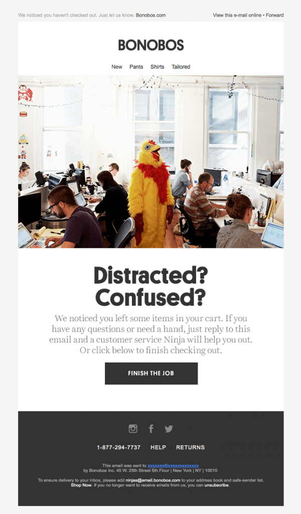
Bonobos
This email successfully uses a comedic approach in its attempt to re-engage inactive customers. In addition to making you smile, Bonobos offers its customer service to help remedy the issue of having an abandoned cart.
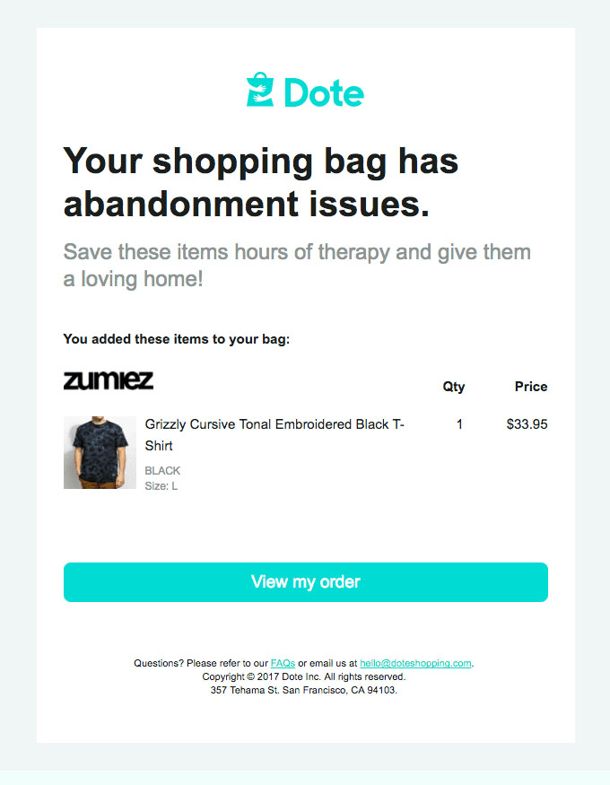
Dote
We love Abandoned Cart Email Examples with a comedic approach. Usually, customers purposely leave their carts because they simply changed their mind about purchasing a product. A re-engagement email with a sense of humor is less likely to annoy people who don’t want to be reminded about the money they decided not to spend.
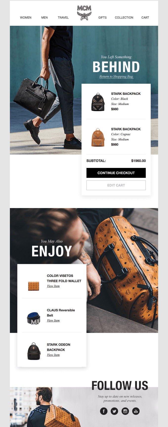
MCM
MCM uses beautiful product images and a clean, simple aesthetic to encourage shoppers to revisit their carts. We also like how they include a personalized product recommendation section of the email.
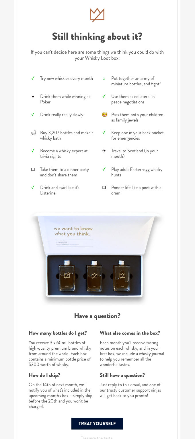
Whisky Loot
The light-hearted tone of this email is perfect for a re-engagement email targeting its demographic (trendy, affluent millennials.)
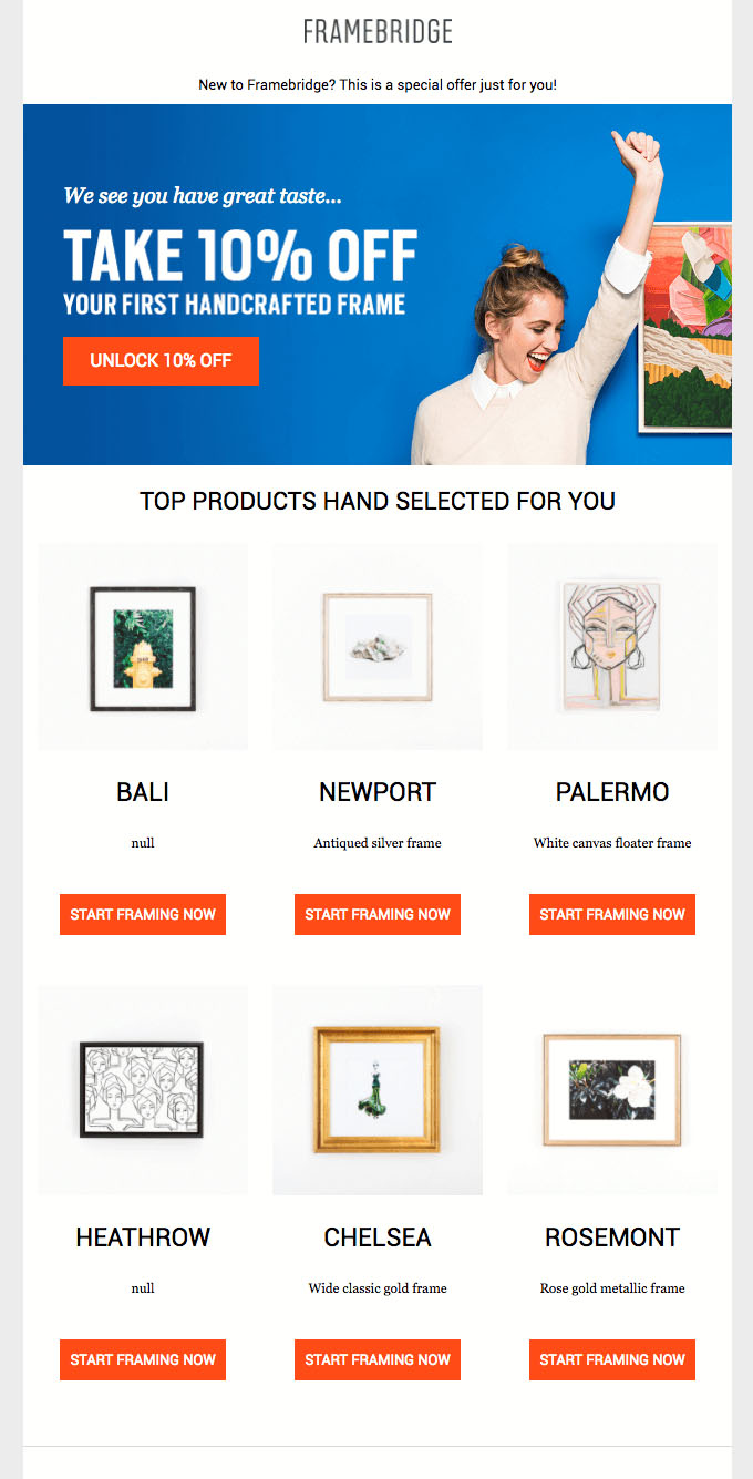
Framebridge
This approach to a re-engagement email does not specifically mention an abandoned cart, but rather focuses on sending email subscribers back to the website to follow through with their purchases. Note how the offer includes a discount as well.
Review Request Email Examples
If someone likes a company or brand, it’s natural to want to spread the word about them. Use creative review/referral request emails to receive that positive feedback.
The Skimm
It’s interesting how theSkimm turns their 5th birthday into a referral generator.
By building up to their request throughout the email and by offering an excellent incentive, theSkimm turns their own milestone into a positive experience for subscribers.

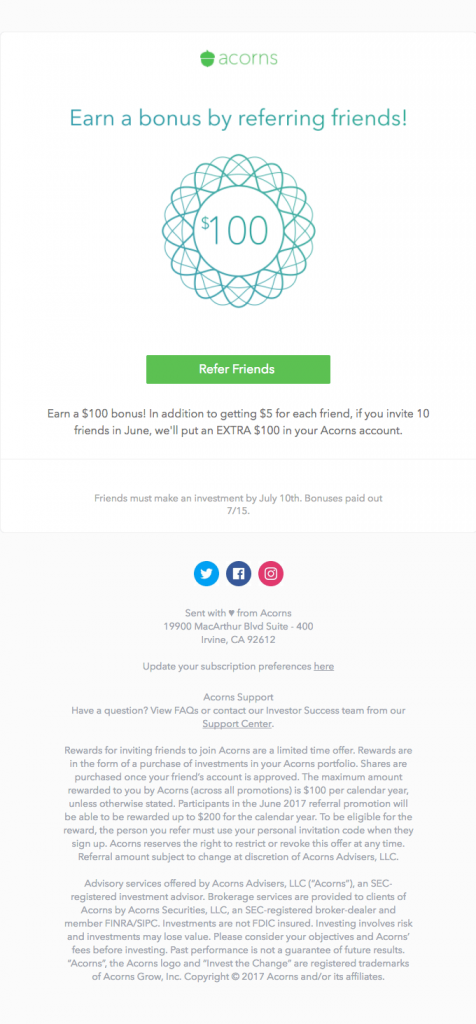
Acorns
The “Give 5, Get 5” referral incentive is enough for Acorns users to try getting their friends on board. It isn’t obnoxiously the main attraction of the email, but it adds an extra dose of incentive at the bottom of the email.

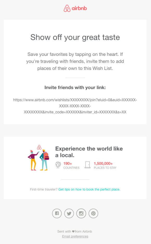
Airbnb
In this email, Airbnb encourages their customers to curate a wishlist unique to them (similar to Pinterest).
The natural way that Airbnb suggests inviting friends to add places to their wishlists is a smart way to generate more reviews and a references.
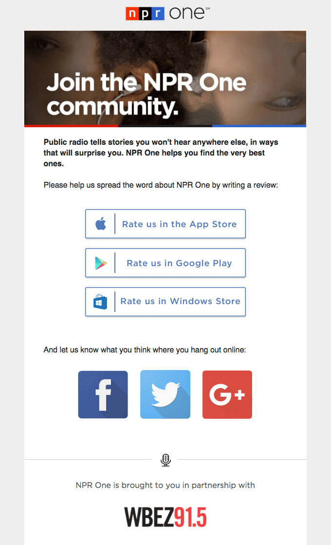
NPR One App
This request for a review is sincere and makes a brief, compelling argument. Note the emphasis on community and social media.
Slack
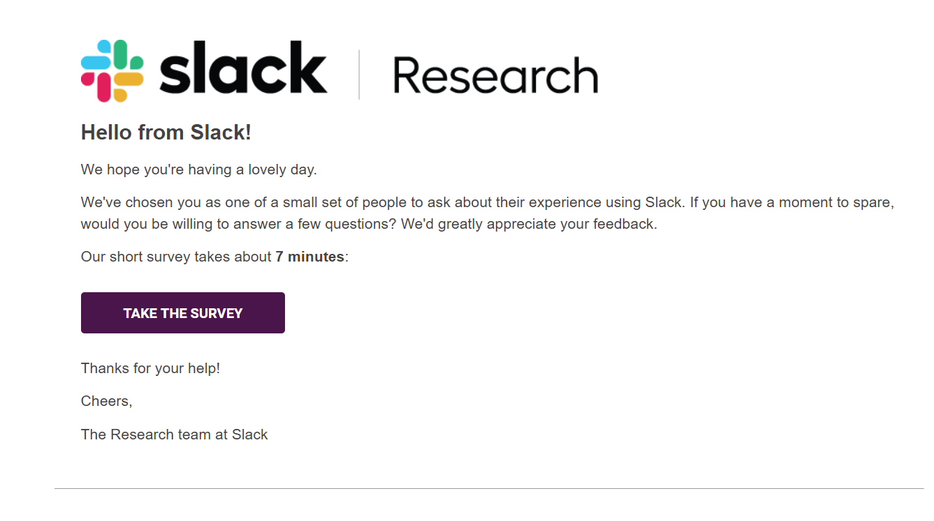
Slack gives its email recipients the heads up about how long the feedback survey will take, and implies that it will help make their user experience better. It makes sense that someone who uses Slack would want to take a few minutes to help improve it.
Sephora
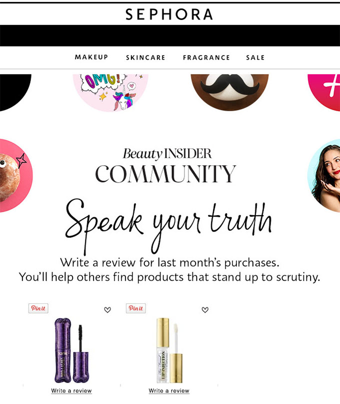
Sephora urges members of its Beauty Insider Rewards Club to rate and review products to contribute their opinion to help their community of customers.
“You Might Also Like…” Recommendation Email Examples
This is so simple and so effective, and if you have access to data-backed insights, you’re at an even greater advantage. Behavioral marketing is the most effective types of marketing because of the actionable data.
Trouva
This email is so specific in the way it rounds up suggestions for the customer based on past behavior. Someone is much more likely to respect a company or service if it at least pretends to know him or her well.

Airbnb
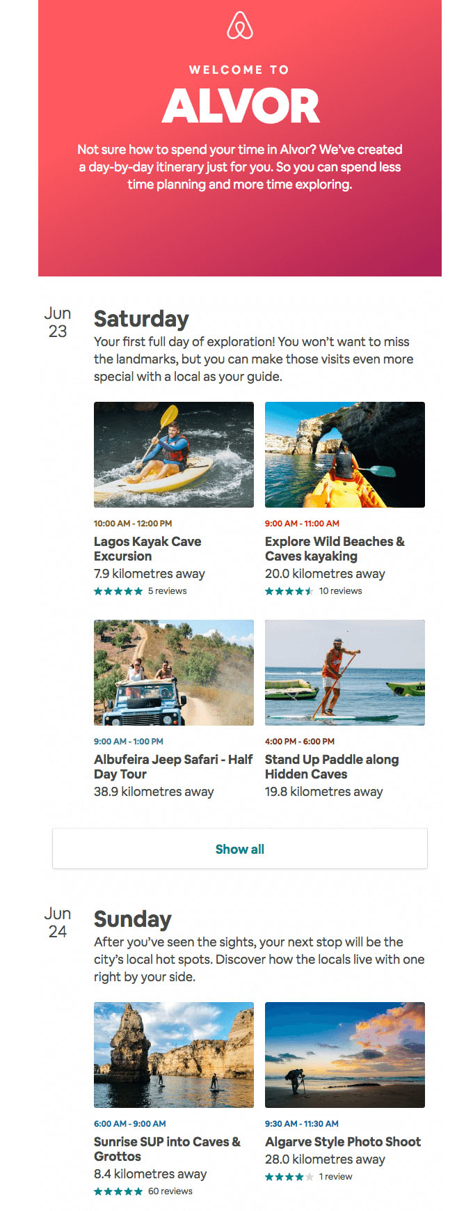
Airbnb’s thorough and detailed recommended itinerary for the city where someone booked their stay is a great way to encourage another Airbnb booking.
Survey Email Examples
What better way to invite engagement than to ask for feedback? Use similar tactics as you would for other email marketing endeavors, but don’t over-rely on surveys.
Nokia
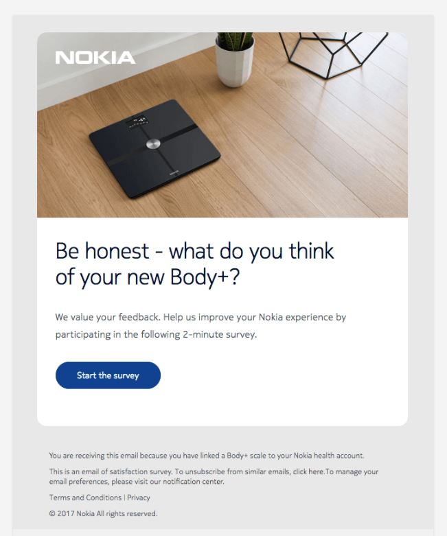
The opinions of your customers are valuable, but most importantly, customers notice when you offer to listen to them. Make the communication as easy as possible.
Insurify
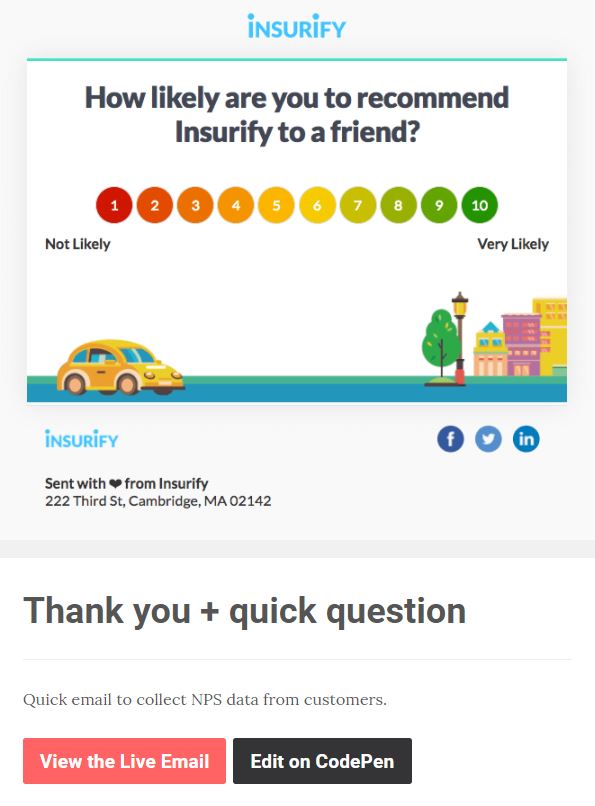
Insurify makes it remarkably easy for the recipients of this email to express their opinions. Take a cue from Insurify and make it so simple for users to engage. When it takes someone less than 2 seconds to engage, why wouldn’t they?
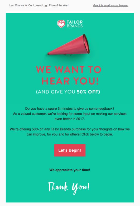
Tailor Brands
This is the quintessential survey request email. The color contrast, the graphics, and most importantly the incentive (50% off) is enough for subscribers not to hesitate to take 3 minutes out of their day to do this.
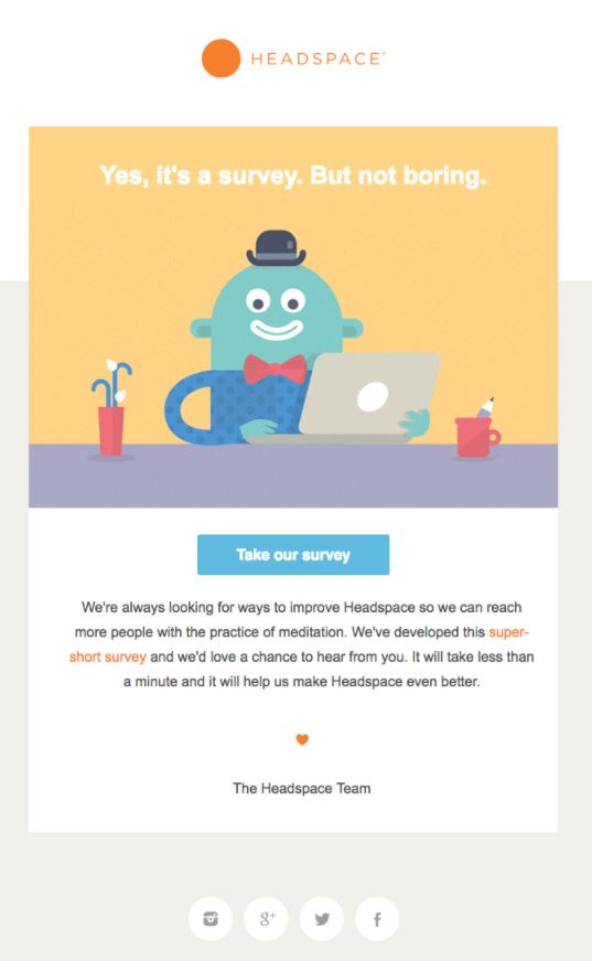
Headspace
Headspace proves that they know their customers by prefacing their whole email with the promise that their survey isn’t boring.
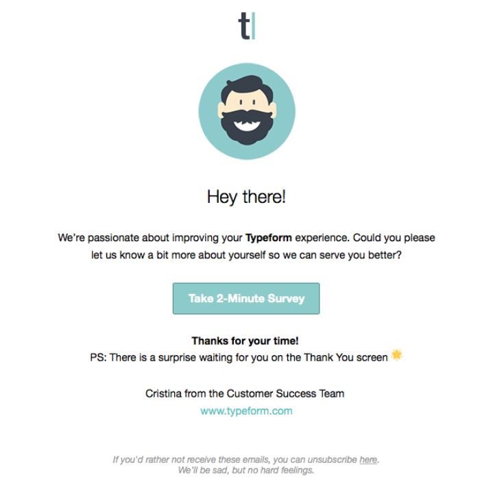
Typeform
The element of surprise at the end is enough to prompt someone to take the two minutes. Also, when you emphasize having a survey in order to improve customer experience, it also helps.
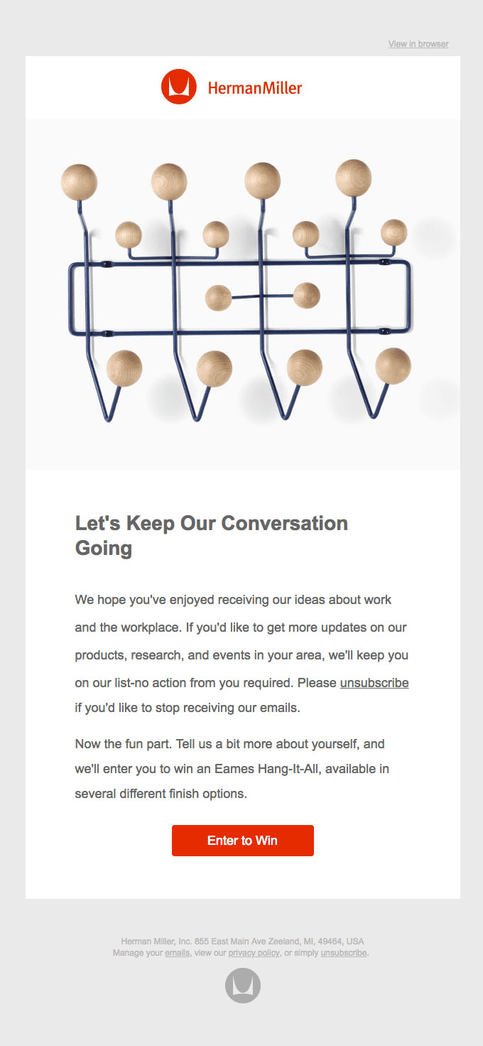
Herman Miller
The way Uber recounts drivers’ accomplishments whenever they complete another year of service makes the emails seem completely custom.
The timeline style with large, legible numbers and graphics are great at helping someone see their work experience from a bird’s eye view.
Anthropologie
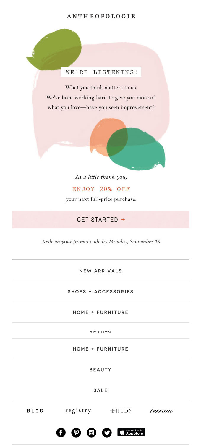
Anthropologie realizes that rewarding email subscribers with a discount for filling out their survey will encourage more people to take the five minutes out of the day to do it.
Milestone Email Examples
Milestone emails are a great chance to focus on and prioritize customers/users already using (and hopefully loving) your product or service.
Uber
The way Uber recounts drivers’ accomplishments whenever they complete another year of service makes the emails seem completely custom.
The timeline style with large, legible numbers and graphics are great at helping someone see their work experience from a bird’s eye view.

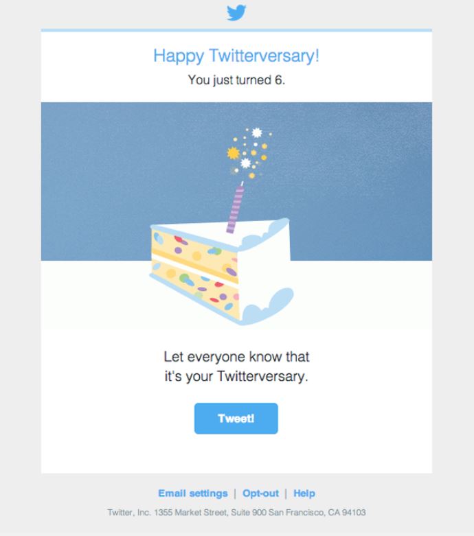
Twitter can get away with this super simple email because the whole point is to get people to share the “Twitterversary”. It’s funny how simple this is, and yet if every single person always shared their Twitterversaries on the platform, think about the spike of traffic that would cause.
A Book Apart
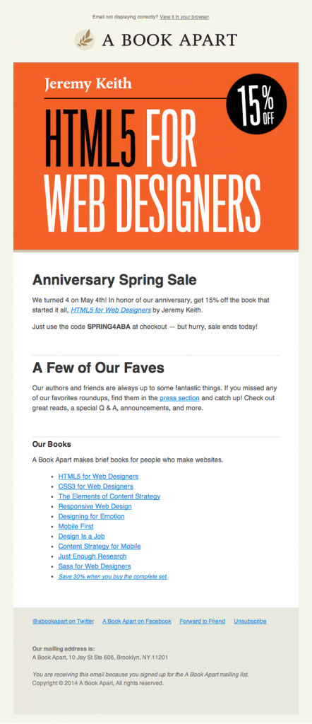
When you celebrate a company milestone with a discount or some kind of self-promotion that also benefits customers, it’s a win-win.
Issuu
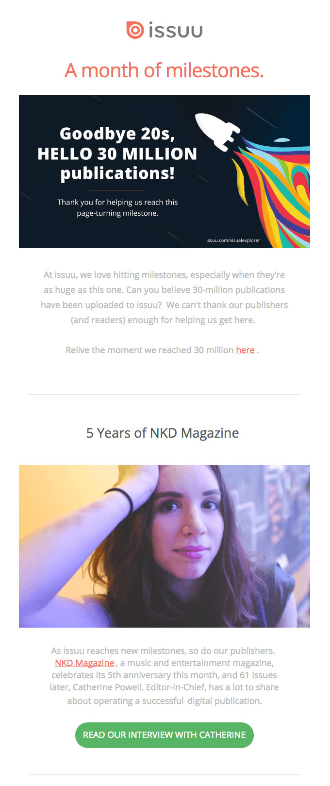
When an organization reaches an impressive milestone, it’s worth celebrating to affirm that users/customers made the right choice to begin with by choosing your product or service. We love how issuu celebrates its own and features its users’ achievements in the same email.
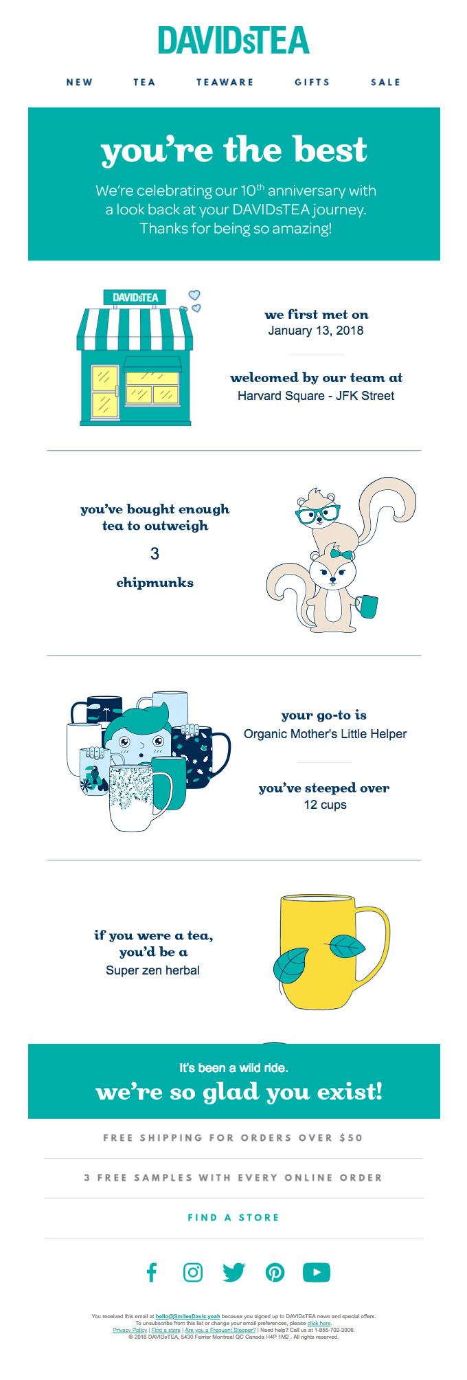
David’s Tea
This milestone email celebrates a customer’s purchases. By reflecting on a customer’s buying behavior in a personalized, fun, and comical way, this email from David’s Tea increases its chances of standing out in an email inbox.
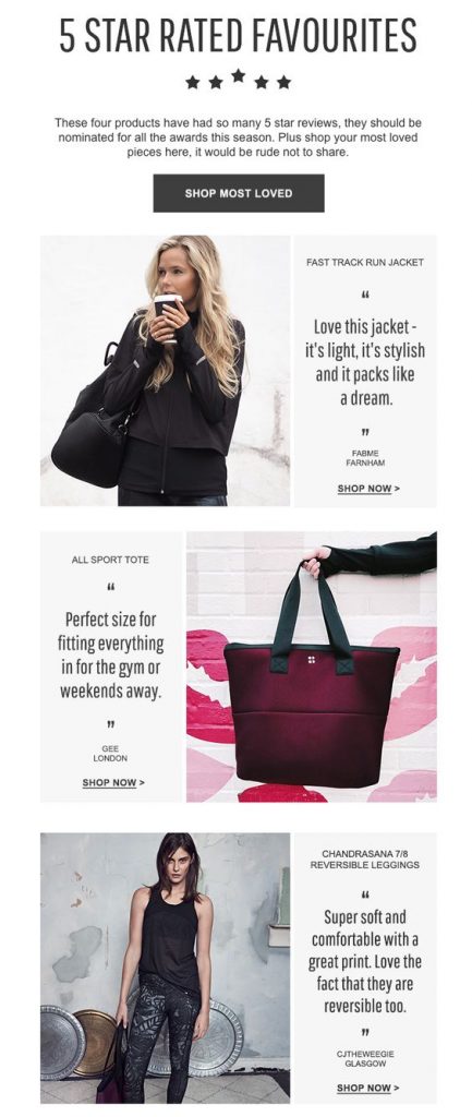
Sweatybetty
Social proof causes community-driven sites to thrive. It’s one thing if a well known celebrity buys a product, but it’s another thing entirely if your best friend (or someone who seems like they could be your best friend) recommends it.
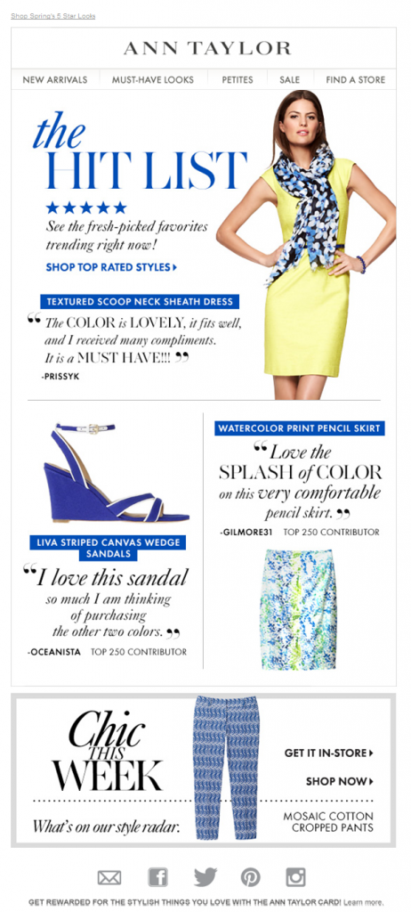
Ann Taylor
Another praiseworthy email from Ann Taylor. This is why Ann Taylor succeeds when they included customer contributor’s comments and reviews in this email.
Tictail
When you have a list of community favorites, people are more likely to believe you. Tictail knows this and decides to put it front and center.

Keds
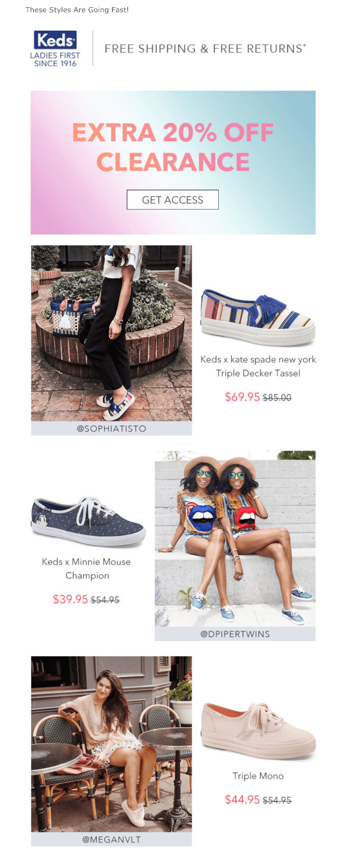
Keds not only offers a great discount, but also features Instagram influencer-approved styles to add an element of social proof. People trust their favorite influencers’ opinions and endorsements almost as much as they trust their friends’.
Violet Gray
Glowing product reviews from trusted sources are guaranteed to nudge customers in the right direction. We love Violet Gray’s consistently simple and elegant emails that match the look of their site and social media channels.

Urban Outfitters
This email mimics the format of an Instagram feed, and features the most-liked images featuring Urban Outfitter products. For the young, social media obsessed demographic Urban Outfitters is targeting, this kind of email is effective.

Ello App
Similar to the way Urban Outfitters makes their email look like someone is scrolling through Instagram, Ello curates images in this way, too.

Canopy
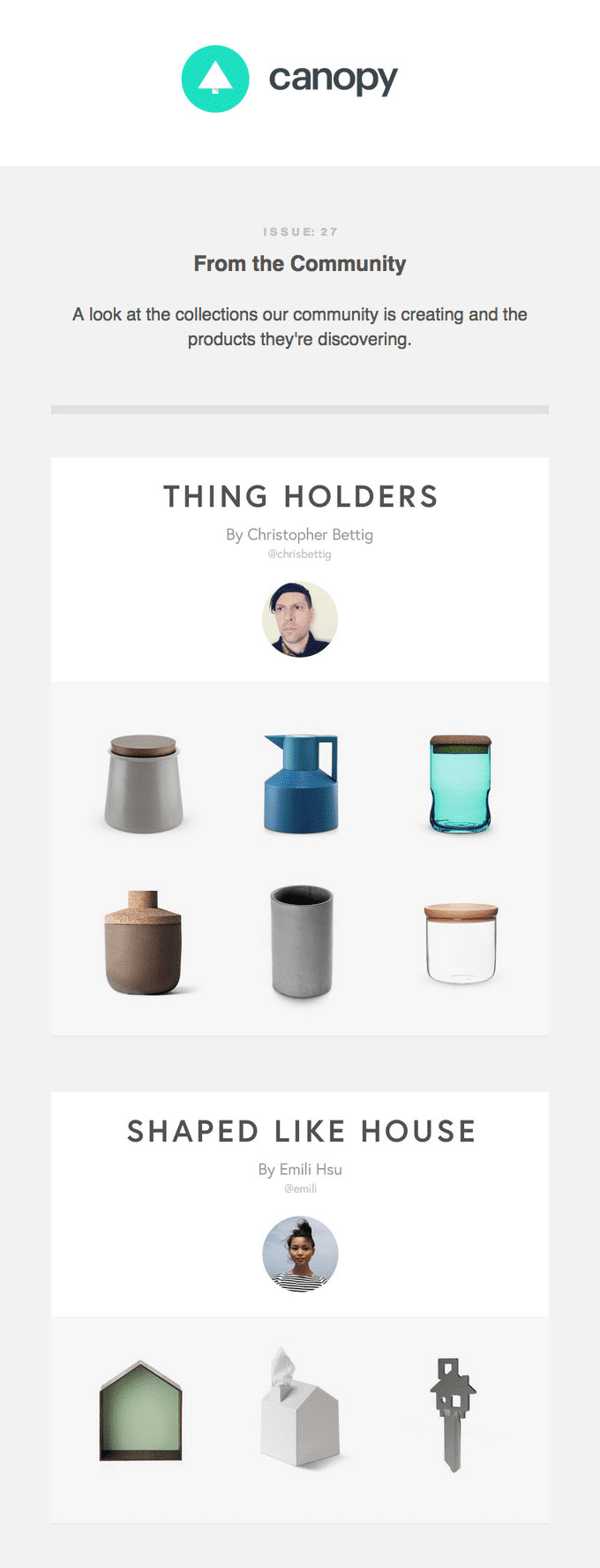
This email recognizes that recipients will appreciate other members of the Canopy online community’s collections, especially if they are quirky or unique.
Behance
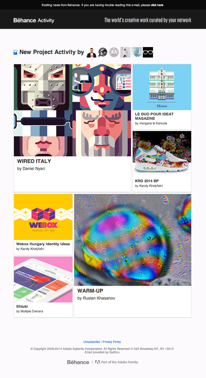
Since people who signed up to be on the Behance email list are likely designers or interested in design (and they are more concerned with visuals than text), Behance knows their audience with this image-only email sharing other members’ activity.
Coastal
Coastal showcases its products in an aesthetically pleasing way while incorporating believable reviews from average customers, with star ratings included.

Billabong
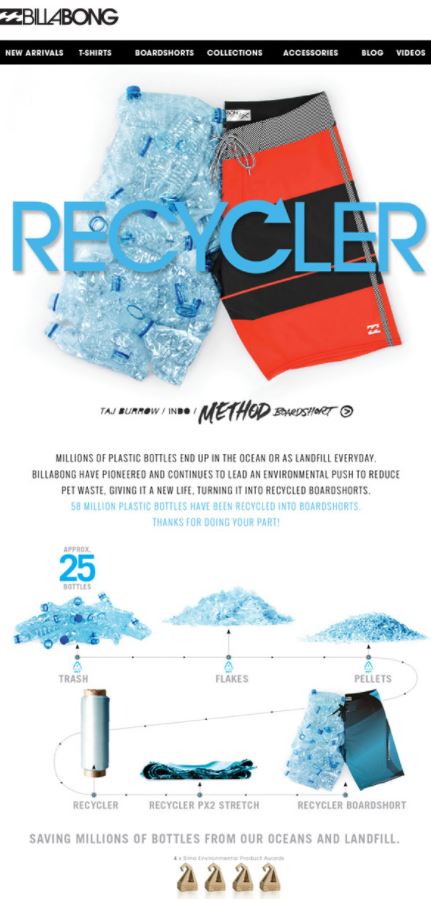
Billabong takes the uncomfortable truth of the sheer magnitude of plastic that humans use and turns it into something inspiring.
CB2
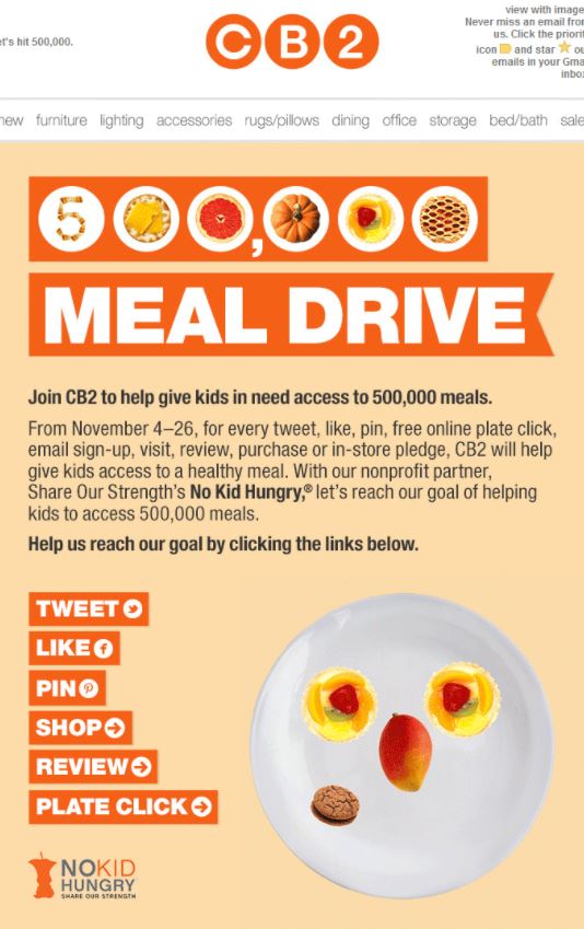
Community activism to feed the hungry resonates with everyone. Especially when it comes to big companies (CB2 is an offshoot of Crate + Barrel), people want to see corporate social responsibility. Hold yourself accountable to outreach of some kind, no matter your industry, and then talk about it.
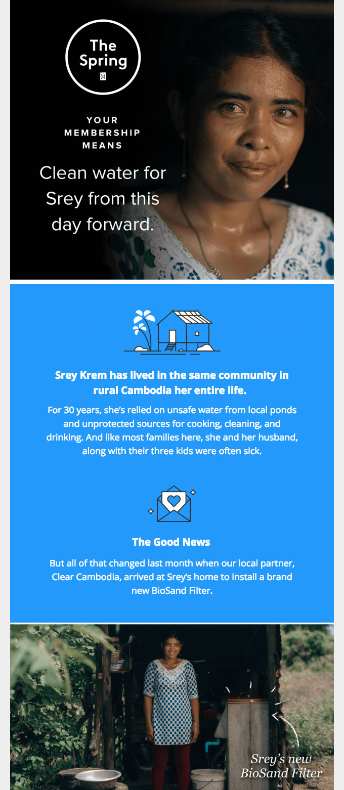
The Spring
Not only is this email thoughtfully designed, but it also tells an uplifting story. Less is more. By focusing on one example of someone who benefited from one of The Spring’s products, the story seems more personal. It’s great to mention the number of people an organization or charitable partnership helps, but adding a name and face makes it seem more real.
Charity Water
One perfectly chosen image, a powerful story, and a “thank you” is all it takes for this email to be effective.

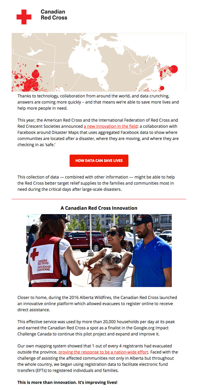
The Canadian Red Cross
It’s one thing to send an email announcement about technological innovations that increase an organization’s efficiency, but when that means improving lives in the process, it makes an even greater statement.
Unicef
It’s one thing to send an email announcement about technological innovations that increase an organization’s efficiency, but when that means improving lives in the process, it makes an even greater statement.

Customer Retention Emails
If someone is a former customer, invest in them first. They already believed in your service or used your product at one point, so convincing them to re-engage is a lot easier than relying on cold leads. You will be generating revenue before you know it.
Xfinity
In a society that’s obsessed with streaming shows and movies, this is the perfect email to get people excited again about the possibilities. The fact that they polled to find out which show the majority of people were excited to see first adds a social element.

Acorns
Acorns’ clever design helps the important new features jump off the page.
Boords
Announcing new, exciting developments will always grab someone’s attention.

Lyft
We love Lyft’s graphics and fun stats that pique people’s curiosity (especially when it’s about places in their own city). This is a great way to remind users why they should prefer Lyft over Uber.

Digiday
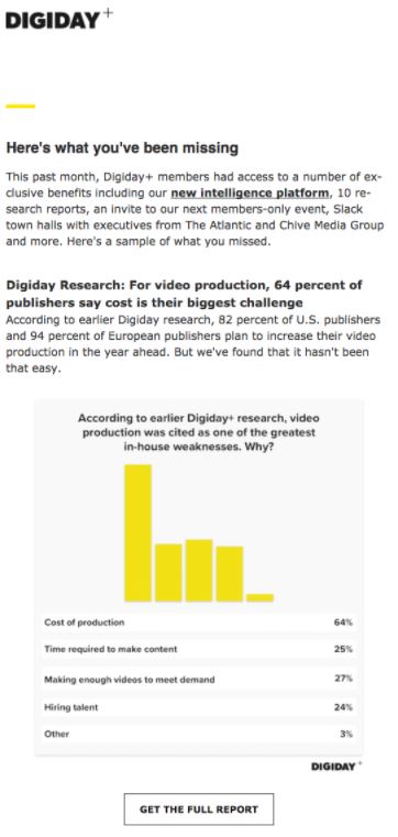
A rundown/update is a great way to keep yourself on your customers’ radar. People’s fear of missing out will likely entice them to read this email.
Foodjunky
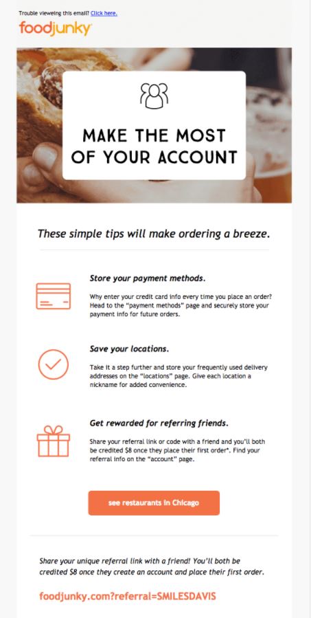
Anything you can tell your customers to help streamline the process of using your product or service will benefit you in the long run. The simple, actionable tips in this email prompt users to re-engage without sounding obnoxious. The well-placed CTA is a great move, too.
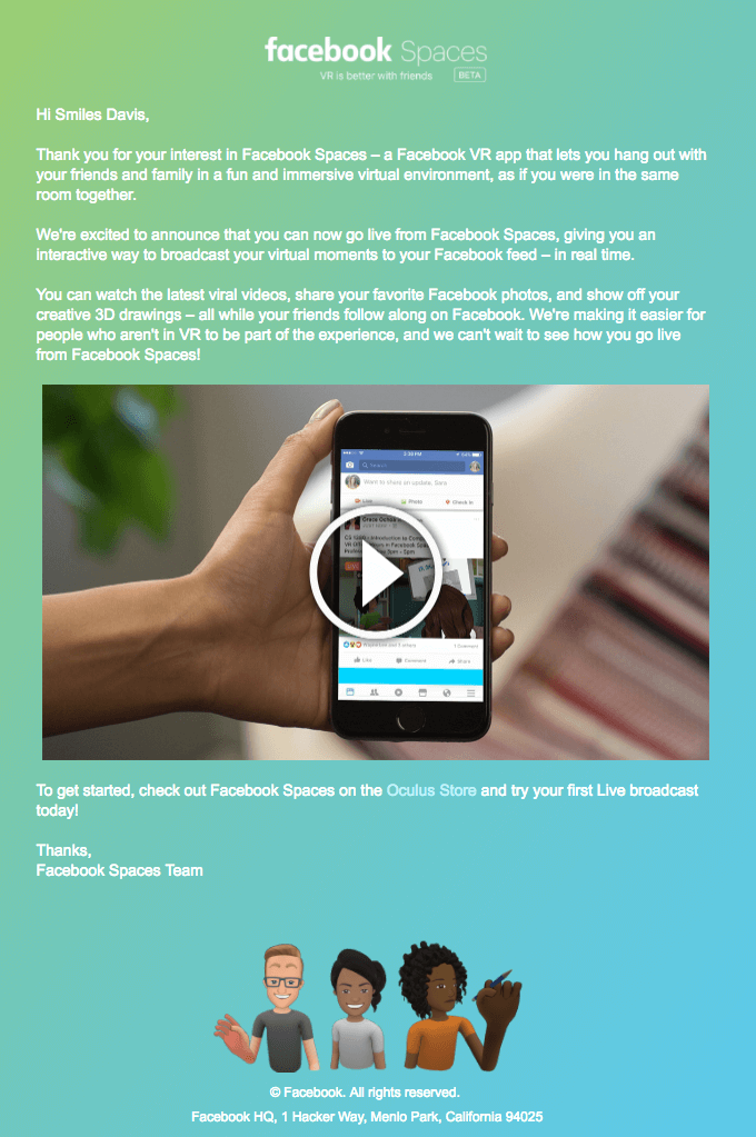
If the main idea of your email is enticing on its own, that works to your advantage even more than good CTA placement or design. Including a video is also a clever way to pique your audience’s interest.
Zapier
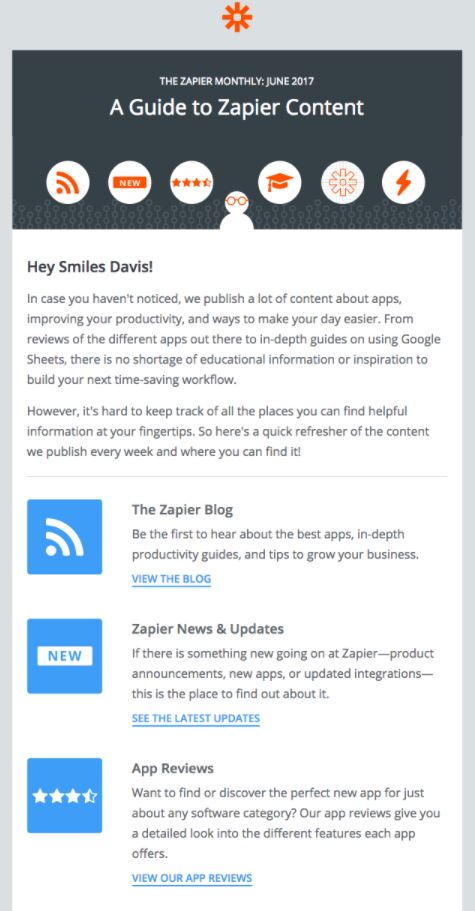
Defining and communicating expectations is one of the keys to healthy and fruitful customer relationships. A guide that gives an overview of what to expect is a great idea to get your audience curious of what’s to come.
Withings
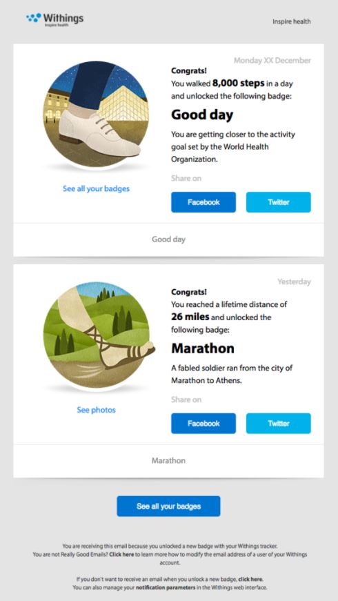
Anything that congratulates and recognizes your users tends to motivate them to take action. In this case, the social media share buttons make it super simple for people to celebrate their achievement with friends/family/followers, which simultaneously spreads the message of the brand in an organic way.
Spotify
The way Spotify personalizes their customers’ emails ensures that they want to stay a Spotify user. It’s a pain to switch music services and lose all of your preferences and playlists collected over time. Plus, people who aren’t paying close attention to what they listen to on a daily basis will be genuinely curious to see their listening history recorded and summarized for them in an easy-to-read email.

Todoist
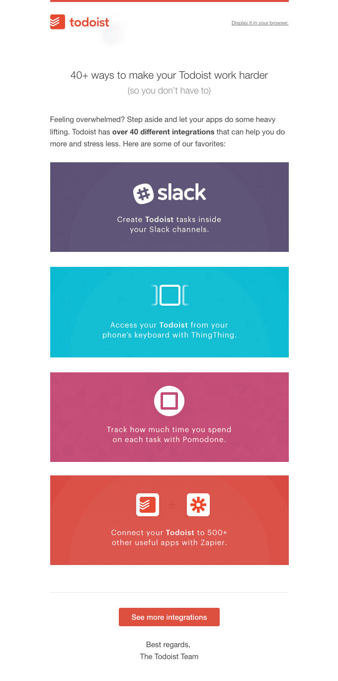
Everyone appreciates “hacks” and shortcuts. A great way to retain customers is to share new, interesting, useful and unique ways to make the most of a product or service.
Harry’s
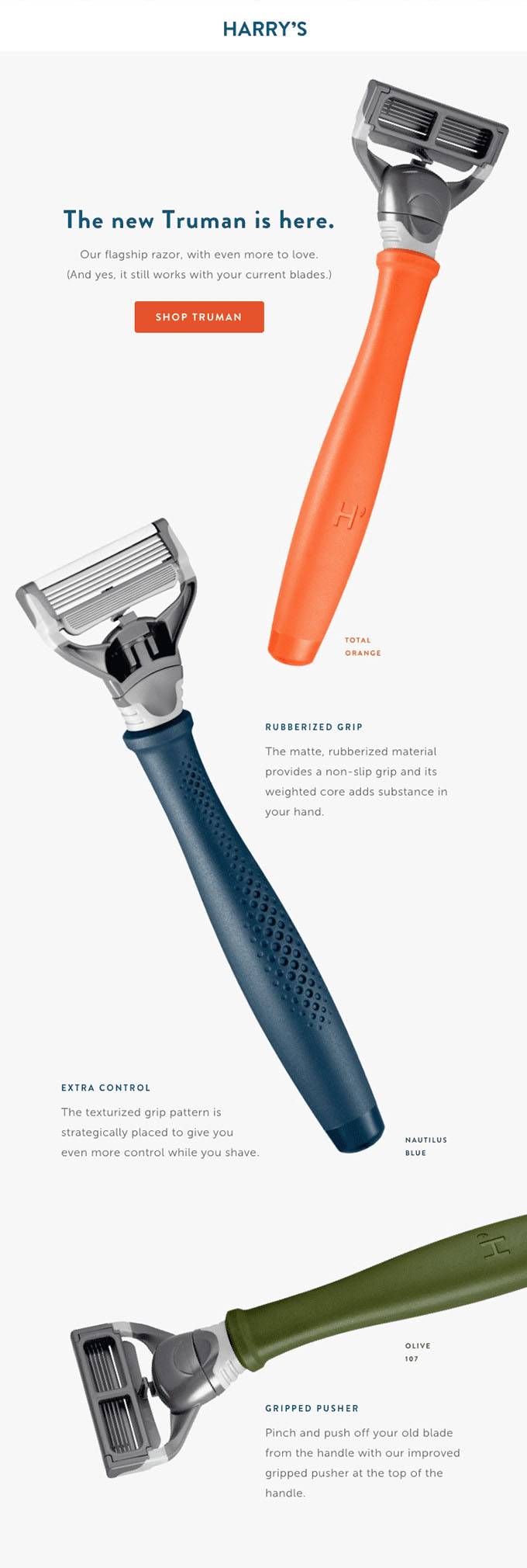
One way to retain customers is to make sure they know your business and its products/services are innovative and exceed industry standards. We love how Harry’s announces the launch of its most recent version of its best selling product.
Duolingo
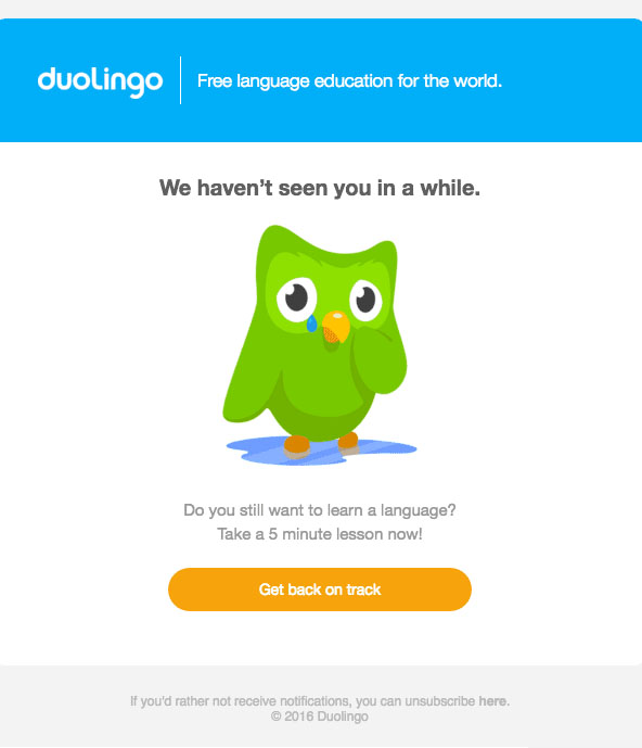
Duolingo’s emails are recognizable with their bright colors and cartoon mascot. The call to action implies that not visiting their site or app is the equivalent of falling off track with your language learning goals. Reminders like this email are a simple but effective way to convince users to start practicing consistently again.
Treehouse
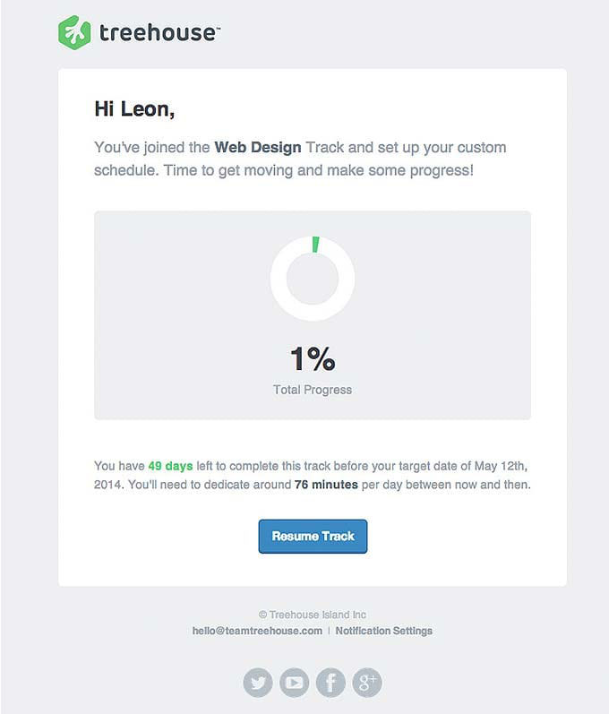
Treehouse personalizes their emails with suggested timelines and study plans to make the most of their online courses.This is smart, considering people like structured, actionable advice in our over-scheduled, busy world.
Dropbox
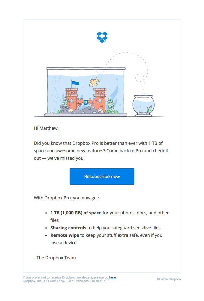
When someone downgrades, it’s a sign that they might not be interested in your product or service at all anymore. Dropbox is proactive and offers a deal to encourage the customer to re-subscribe with a premium subscription.
Tom Raffield
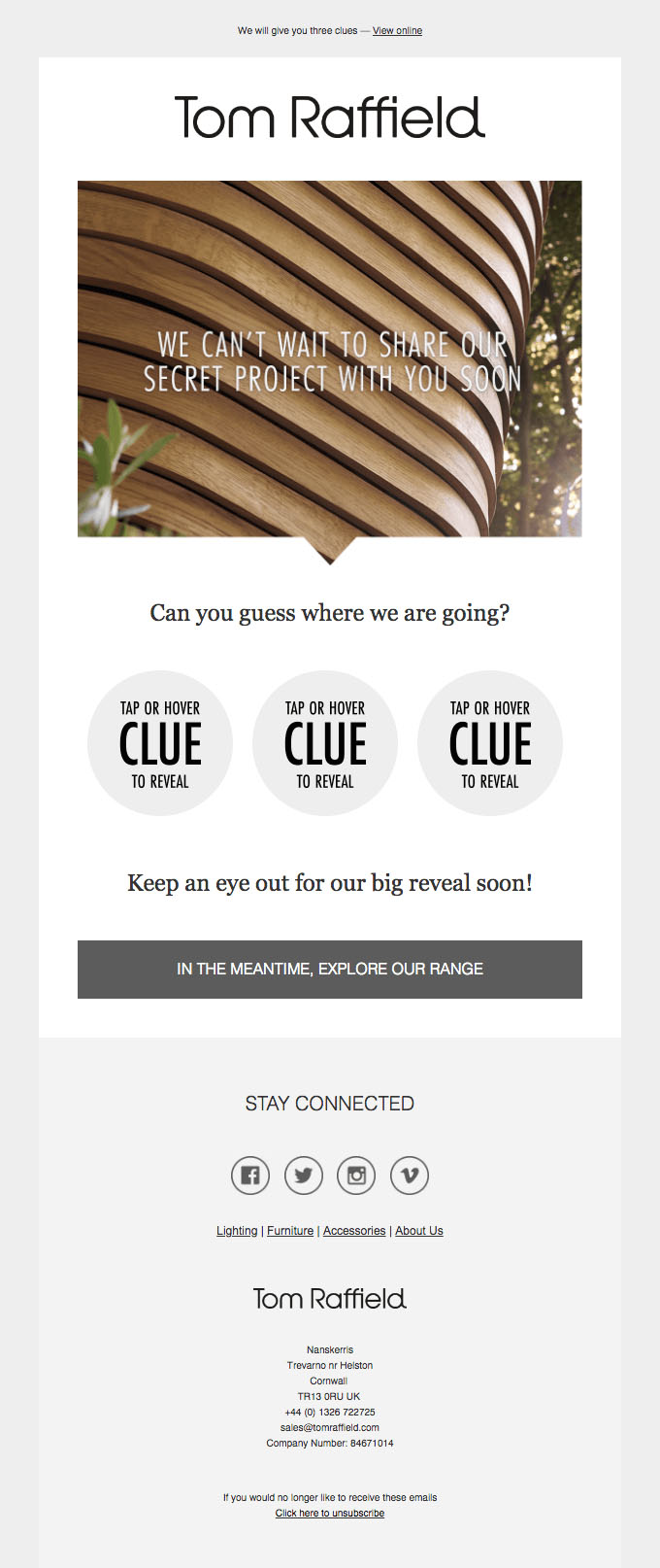
The element of surprise that the Tom Raffield brand includes in its email series is a smart way to keep email subscribers on their toes and to feel like they are privy to exclusive updates by being an email subscriber.
Venmo
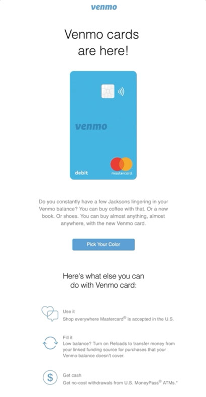
This email is a short and sweet way of announcing a possible new perk of being a venmo user that could serve as another reason someone would keep using the service. The email clearly outlines how the Venmo card can be used and how it makes users’ lives easier.
MacPaw
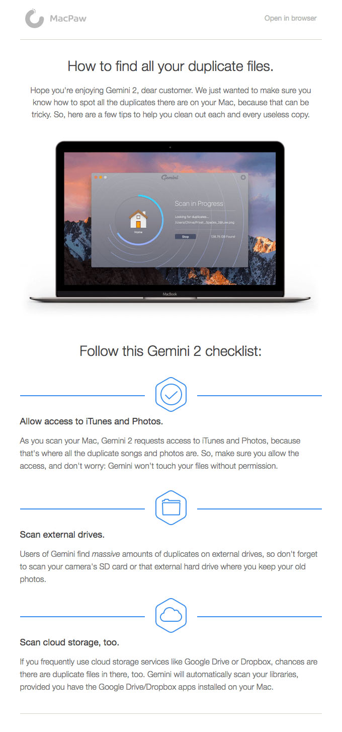
This customer retention email serves as a way to check in with customers and make sure they’re taking full advantage of the features of your product.
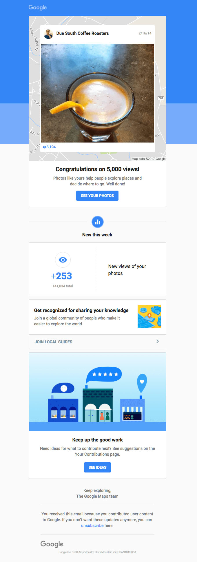
Google encourages the use of Google My Business by small business owners and offers personalized weekly feedback on the status of GMB accounts. Google also offers ideas to inspire users with its curated “Your Contributions” page.
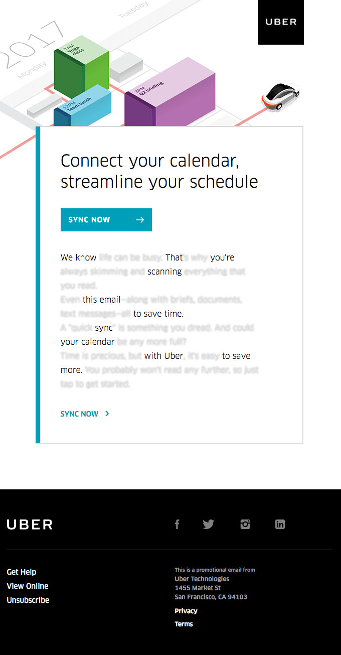
Uber
Uber offers to increase customers’ efficiency with a calendar-syncing feature that is intended to streamline customer experience (and serve as another reason to take an Uber and not a Lyft.)
Wrapping It Up…
We hope this guide has left your mind teeming with ideas and strategies. Use this guide as a reference as you decide on templates and copywriting styles for your next campaign.
Don’t forget to leave feedback in the comments and tell us your thoughts!
Social Proof Email Examples
At the crux of social proof is that consumers trust what other consumers think. Let’s apply this principle to email marketing.