ONBOARDING EMAILS
Well-designed onboarding emails can guide new customers in the right direction and set the tone for their experience with your company.
Table of Contents:
- Welcome Emails
- Getting Started Emails
- Free Trial Ending Emails
- Activation Emails
- Nudge Emails
- Upsell Emails
Welcome Email Examples
The importance of getting off on the right foot with your email communications is critical in this competitive digital era.
Magnolia
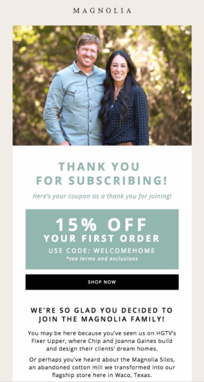
Regardless of your familiarity with Chip and Joanna Gaines and their home building/renovation show and online marketplace, this email welcomes you with a simple, effortless design and an inviting call to action (CTA).
The discount front and center is a smart move. Also, the copywriting is on-point: “We’re so glad you decided to join the family” is the perfect warm welcome that Magnolia’s target audience wants to hear.
National Geographic
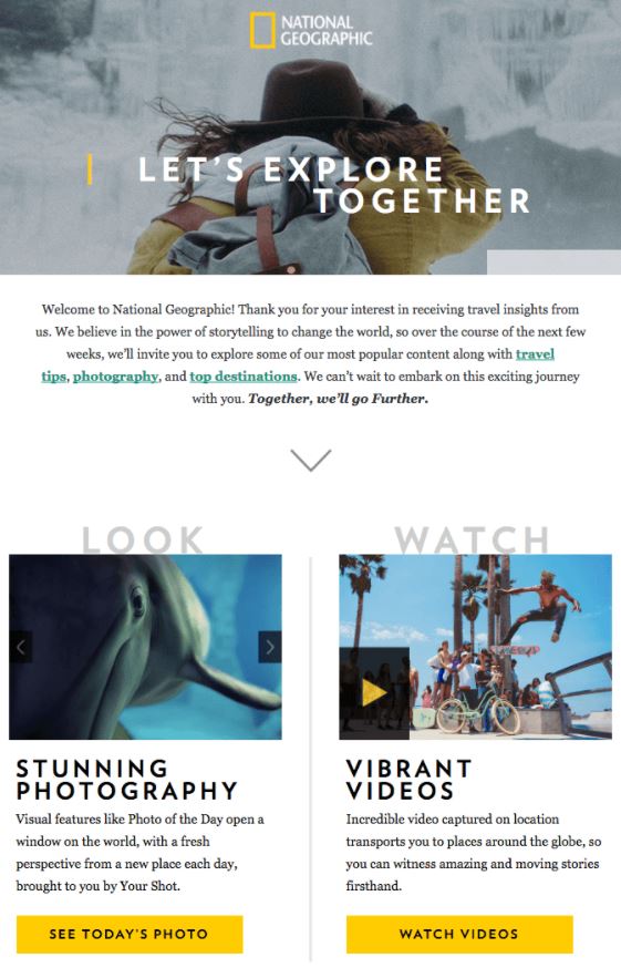
National Geographic is another company that proves it knows its audience well. The focus on exploration and adventure and stunning imagery is perfectly on-brand.
The 3 CTA’s to “Look”, “Watch” or “Explore” drive recipients to Nat Geo’s website.
They also expertly include a question at the end of the email to help further personalize the subscriber’s experience.

ban.do
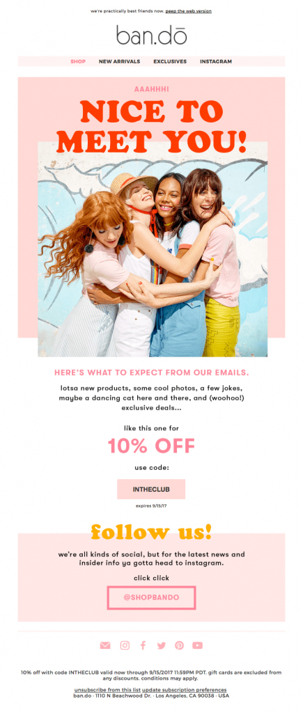
The same way that Magnolia offered an enticing discount, ban.do rewards new subscribers with a special deal.
The large, colorful text and imagery is aligned with the rest of ban.do’s brand image, and they skillfully include social media buttons as a clear micro-CTA.
Bespoke Post
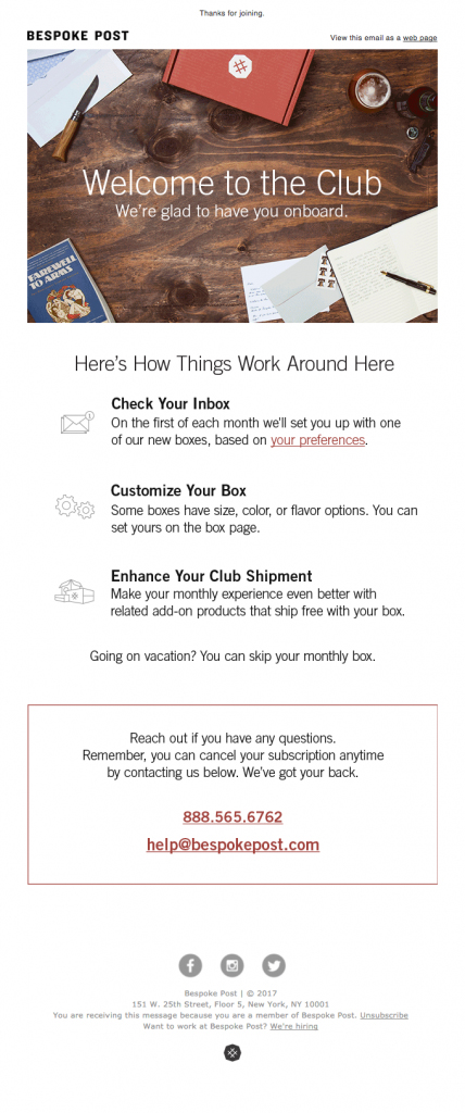
By setting the stage for easy communication in this first onboarding email, Bespoke Post sets itself up for a great relationship with its subscribers. People love to know exactly how things work and what to expect.
Subscribers will also love how clearly the company states its customization capabilities. I also think its enviable how the email doesn’t shy away from reminding recipients that they can cancel their subscription at any time.
Lush
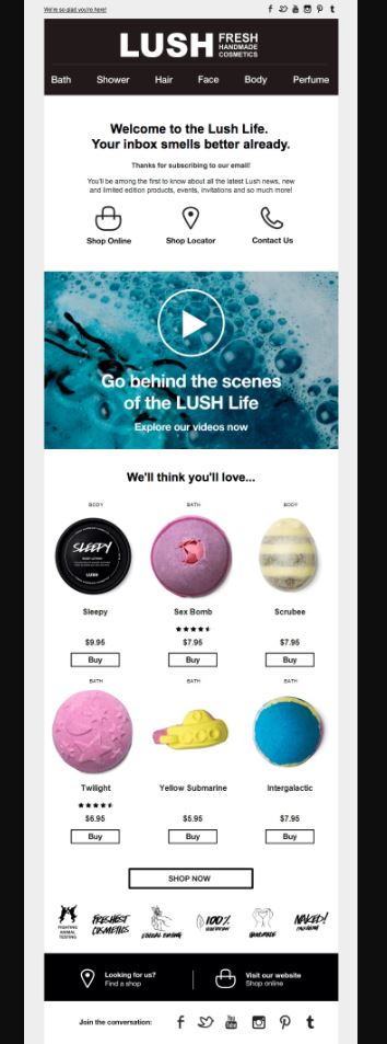
The highlight of this welcome email is the “We think you’ll love” section, complete with enticing images of one of Lush’s signature products.
Another great part of this email is the inclusion of the social media buttons and the invitation to “join the conversation” and engage with them.
Also, the video was clever to include, because when you click on it, it brings you straight to a landing page that plays the video (automatically driving traffic to Lush’s site).
Levi’s
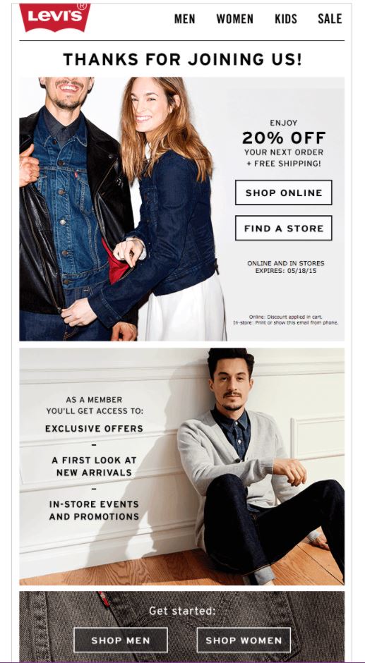
This email is classic and streamlined. It has the appropriate CTAs without sounding pushy (which is never a good idea with an onboarding email, especially).
It also clearly spells out the three perks of being a member.
Casper
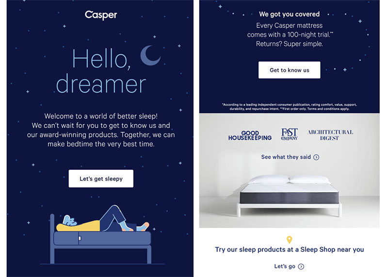
The marketing team at Casper maintains consistent, well designed marketing messaging across channels, especially email. Their brand voice is conversational and proves their quality with endorsements from Good Housekeeping and Fast Company. Welcome emails like this set a positive tone and expectation for the emails to come.
Wynd
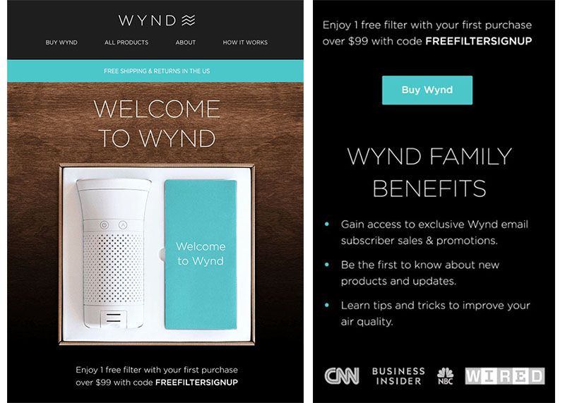
This welcome email not only has a sleek design, but also includes a discount code, clearly outlined benefits, and approval from reputable news sources such as CNN and NBC.
Beek
In the crowded space of footwear ecommerce, Beek stands out because their welcome email conveys its brand mission through the perfect mix of high quality photos and clever messaging.

Asana
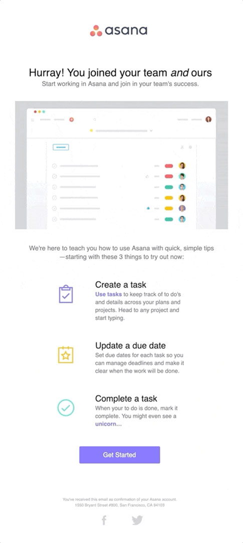
Asana adds a human element to their welcome email with their opening line of copy, “You joined your team and ours.” Some SaaS companies can sound robotic with their marketing messaging, but Asana makes a point to keep the welcome email clean and simple in design and personable in tone.
Peloton
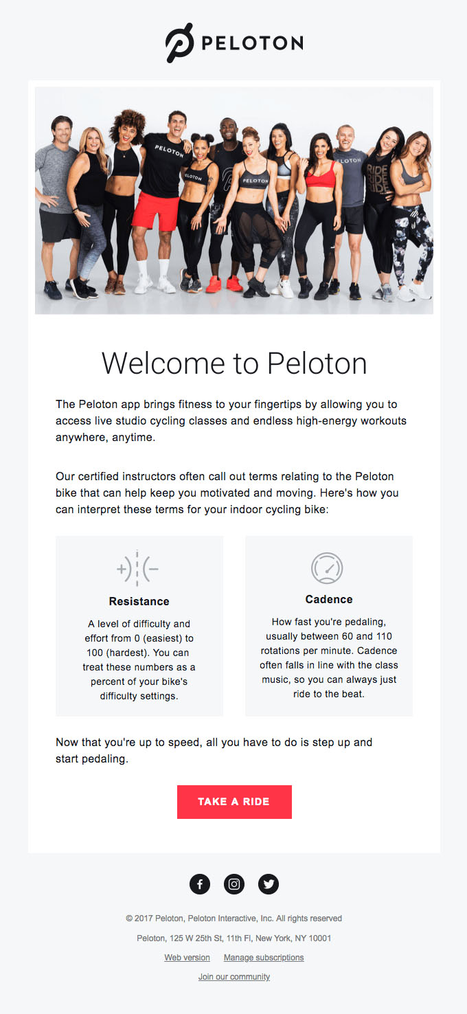
This email gives off the feeling of a warm welcome by starting off with a friendly photo of the instructors, and keeping the rest of the email informative but simple. With a product like Peloton that comes with so many features, it could be tempting to want to cram in all the perks, but it’s best to keep it simple.
Getting Started Email Examples
“Getting Started” emails are all about the subscriber taking action. Don’t freak out your subscribers. Use the getting started email to get new folks to take a single step.
Mailchimp
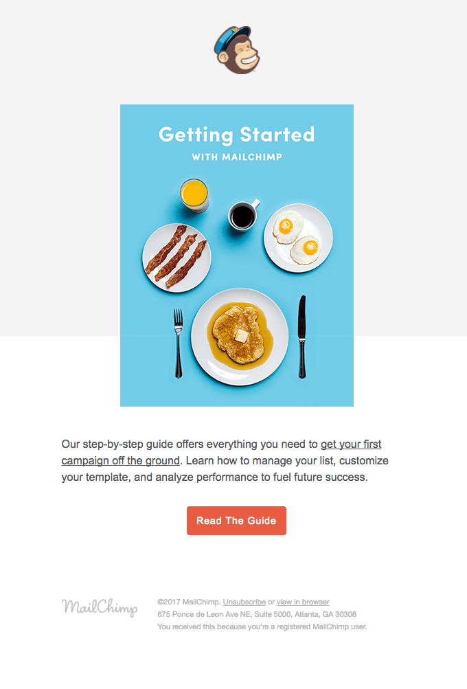
MailChimp is very straightforward but effective. The bright, simple imagery is engaging and to the point. The button links to the guide that people need to follow to finish getting started, which is great.
Chewy
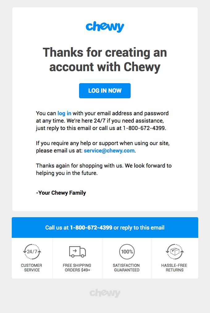
Simplicity is sometimes the best possible way to have your voice heard.
The “Login Now” button front and center quickly drives subscriber’s to Chewy’s site so they can start buying.
Glossier
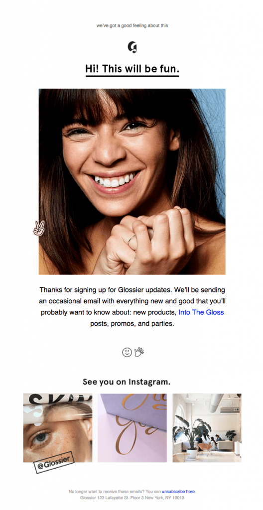
Glossier has a transparent, friendly look and feel to their emails that’s consistent across their marketing channels.
As a purely e-commerce brand, a clean, user friendly, visually appealing aesthetic is necessary for its survival.
Also, notice how this email plays favorites with social media channels, saying “See you on Instagram”.
Asana
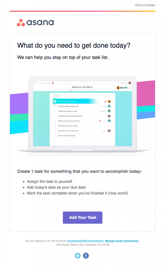
Any email marketer can agree that Asana is on the right track with its CTA: What do you need to get done today.
Its subscribers most certainly will have an answer for that and will click the “Add Your Task” button to get started right away.
Ibotta
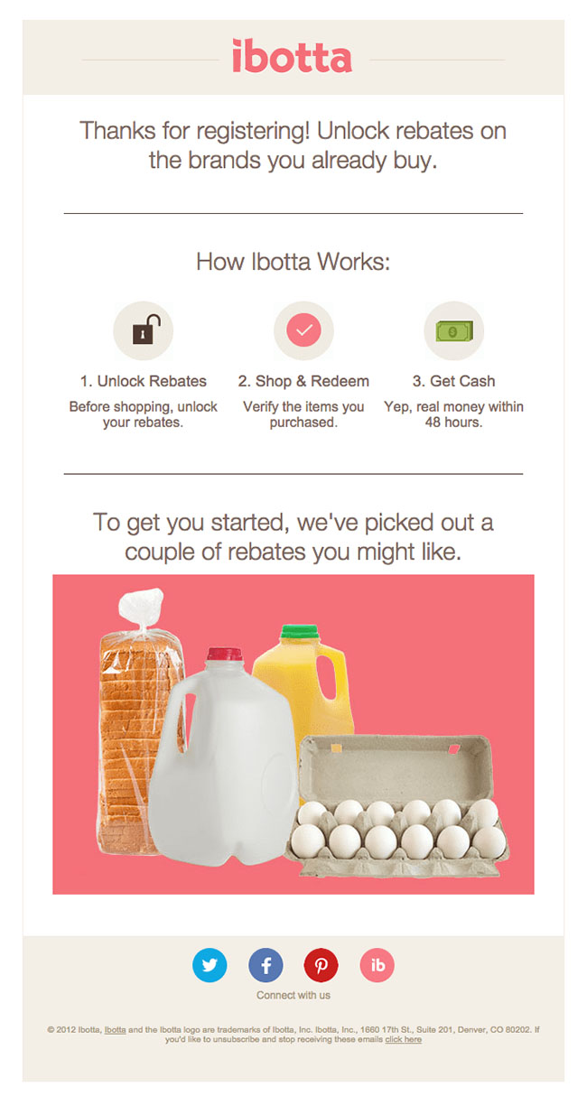
Ibotta does a great job of explaining how to use the product in three simple steps. To make getting started a no-brainer, Ibotta chooses a few rebates to give new users an extra push to get started.
Sidecar
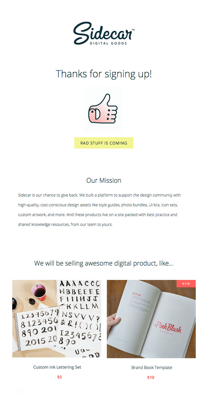
This email has two main elements that make it the perfect type of message you want to receive after signing up for access to a product or service. First, the company thanks the customer and explains its mission in a succinct and genuine way. Also, the company shows an example of what to expect, affirming the customer’s choice to pay.
“Free Trial Ending” Email Examples
When it’s your last chance to convert subscribers into paying customers, you need to concise, direct and inviting.
You want your last pitch to get straight to the point and make a lasting impression.
Sqwiggle
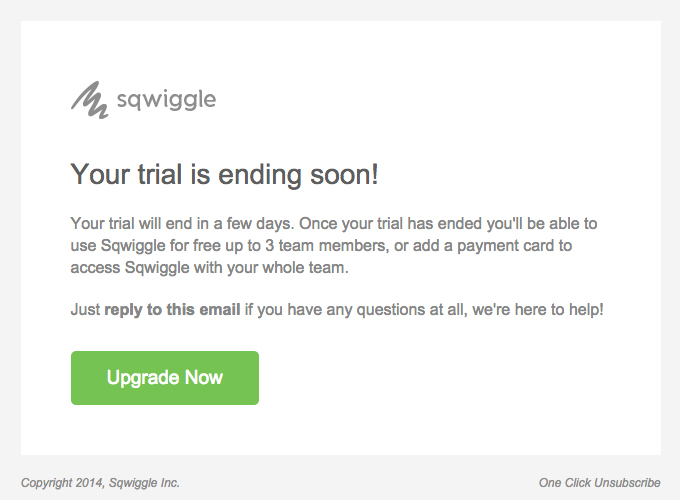
Communication is key with end-of-trial emails. This email relays the necessary information about what changes if you decide not to pay.
Its minimalist design serves this company well because it makes the green “Upgrade Now” button stand out.
Shopify
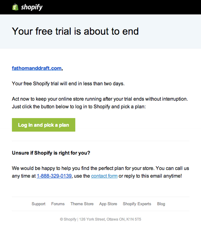
When people know that they’re going to lose something, it makes them pay attention.
If they know their online stores will have an interrupted connection, chances are they will take action sooner than later.
With another clearly visible green button, Shopify encourages subscribers to act immediately without sounding like they’re forcing anyone to do anything.
Netflix
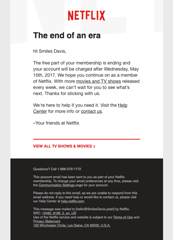
This email doesn’t need a CTA thanks to Netflix’s business model of automatically charging customers after their free trials end.
By thanking you in advance for sticking with them, and signing off with “Your friends at Netflix”, you can tell that the media streaming empire doesn’t have too many issues making people stay.
Apple Music
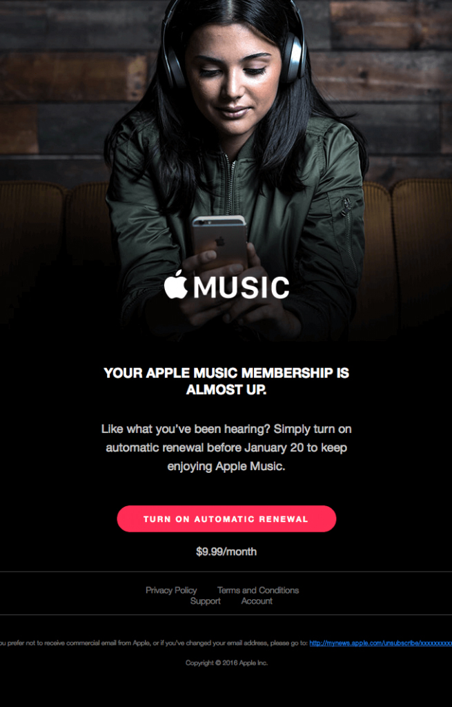
Apple succeeds at designing a sleek email with a clear, bold buttons to highlight the call to action: “Turn on Automatic Renewal”. The dark background makes the CTA pop even more.
Typecast
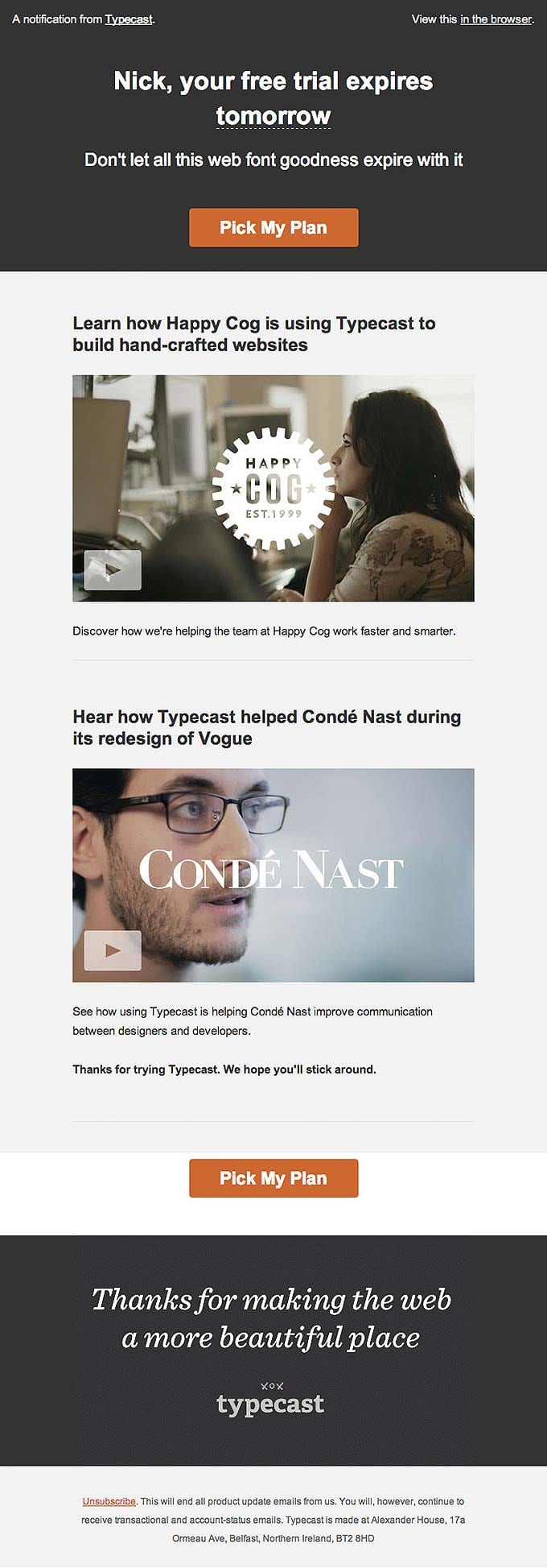
This email reflects the Typecast brand’s casual and friendly tone, while including two clear calls to action and two reputable testimonials.
Squarespace
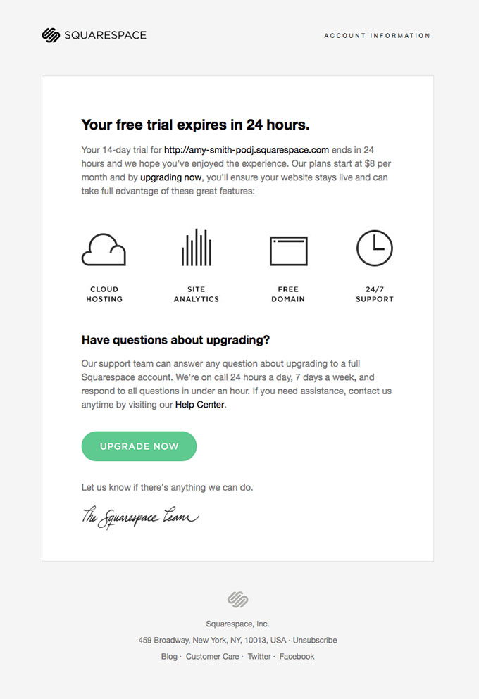
One of the main perks of choosing to build a website with Squarespace is access to 24 hour support. By simply stating Squarespace’s benefits and underscoring the support team’s willingness to answer questions and troubleshoot, this email makes it case for the upgrade. Also, the green “Upgrade Now” CTA button is hard to miss.
Activation Email Examples
Activation emails are a mix between transactional and promotional.
The activation process has to get completed either way, so you might as well use it as another way to reassure your customers and market your brand.
Thread
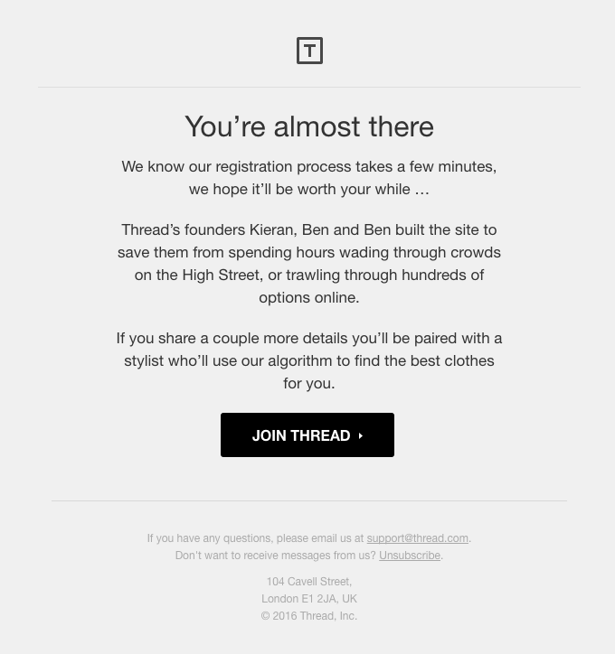
The honesty and sincerity in this email from Thread is perfect for an activation email. The company acknowledges that it takes a decent amount of time to register, but reminds subscribers of the benefits.
Rdio
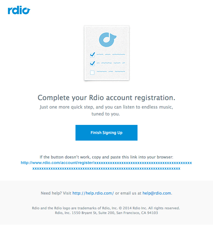
On the other hand, rdio emphasizes how quick it is to finish signing up to take advantage of their service. “Just one more quick step” is a great way for subscribers to activate fast.
Campaign Monitor
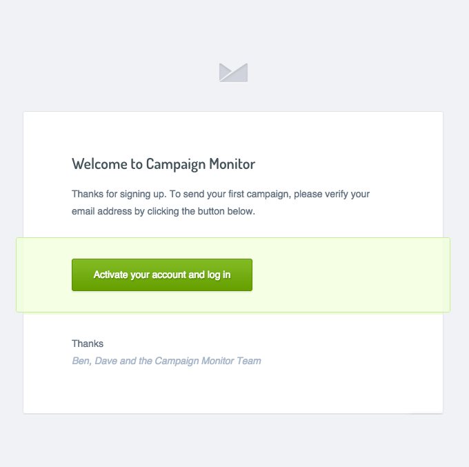
Activation emails require that subscribers take action, and sometimes less is more.
An extremely straightforward email without any bells or whistles like this one from Campaign Monitor ensures that the subscriber doesn’t get distracted and directly finishes the activation process.
Blue Apron
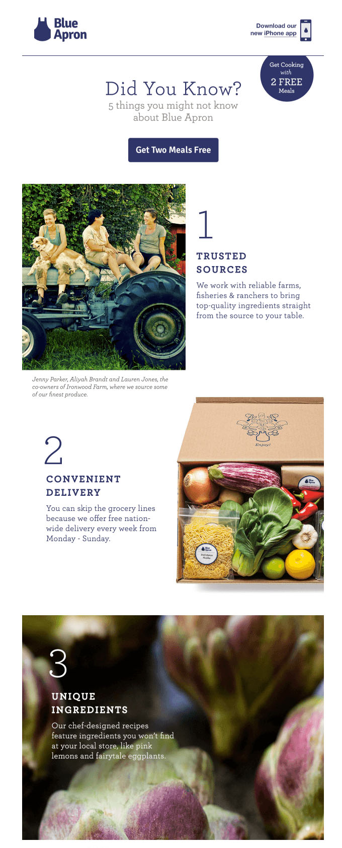
This activation email not only offers 2 free meals, but also outlines impressive facts about the service. Considering Blue Apron is in the oversaturated space of meal ingredient home delivery services, they need to find a way to stand out from competitors.
Oru Kayak
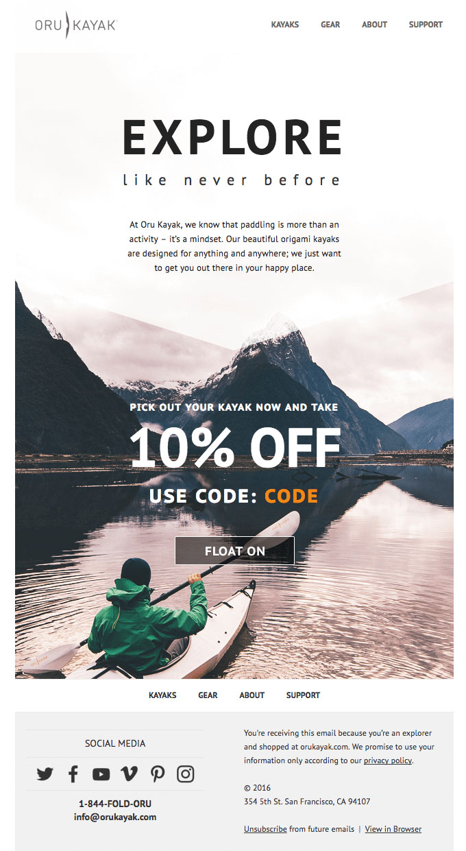
Oru Kayak has the right idea when it comes to “activating” email subscribers and turning them into customers. A beautiful image of the product with an inviting discount code is perfect.
Nudge Email Examples
Convincing someone of why they should invest in your product or service needs to be done in a tactful way.
Make the focus of your nudge email the benefits of your brand. It also can’t hurt to provide a few reasons why users should choose your company.
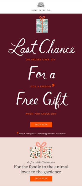
Rifle Paper Co.
“Last chance” is always an effective way to get a subscriber’s attention.
With the bright orange CTA’s to drive subscribers to Rifle’s website, this email excels by emphasizing the promotion’s time-sensitive nature.
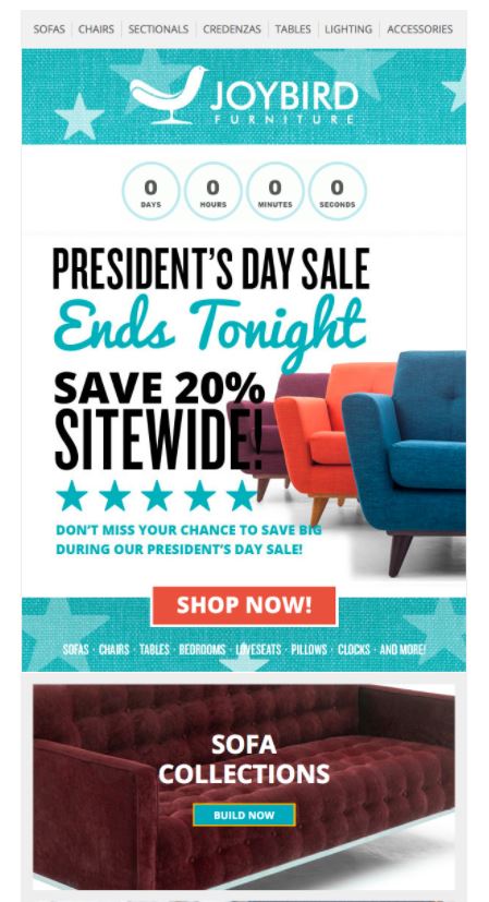
Joybird Furniture
No one wants to miss out on a sale. This email uses human nature to its advantage by triggering subscribers’ fear of missing out. The countdown at the top of the email, emphasizing that “time is up”, pushes subscribers to act quickly.
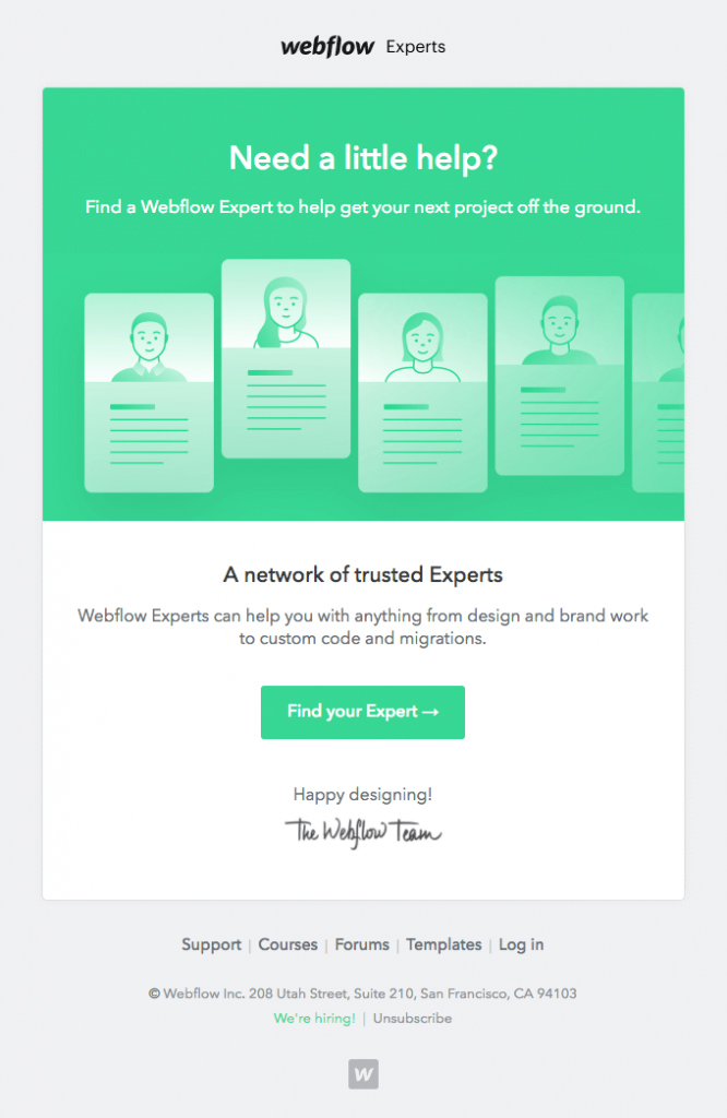
Webflow
An email that offers help is another great approach to a nudge email. Someone who might have been inactive on your platform could realize they need to revisit your site for your services.
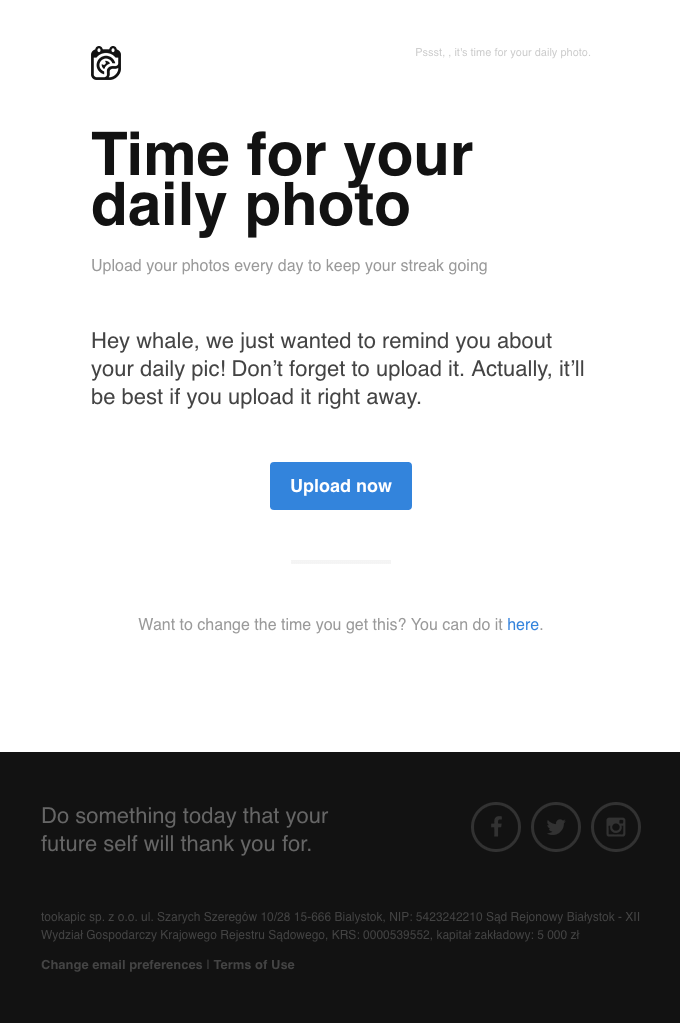
Tookapic
This nudge email is unique in that it starts off as a typical reminder and then switches to a more urgent suggestion in the next sentence.
The great part about this email is the fact that it gives subscribers the option to change the time they receive the daily email as well.
Any chance you have to give users control over their experiences, you should do it.
Handy
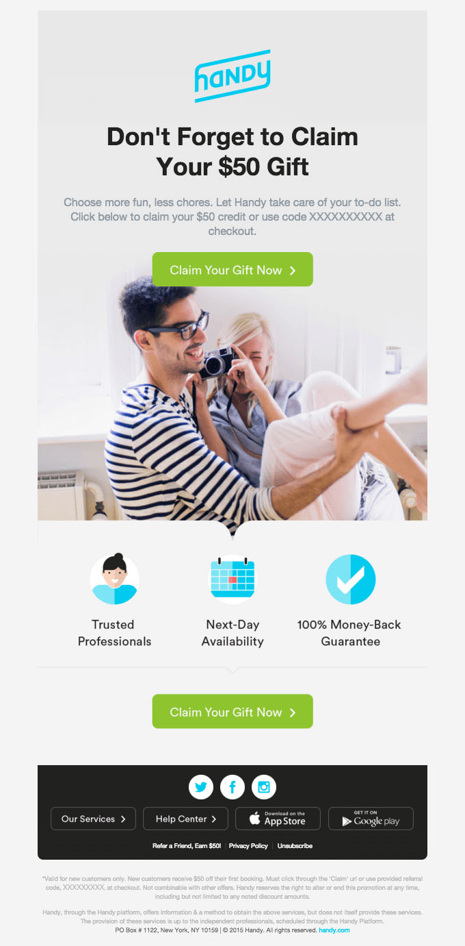
The key to an effective nudge email is to remind an email recipient to do or buy something that they already had the intention to do or buy. In this case, Handy reminds subscribers to claim a $50 gift, which is an easy way to get someone to your site.
Felix Gray
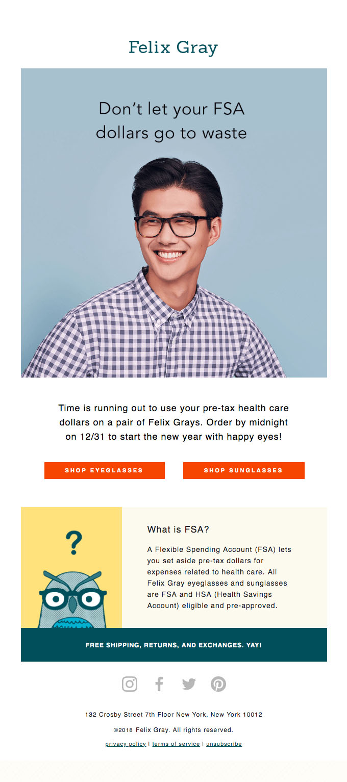
Everyone loves saving money. Felix Gray catches the subscribers’ attention who are familiar with or have a Flexible Spending Account through their health benefits, and piques the curiosity of those people who are learning about it for the first time.
Upsell Email Examples
Your goal is to prove that you are providing value with your upsell. So many upsells actually provide great additional value to clients/customers, and yet people still often assume you’re only trying to get more money out of them.
Since this is a common assumption, it’s wise to be extra strategic about the way you frame your message.
Medium
This upsell email does it all. It proposes the account upgrade in a polite way, thanks the user for having an account in the first place, reminds the user of the benefits of having an upgraded account.
Using language such as “Shall we?” and “What do you say?” seems friendlier and makes the choice less pressured.

Moo
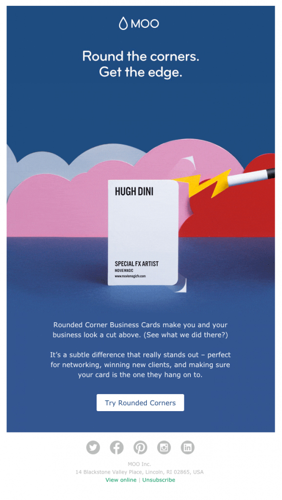
The way Moo frames this upsell is on-point. The play on words “Round the corners. Get the edge” paired with bright colors and spacing is eye-catching.
Keeping in mind that upgrading their business cards’ shape is probably not a priority for most people, they make a compelling argument for why it’s worth it.
Dollar Shave Club
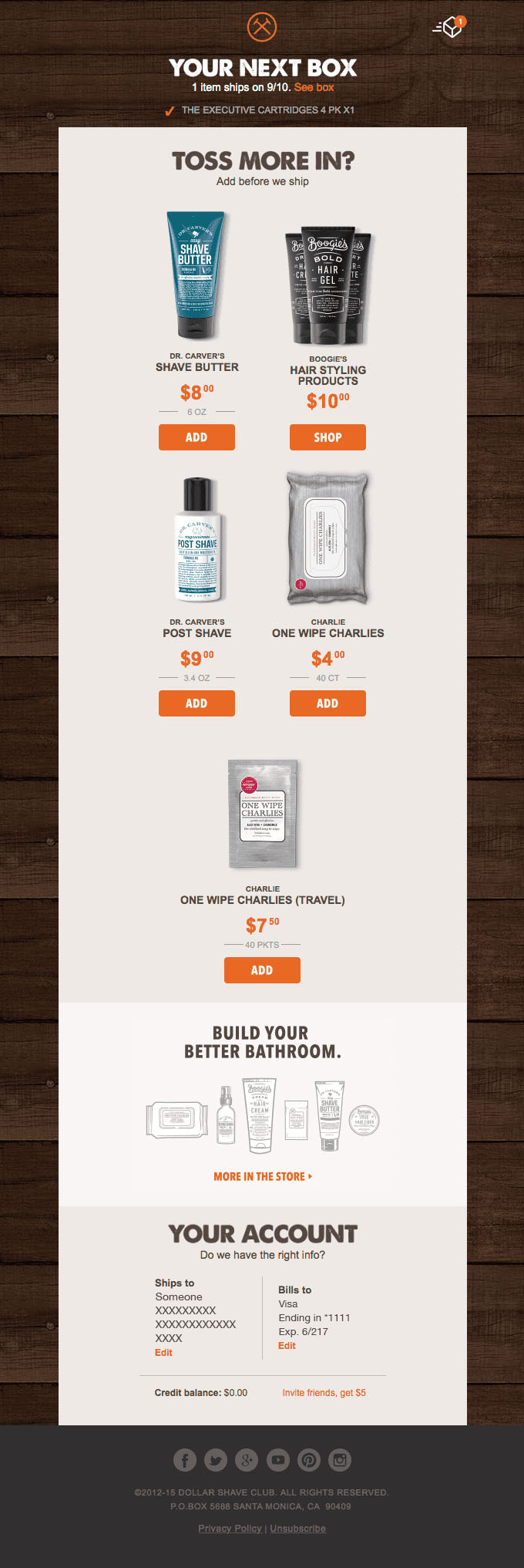
This email makes it seem like the customer already had the inclination to “toss more in” his cart, which makes it an effective upsell email. An upsell shouldn’t be a hard sell, and since the products suggested are closely related to what the customer just purchased, it makes sense.
Postmates
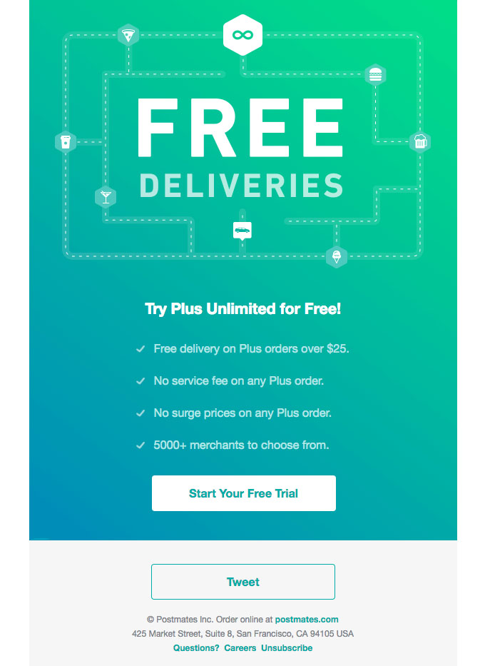
The bright and simple design with an emphasis on free deliveries is perfect for this type of email. Postmates also makes the smart move of offering a free upgrade to constant free delivery for a limited time.
