TRANSACTIONAL EMAILS
Since you have to send transactional emails anyway, why not make it an enjoyable and productive experience for you and the customer?
Too many marketers underestimate the power of transactional emails, but they can be an extremely valuable tool.
Table of Contents:
- Email Receipts & Payments Emails
- Username & Password Reset Emails
- Opt-In Emails
- RSVP Emails
- Notification & Alert Emails
- Shipping Confirmation Emails
- Subscription Emails
- Unsubscribe & Cancellation Emails
- “Here’s What You’ve Been Waiting For” Emails
Receipt & Payment Email Examples
It’s disappointing that so many marketers disregard the massive opportunity that sending email receipts presents them.
Even if you’re not an ecommerce business, an emailed receipt is almost always preferred by customers. A non-pushy CTA is the perfect way to make the most of an email that you have to send anyway.
Postable
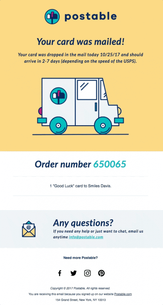
The combination of the fun GIF and the easy-to-read text with a clear tracking number makes this email enjoyable to open.
Allbirds
The layout of this email is impeccable. The graphics and pun are on point, and they manage to squeeze in all the important order and exchange information without overcrowding the email.
The seamless incorporation of the social media icons also adds a great touch.

Indiegogo
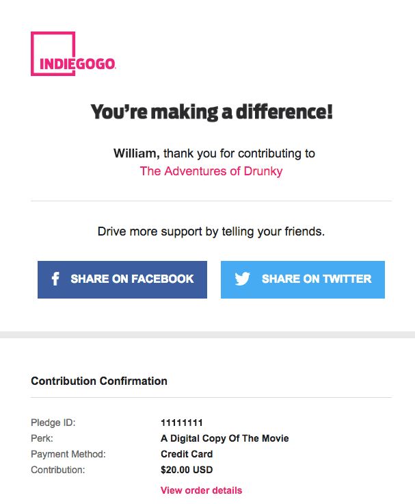
Everyone likes to know that their dollars are going towards something that counts and thankfully IndieGogo has the advantage that their business revolves around this idea. The email doesn’t need much else, and IndieGogo knew that.
This email underscores the importance of knowing your audience and organically offering the chance to contribute to more campaigns that could interest them. The curated preview of other campaigns to explore is a smart move.
Huckberry
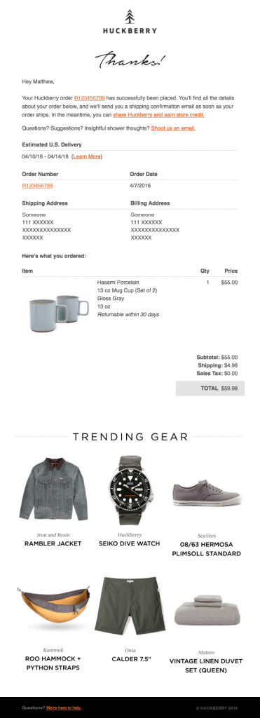
Receiving a receipt email with too many elements or a distracting design defeats the purpose of a straightforward and informative message.
Huckberry struck a great balance between clean, minimalist email design and including plenty of CTAs.
The email not only provides the most important order information first (with a couple of CTAs sprinkled in), but also transitions nicely into displaying trending products toward the bottom.
Chipotle
When it comes to food pick up and delivery, no mistakes are tolerated.
Chipotle designed these emails to prioritize when and where to pick up (we love that a Google Maps snapshot is embedded right in the email).
The clear communication and simplicity of this receipt is spot on, leaving no room for confusion.

Postmates
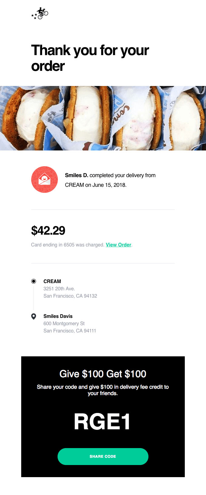
This email provides the key information a user needs with the perfect amount of whitespace to make it easy to read at a glance. It’s smart that Postmates included a special discount at the bottom that’s hard to miss with a prominent green call to action button. It’s a prime example of making a transactional email promotional without being obnoxious.
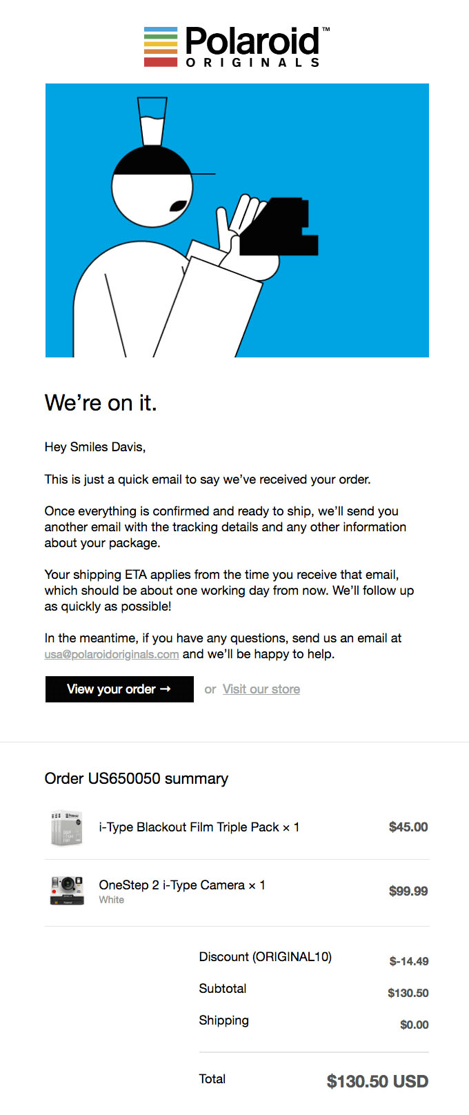
Polaroid
Polaroid steps up its receipt emails with a brief but thorough and reassuring message that they are processing a customer’s order. Any time someone spends money on a product or service, it makes sense that they would want their purchase validated. We love that Polaroid is transparent about next steps and offers to answer questions.
Username & Password Reset Email Examples
The trick with these transactional emails is that the better they are designed, the less people will notice them.
You’ll leave a subconscious positive impression on customers if your password reset process is super easy and quick.
On the other hand, if extra steps are involved, or people can’t get the information they need.
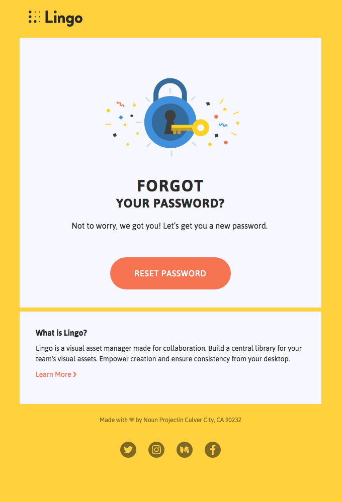
Lingo
Every time that you’ve received password reset emails, you were probably always in such a rush to get the information that you barely noticed the design.
What makes this email great is that the design is noticeably bright and fun, without making it any trickier to expedite the password reset process.
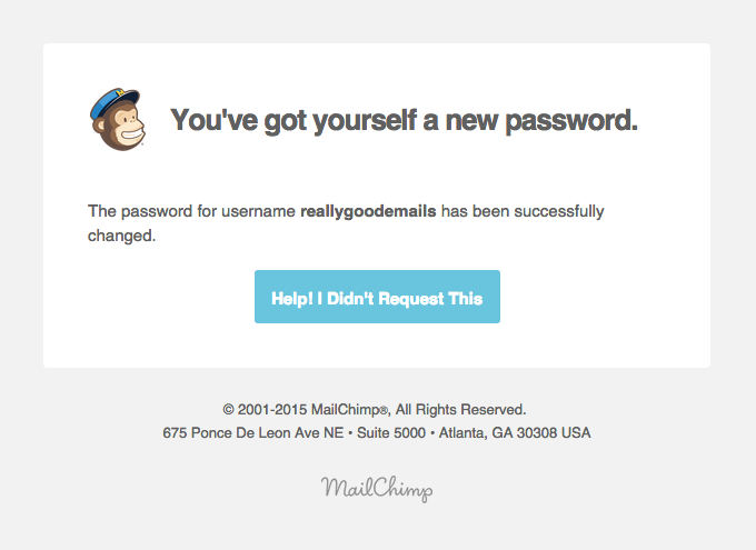
Mailchimp
If someone changed your password (that wasn’t you), you would want to know as soon as possible, in the most straightforward possible way.
MailChimp understands this and cuts straight to the chase.
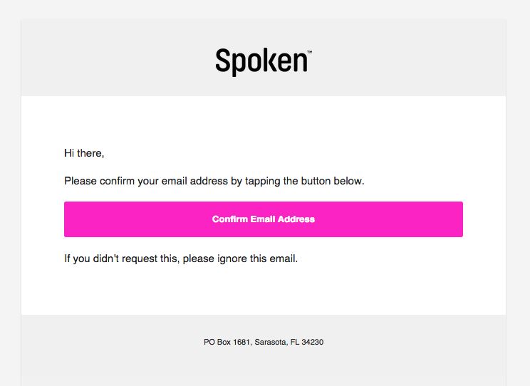
Spoken
This is an ingenious confirmation email that recognizes the fact that its primarily mobile users will want an easy-to-tap way to confirm and move on with their lives.
Spoken demonstrates they know their audience, and helps to make their lives easier.
Vimeo
All internet users prioritize the security of their inboxes and accounts more than ever before, and Vimeo recognizes this.
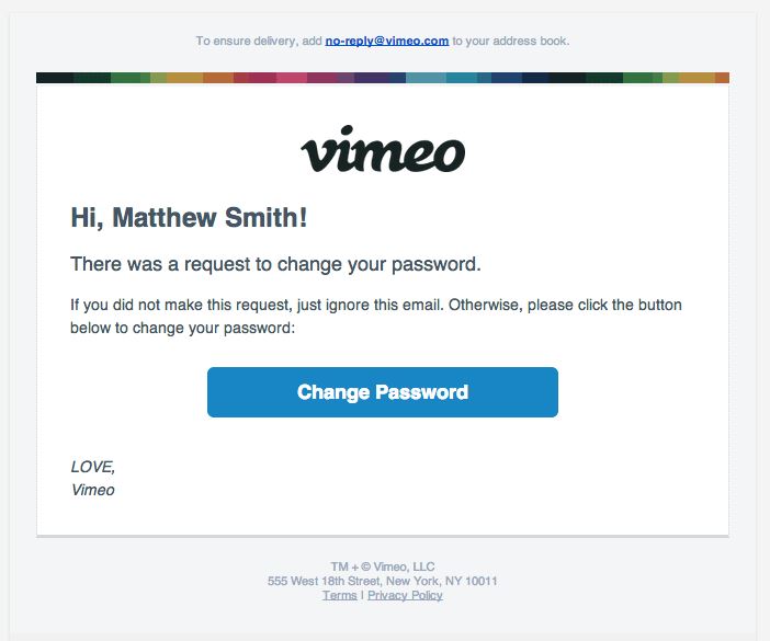
Whenever you receive password reset emails, you’re probably in a rush to get the reset code or information and barely notice the design.
What makes these emails great is that the design is noticeably bright and fun, without making it any trickier to expedite the password reset process.
Verve Wine
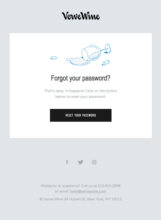
We love how Verve adds a friendly tone a transactional email that is as boring and basic as a password reset email.
Jet
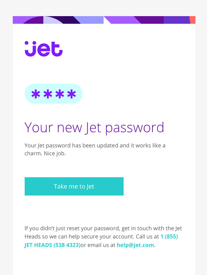
This email confirmation from Jet is well designed and makes the password reset process seem like a no brainer.
Opt-In Email Examples
These emails need to be well-formatted and convince your subscribers that they made the right choice to sign up.
These emails can have an eye-catching design, but the main focus should be to make them as easy to act upon as humanly possible.
Archant
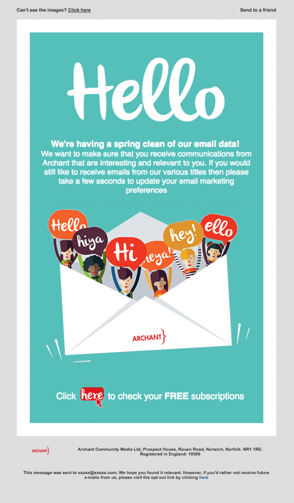
Archant presents this email opt-in as an easy choice. Anyone who enjoys receiving the email will act after receiving this message.
Greats
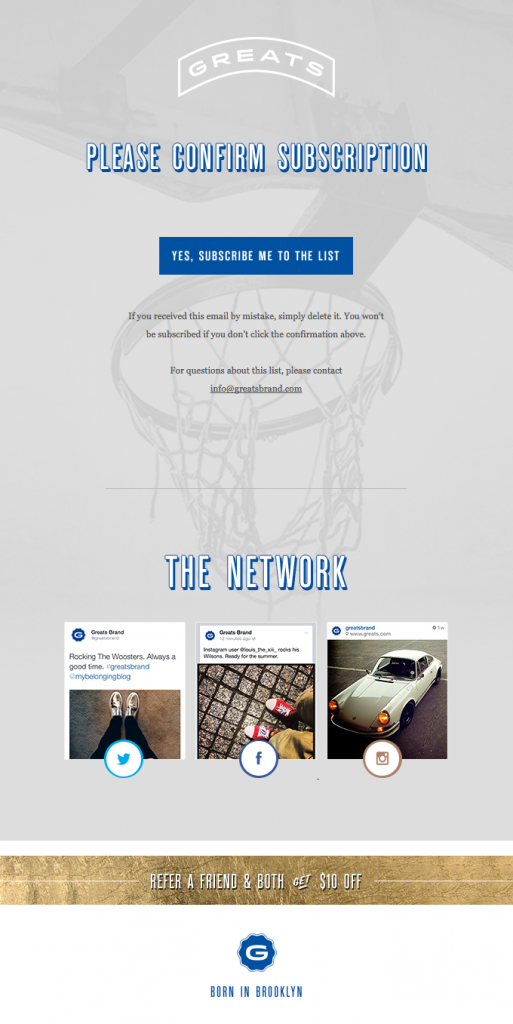
This opt-in email is impressive because of the thought that went into the design and unique lettering (even though it’s just confirming your email sign up).
Republic
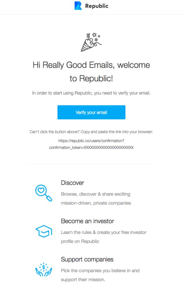
This email doesn’t let you think twice about verifying your email, providing the link to copy and paste as well.
Many companies are smart enough to do this today because there is always the possibility of a button breaking and a client getting frustrated.
Animoto
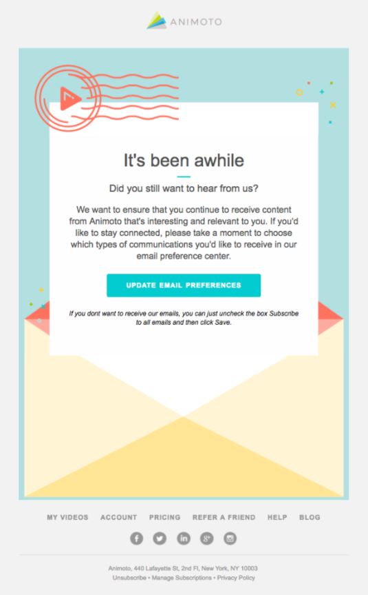
Checking in with subscribers in a way that seems to propose unsubscribing seems like a risky move. The reality is that honesty trumps everything else.
If you’re transparent with your audience/customers and give them the choice to take a break, they’re more likely to have a positive view of your brand (and even possibly re-subscribe in the future).
Refind
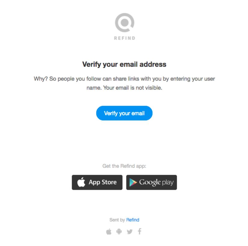
Refind sticks to the basics with this email. This traditional, easy-to-read email from is effective without wasting anyone’s time.
Chipotle
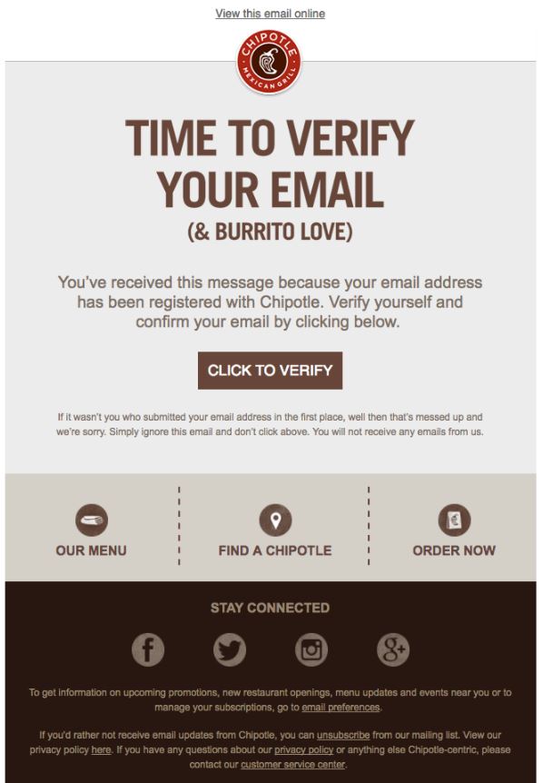
Chipotle knows its loyal customers will be happy to receive email updates and verify their “burrito love.” The friendly tone of their email is perfectly on-brand with its target audience.
Autotrader
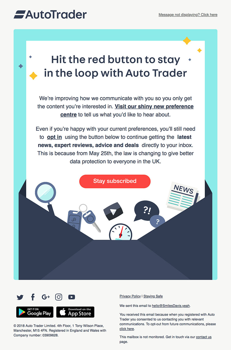
Opt-ins are the perfect way to make sure the people who actually want to receive your emails are the ones receiving them. People love transparency, and AutoTrader is transparent about their effort to make sure their newsletter subscribers are actually interested in staying on the list.
Return Path
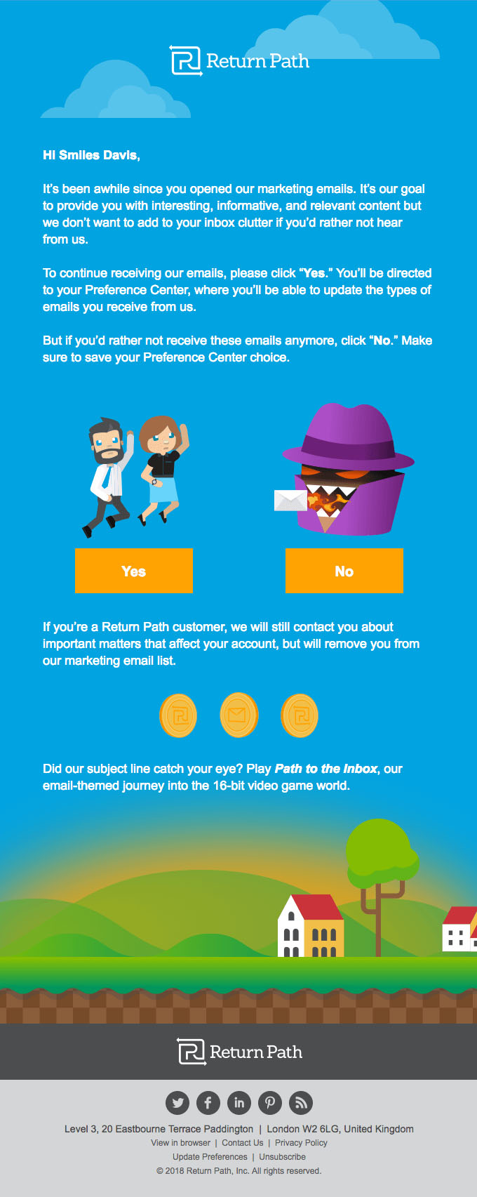
This email from Return Path is great because it affirms that when you check in with your email subscribers and give people the chance to unsubscribe, you end up with a higher quality list of leads in the end. The bright graphics are a nice touch, too.
RSVP Email Examples
These emails should be functional and beautiful. Don’t overdo it: remember that with transactional emails, utility is more important than what it looks like.
The Black Tux
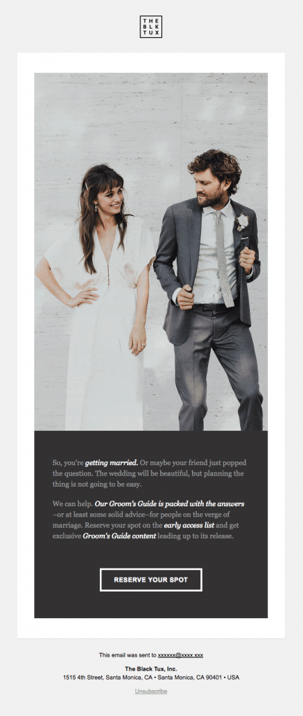
The Black Tux’s tips for grooms-to-be have been extremely popular, so the company seized the opportunity to release exclusive content before another big guide was released.
Although this RSVP email is not for an event, we like the way it feels like an event. It builds up the anticipation before a new product/program launches.
Broadsheet Media
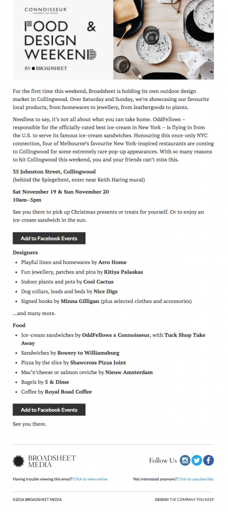
The way this event is introduced as hyper exclusive works ranks in the event’s favor.
Most importantly, the way that the Facebook event RSVP call to action is there twice makes it impossible to miss.
Liquorice
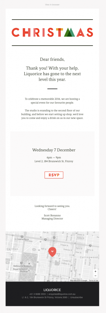
The simple design and lighthearted tone make this email the perfect holiday RSVP request.
Including Google Maps at the bottom of the email is super smart as well.
Republic
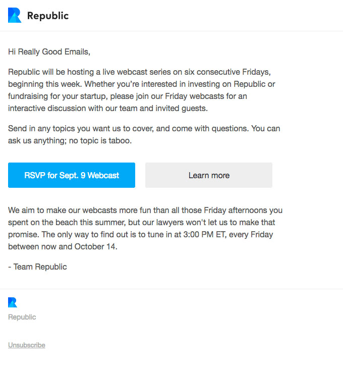
This RSVP email invites participants in the event to contribute questions and ideas before the event. We like that the email gives you options: one CTA button allows subscribers to RSVP for the actual webcast, anTransactional Emails – Opt-In Email – Return Pathd one CTA allows you to learn more.
Notification & Alert Email Examples
One of the best ways to ensure your notification emails live up to their potential is to ask yourself how you would feel if this notification popped up on your phone while you were busy doing something else.
Are you annoyed? Grateful for a quick, easy-to-read, and memorable reminder? Imagine what it would be like to receive your own email, and adjust accordingly.
Calendly
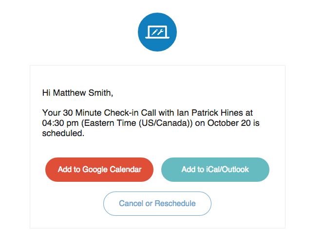
This succinct email is the epitome of short and sweet. Calendly’s options to add it to either your Google calendar, iCalendar, or Outlook Calendar is great. Any way that you can make subscribers’ lives easier, the better.
Mention
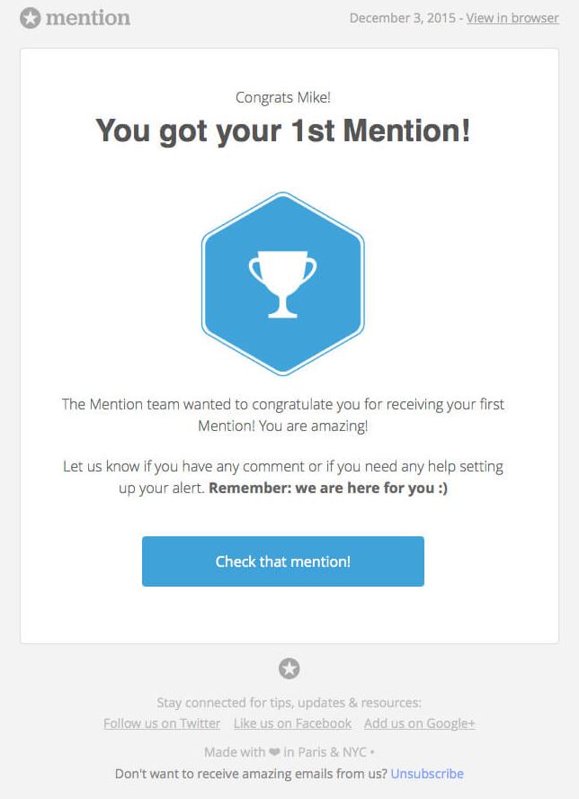
Everyone likes to receive notifications of good news. The way you can make this kind of notification even better is by making it personal.
We love how this email comes across as if mention.com is your own personal cheerleader. The trophy is a great touch.
Celebrating your clients/customers/subscribers whenever they reach a milestone is always a good idea.
Revue
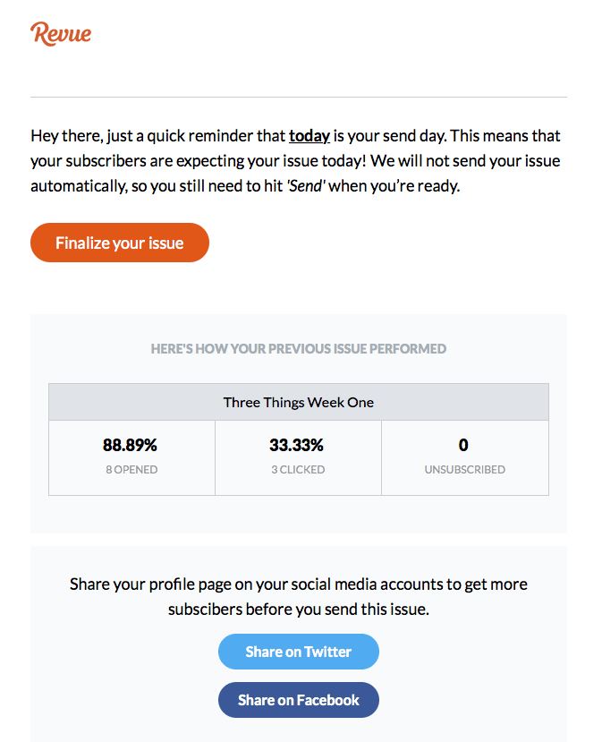
When businesses in the service industry approach communications with customers/clients as a conversation between two colleagues on the same team, information and ideas flow a lot more naturally.
Even though Revue is just email newsletter software, they make their reminder seem personal and not automated. It’s great that it reminds the subscriber of their last report’s results as well.
YouTube
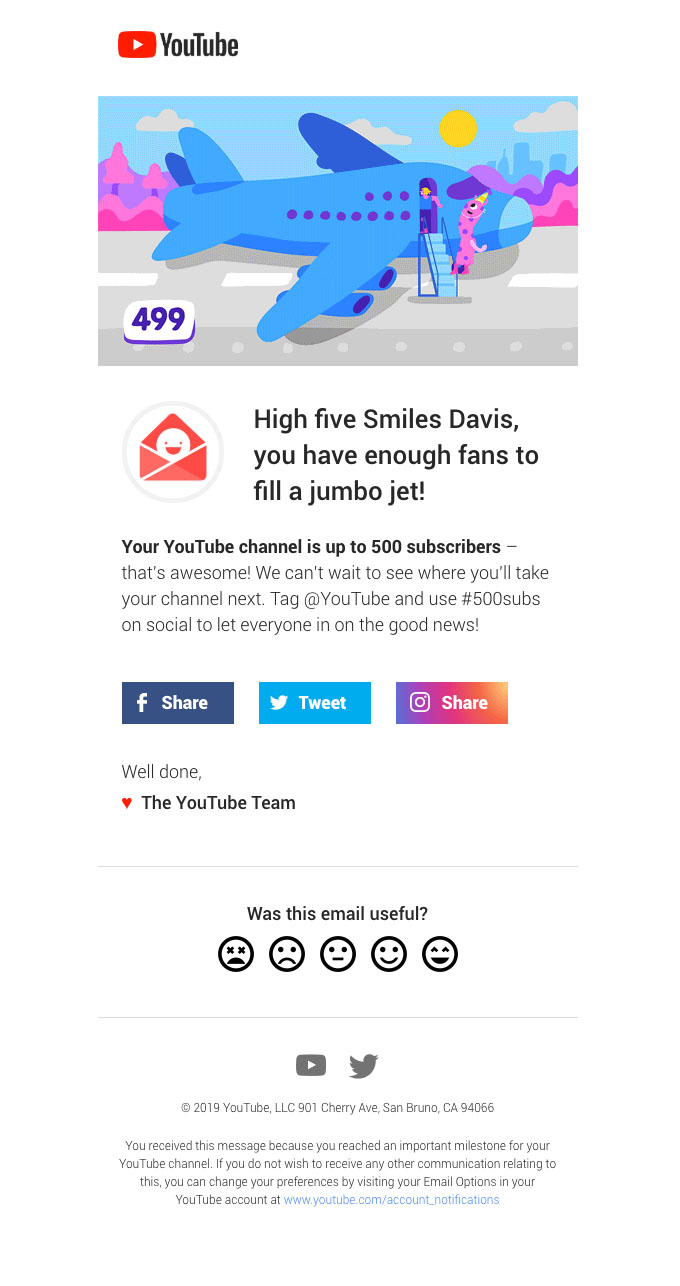
We love how this email is a fun way to alert a YouTube channel owner of their number of subscribers. The analogy is memorable, the encouragement for them to post on social media about it is a win-win, and the survey at the bottom is an easy way to gauge general feedback.
Ballpark
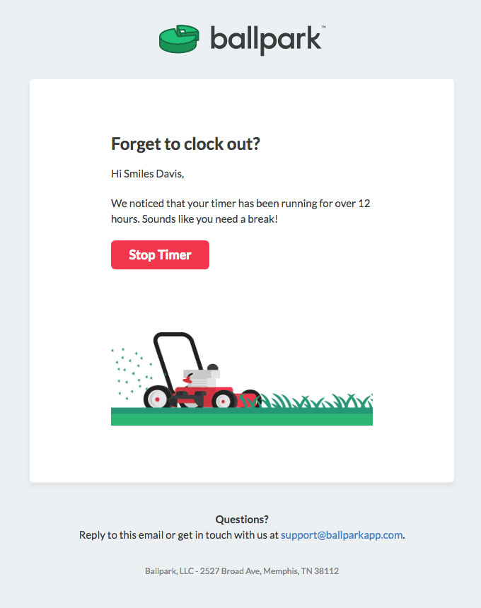
Ballpark makes their reminder notification about forgetting to clock out efficient without being bland.
Lyft
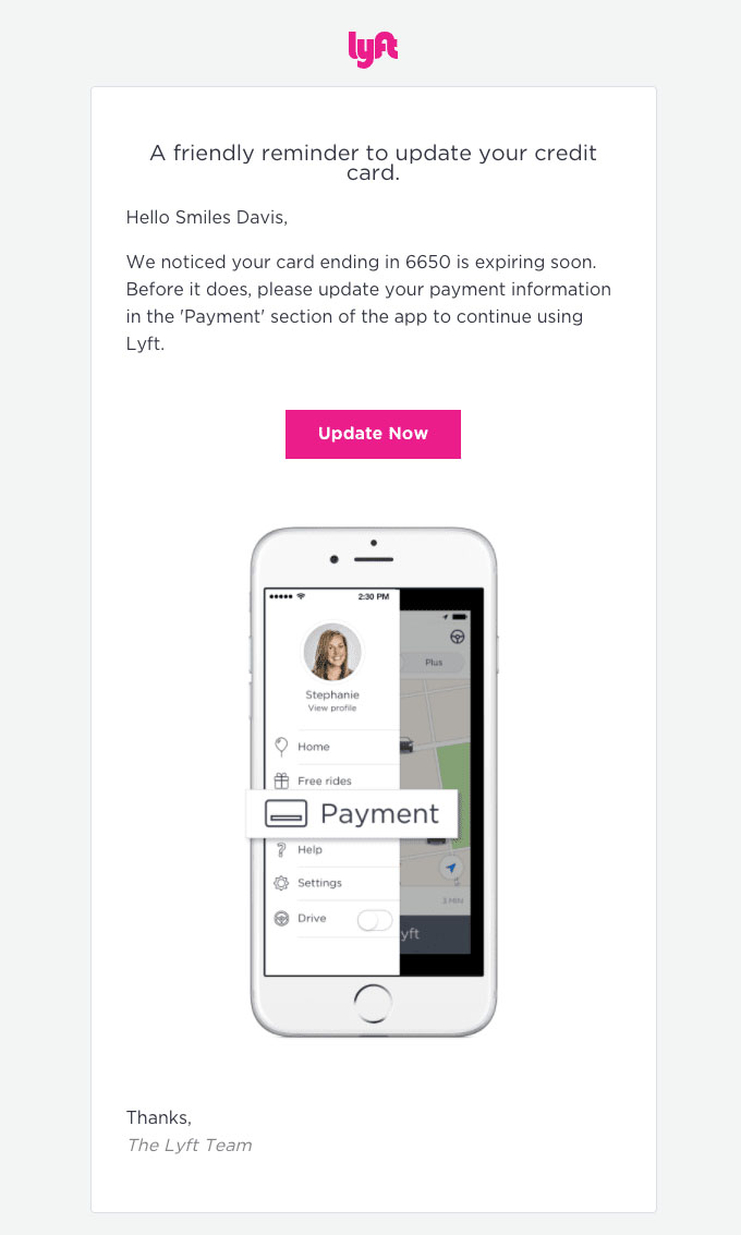
Lyft provides straightforward directions on how to update a customer’s credit card information, encouraging the customer to be proactive. When you consider customer experience, someone would much rather receive a reminder to update their card information far in advance.
This type of notification is a great way to prevent a more urgent email in the future.
Shipping Confirmation Email Examples
Like the other transactional emails we’ve seen so far, some of the best shipping confirmation emails are the ones that say what they need to say and nothing else. At the same time, simple and unique design can’t hurt.
Tradesy
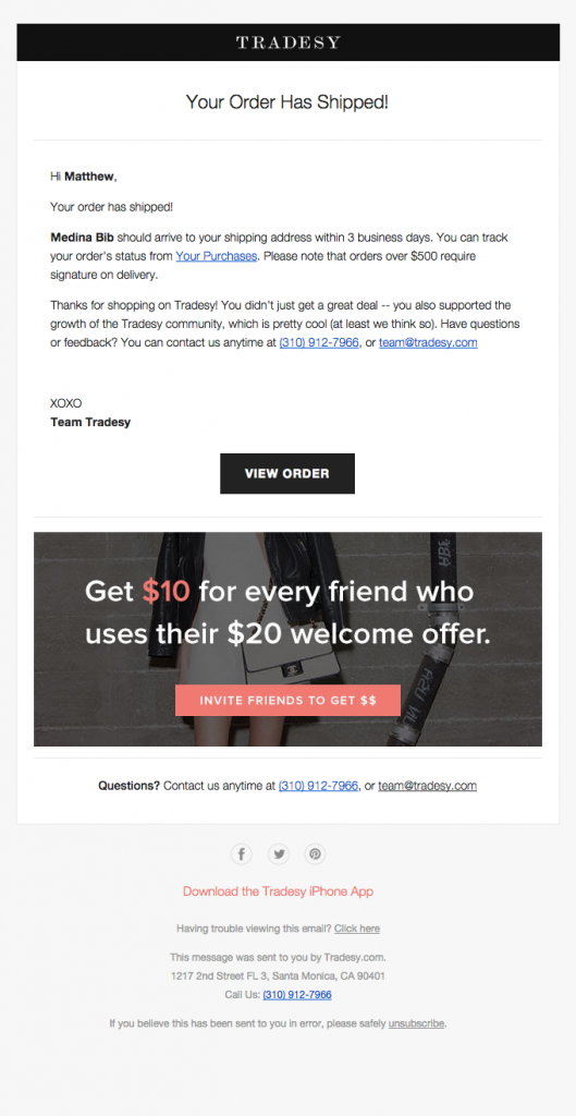
Tradesy provides customers with all the crucial information regarding their purchases, while also thanking them for their support in helping them grow.
They know how to tie a confirmation email with a thank you email and reap the benefits of both at the same time.
Warby Parker
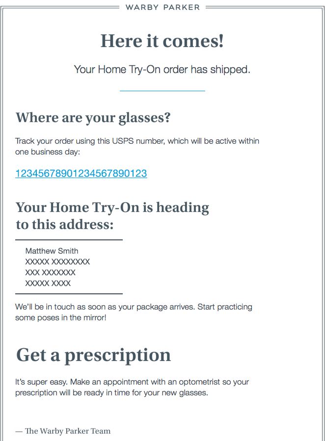
This email could almost be too plain, but the commitment to personalization and customer service shines through. In Warby Parker’s case, personalization is one of the defining marks of the brand.
Fitbit
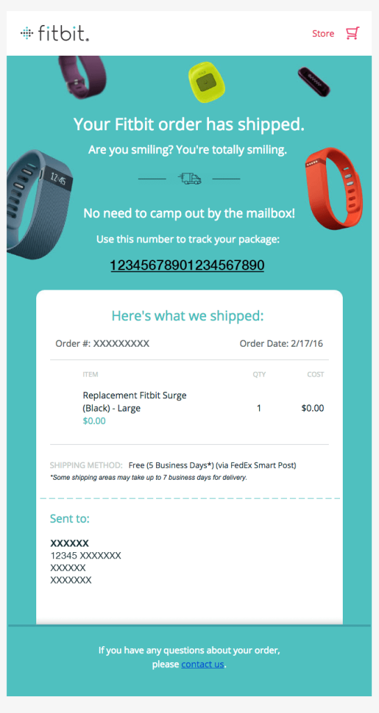
We love how the teasing tone of this email and its bright colors make it inviting and fun to open. Compared to most confirmation emails (that are either boring or dizzying) this email has great design.
Etsy
With shipping related emails, people want to know the specifics. The more information you can provide without overcrowding the email, the better. We love how Etsy provides a visual of the mileage the products have to cover as well.

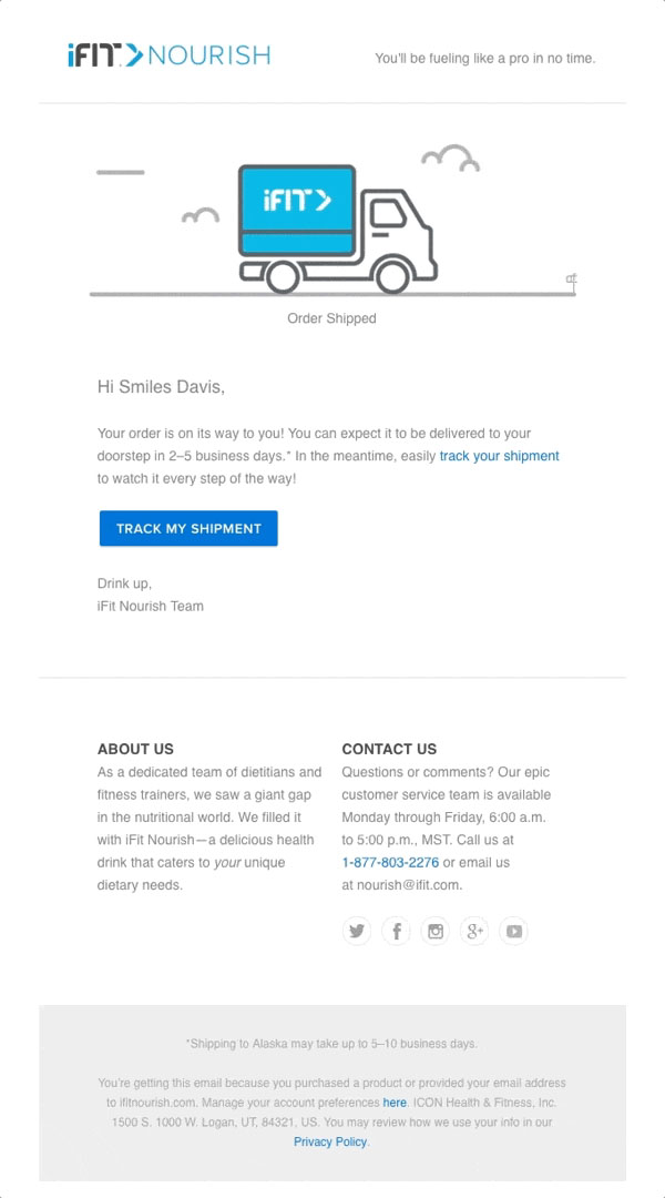
iFit Nourish
iFit Nourish understands that people like the option of tracking their order to make sure it arrives in due time. The on-brand email copy and simple graphics are perfect.
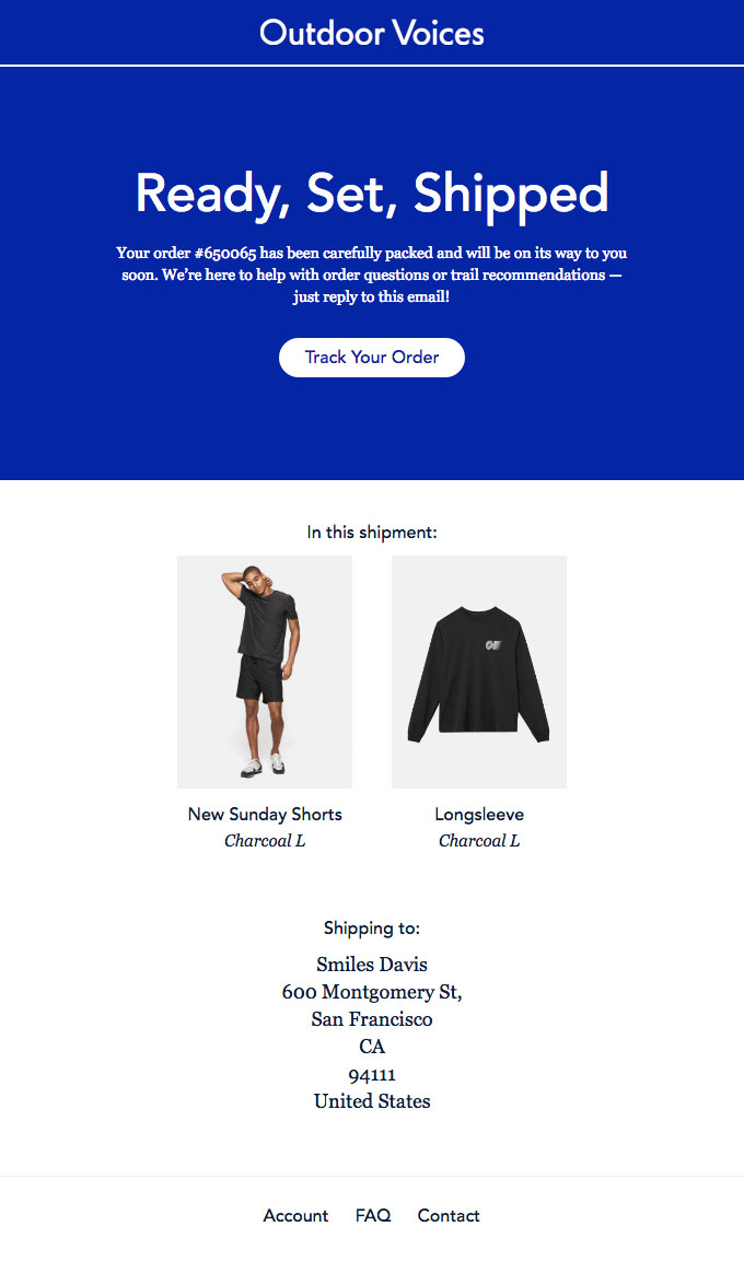
Outdoor Voices
This email confirmation is a great example that less is more when it comes to text sometimes. If you are quickly glancing at this email to make sure your items were shipped, you’ll appreciate the visuals of the products you ordered.
Subscription Email Examples
The first few emails after someone subscribes to your newsletter are extremely important. Be concise and don’t risk leaving a negative impression.
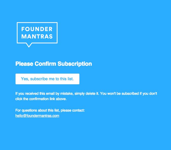
Founder Mantras
The pop of color is working to the advantage of Founder Mantras. Color can be overused and abused but in this case, the white call to action seems to be begging to be clicked on.
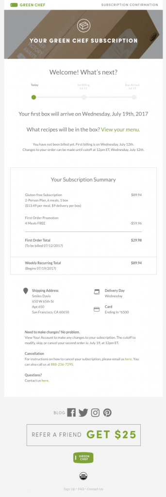
Green Chef
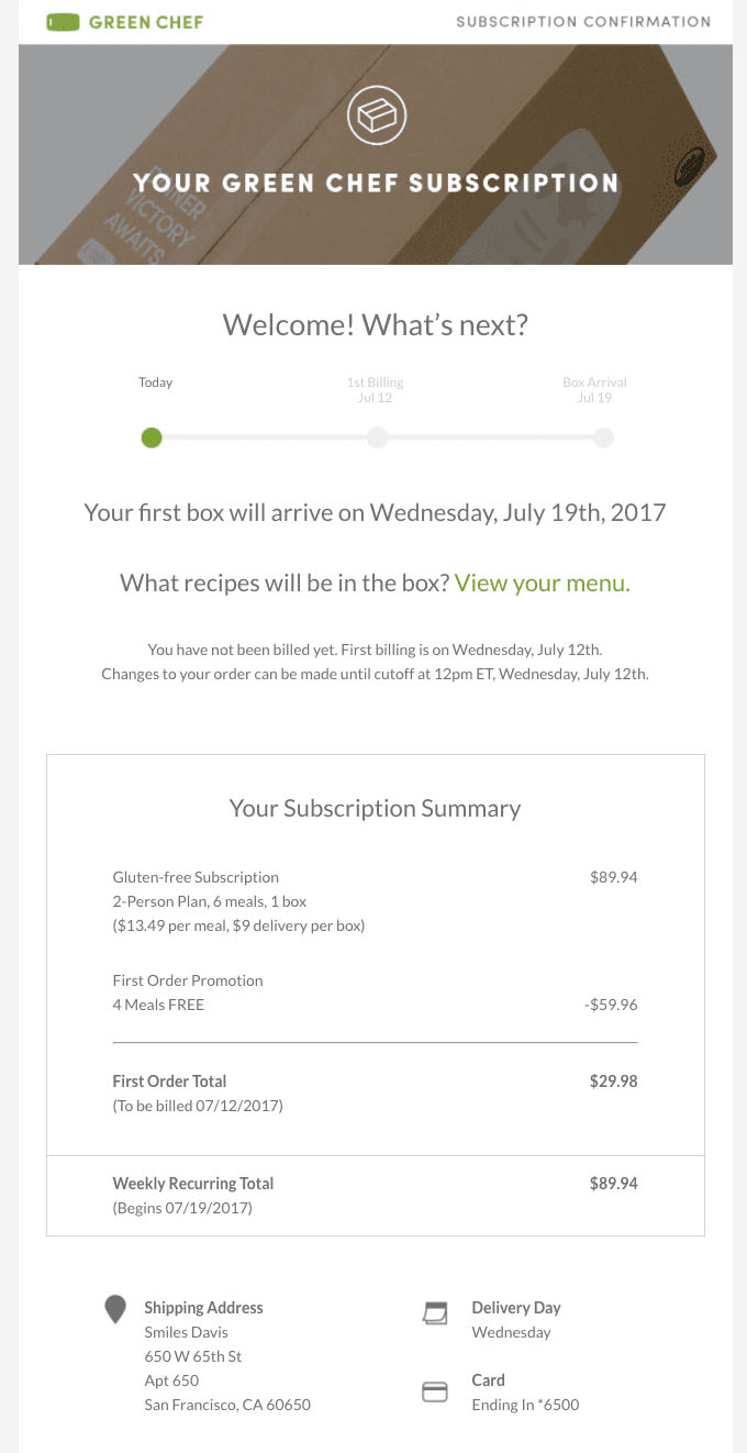
Green Chef focuses on clearly communicating the necessary information and setting expectations so that customers can rest assured they’ll receive the service they’re paying for.
Tedium
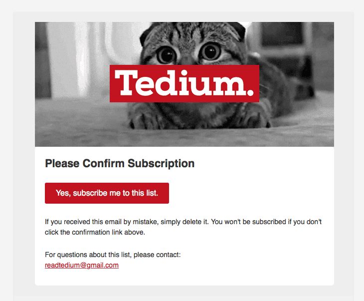
The cute photo and minimal copy directs recipients to do what matters most first: subscribe to Tedium’s emails.
Quickbooks
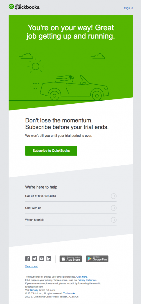
The time sensitive nature of subscribing before your trial ends will inevitably catch someone’s attention when they open this email.
This email is well executed overall, but generally it’s better not to rely on scaring people into subscribing because they’re afraid they’ll miss a deal.
Medium
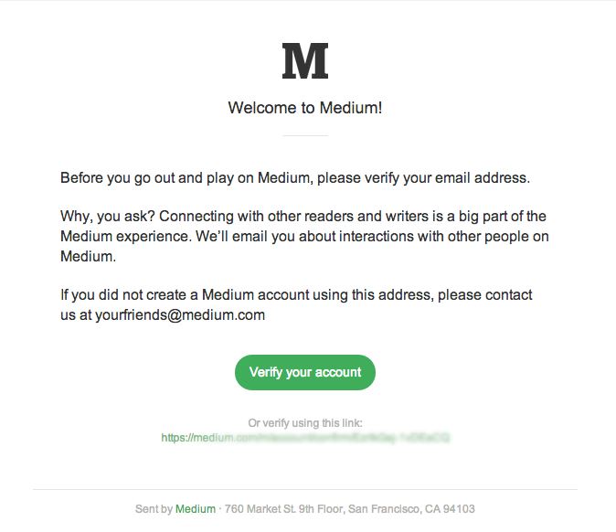
The fact that medium.com introduces itself as a fun experience among a community of friends is an excellent approach.
After all, users are proven to be more likely to respond to and engage with friends and peers than a brand.
Airtable
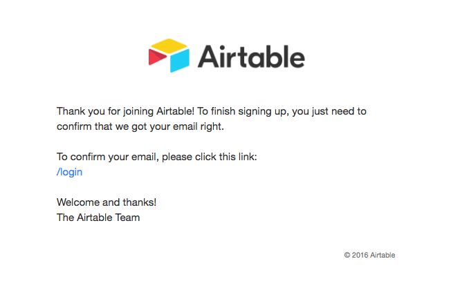
We included this example to show what to do if you want the absolute least amount of text/graphics. The beauty of this email is that it’s effective but it’s also so easy to build in a template. Even the least tech savvy members of your team could replicate an email like this.
Sakara
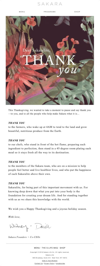
We love that Sakara invented a nickname for their customers (“Sakaralite”) and used it to address their email subscribers. This particular example is a thank you email that is extremely genuine.
Green Chef
Any subscription based business needs to communicate a summary of what to expect, what it will cost, and the timeline for delivery. Green Chef provides a comprehensive subscription confirmation in a clean layout so it’s easy to skim and leaves no room for surprises.
Unsubscribe & Cancellation Email Examples
It’s not a great feeling when you know people are sick of your emails, but the way you handle the rejection is half of the battle.
Also, the way you respond to someone cancelling a subscription will make them more or less likely to re-subscribe.
Beta List
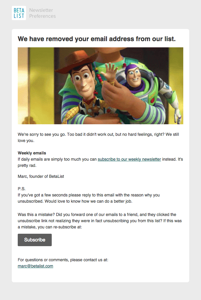
There are three great things about this email. First of all, the comical usage of the Toy Story image is sure to make people smile.
Second, the dramatic line of “we still love you” and the request for feedback.
Finally, it was also wise to make the email say it was from the founder of the company. Even though it’s a simple tweak, it makes it easier to react to a message that says it comes from a single human (versus an entire team or whole company).
Best Made
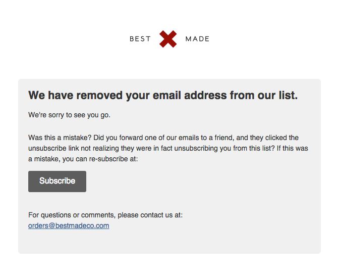
This email is sincere and thoughtful, but doesn’t spend a lot of time trying to win you back. It’s nice that they aren’t pushing to get you to re-subscribe, but instead they’re proposing it in a nice way. The subscribe button is clear and easy to find, but it’s not in your face.
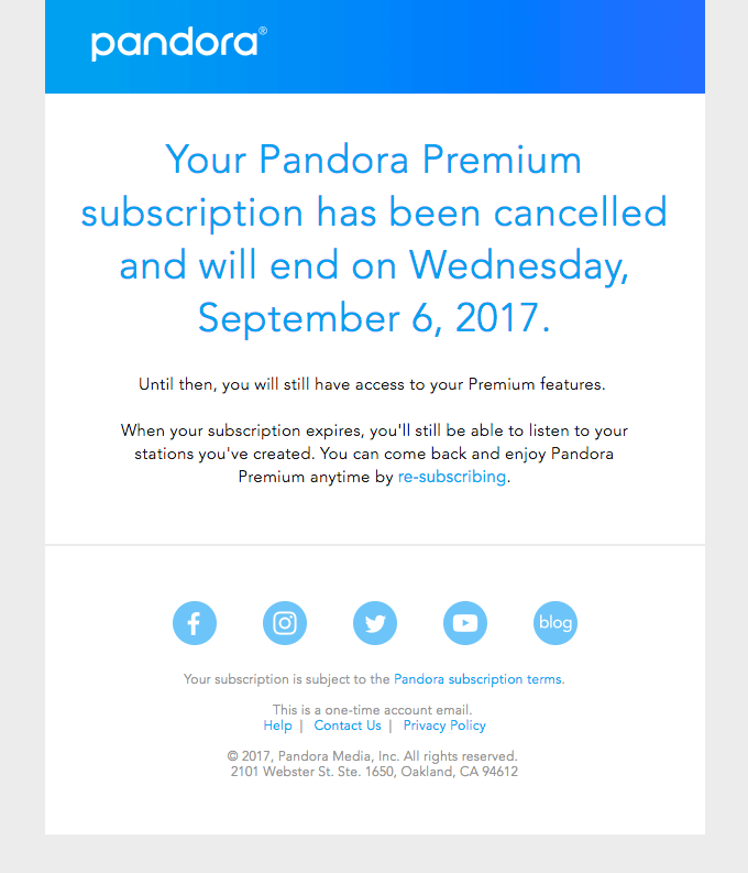
Pandora
In an increasingly competitive world of music streaming, it’s good that Pandora maintains a warm tone that lays the foundation for re-subscribing.
This email is consistent with their new modern, sleek re-branding.
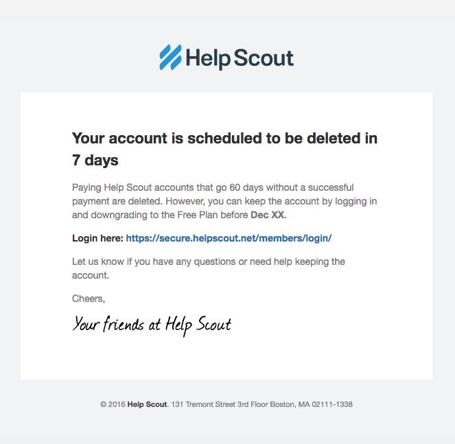
Helpscout
We like the way HelpScout communicates the important message that an account is scheduled to be deleted, and presents subscribers with alternatives.
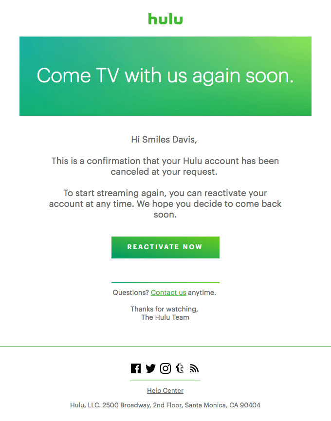
Hulu
Hulu’s cancellation confirmation email includes a “Reactivate Now” button, which might seem premature. However, it can’t hurt to give people a chance to change their minds by inviting them to reactivate shortly after cancelling.
“Here’s What You’ve Been Waiting For” Announcement Email Examples
When users are anxiously awaiting an email, you want it to be painless for them to finally open the email.
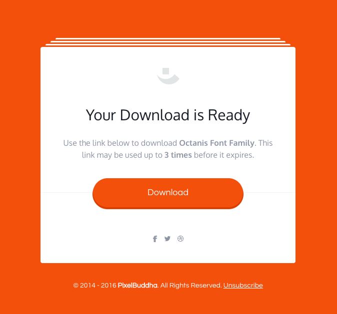
PixelBuddha
This message serves one purpose, and it serves it well. PixelBuddha is sure to specify the number of downloads allowed as well.
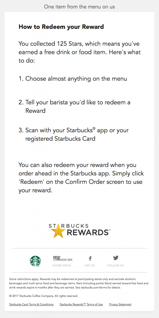
Starbucks
Loyal Starbucks customers patiently await every reward they earn, so making these emails as accessible and easy to follow as possible is extremely important.
Lomography
The announcement of a long waiting product launch deserves an email that stands out. It’s always an added bonus when you can propose or add something else at the same time.
