
In a world of oversaturated inboxes, convincing people to sign up for yet another newsletter can seem like the ultimate challenge.
After attending an informative workshop about email newsletters held at Vox Media studios, we wanted to share some of our greatest takeaways.
We found the tips about where to place your sign up unit/call to action (CTA) super helpful and actionable.
We hope you benefit from these insights and examples as much as we did!
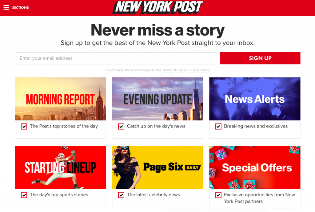
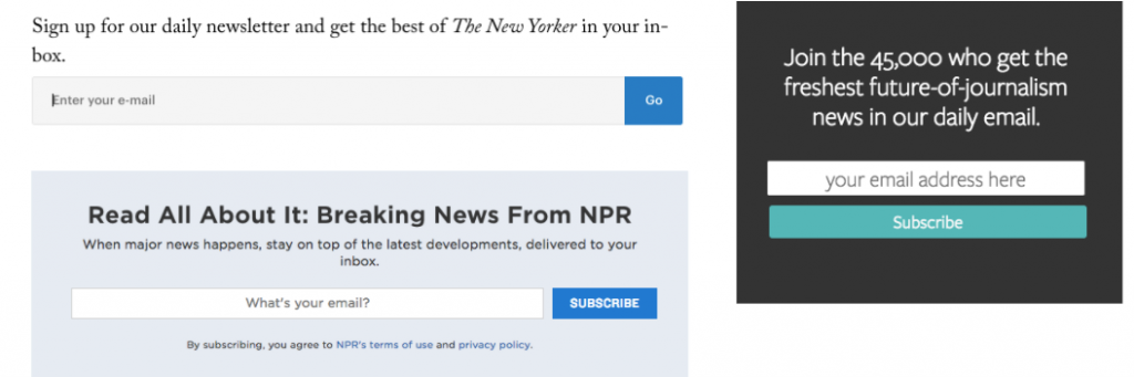
1) Creating an Email Collection Page Right on Your Website
Reach out to us to learn more about how we can help your business grow online. We’d love to give you a free consultation.
Also, don’t forget to sign up for our newsletter for more exclusive tips and strategies that are both effective and easy to follow.
2) Having a Preferences Section on Your Website
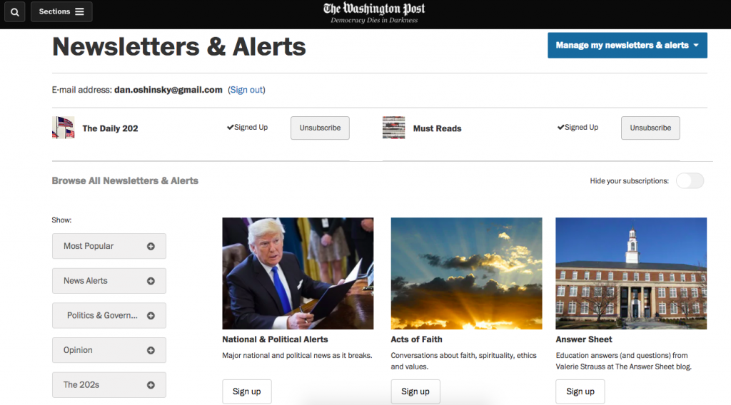
When you give individuals the option to manage their preferences, you gain their loyalty. The ability to manage and filter newsletters and alerts is super desirable in a digital world where people feel like an endless amount of content is thrown at them.
3) Shareable Sign-Up Pages
Shareable sign-up pages are an ingenious way to promote sign-ups in a digital landscape where people share almost thoughtlessly.
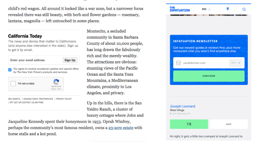
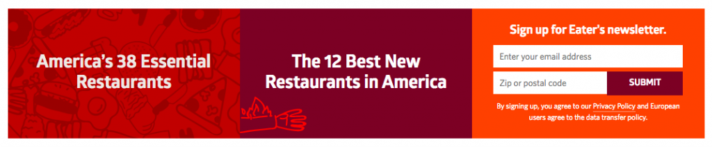
4) Right Rail Boxes
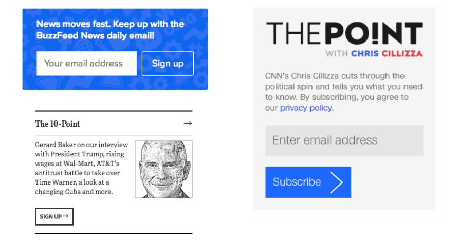
The great thing about right rail boxes is that they’re not obviously in people’s faces. Nevertheless their discreet presence remind people who might have be inclined to to sign up anyway that signing up is an option.
5) Bottom Boxes
It the same idea with positioning sign up boxes at the bottom of the page. You won’t seem desperate but instead you’ll be reminding users of the value that subscribing can bring them.
6) Inline Sign-Up Units
Some people might be concerned with inline sign-ups being invasive and distracting. However, if they’re positioned and phrased the right way, they can be the exact nudge needed to get someone to subscribe once and for all.
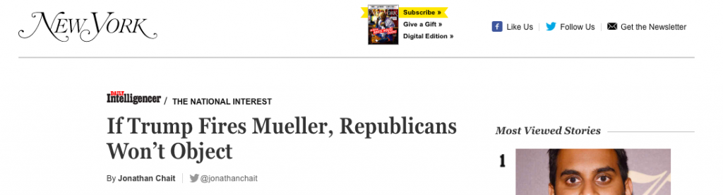
7) Top Units
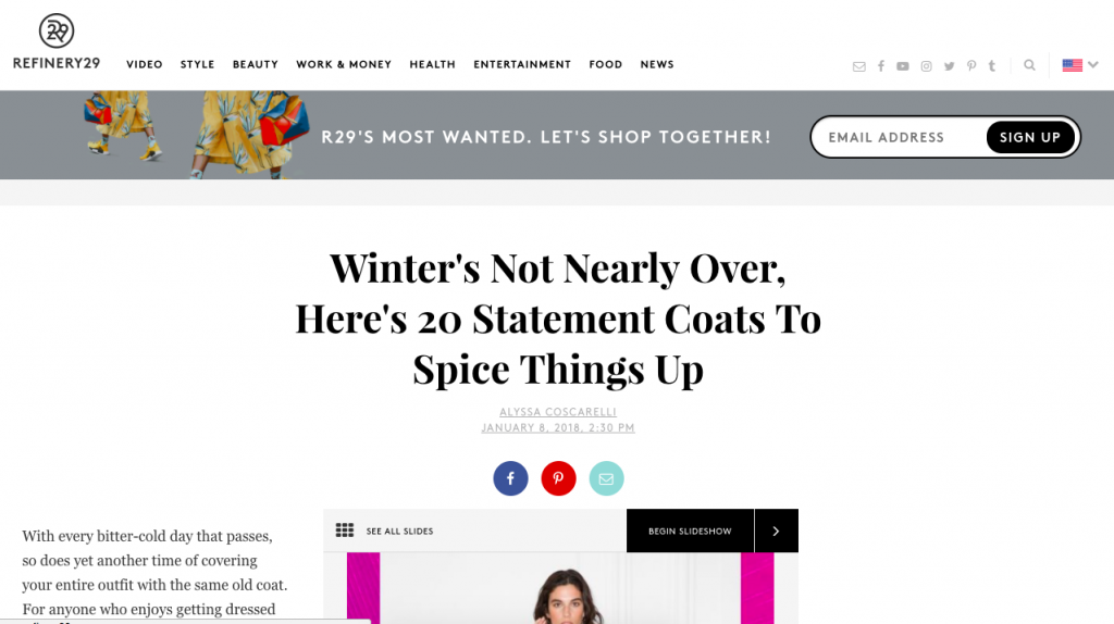
Top unit sign-ups are great because they’re easy to ignore if the reader isn’t interested (all they have to do is scroll down) but they’re also front and center for the people who found their way the webpage/article from another source ad have their interest piqued in signing up for your newsletter.
8) Footer Units
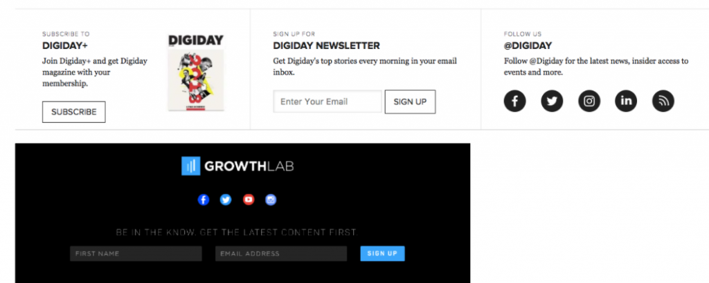
Footer sign-up units are effective for those people who enjoyed reading your content and want the instant gratification of having it delivered straight to their inbox. Be sure the sign up unit is clear and available before they click away to another featured piece of content at the bottom of the page.
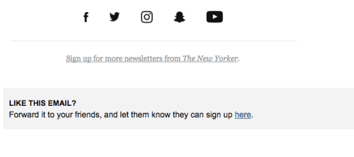
9) Social Icon Units
One of our favorite units is the social icon unit that blends in with the social media icons. People’s eyes often gravitate to the social media icons, so when they see the call to action next to the social media invites, they’ll be more likely to just click it and sign up.
10) Sign-Up Blog Posts
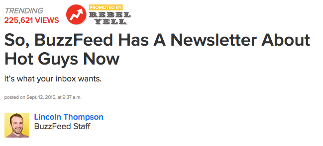
Creating a catchy and well-written blog post that essentially advertises a newsletter is a smart way to get people willing to subscribe.
When you provide a teaser of the content in an irresistible (or in Buzzfeed’s case, comical) way, people’s curiosity will get the best of them and they’ll sign up.
11) Homepage Units

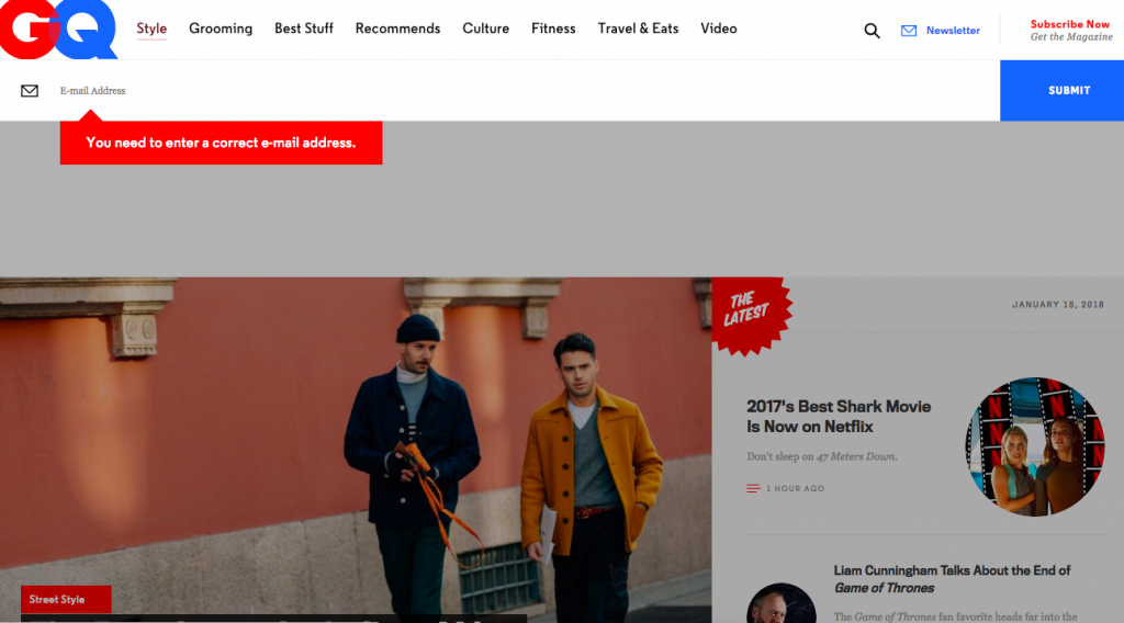
A newsletter sign up unit can be incorporated boldly or in an understated way, depending on your brand and your subscriber growth goal.
If you want to have a homepage unit that blends in and seems to be another element of the design, follow GQ’s lead.
With this style, people might not consciously notice it or take direct action, but skimming over it will still serve as a subconscious reminder that subscribing is an option.
Or, you can take a more ostentatious approach and make it the first, brightly colored element of the homepage that your website visitors see, like Infatuation did.
12) Remnant Ad Inventory

If you have leftover ad space that people/businesses aren’t buying, it’s in your best interest to dedicate some of it to the growth of your newsletter subscriber list.
You never know when that one person who really wants your newsletter will glance that ad while he or she is searching for something else on your site.
If nothing comes from it, then it’s no harm to you either. It’s worth setting some of that remaining ad inventory aside next time.
13) Referral Programs
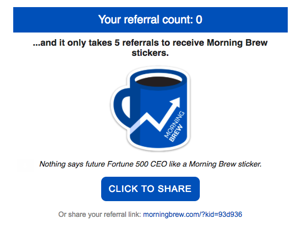
People love incentives for anything and everything. They’re also used to being offered rewards for their referrals. Offering something as simple as stickers can make someone more likely to shoot out your newsletter sign-up link to 5 more people.
14) Author Bios
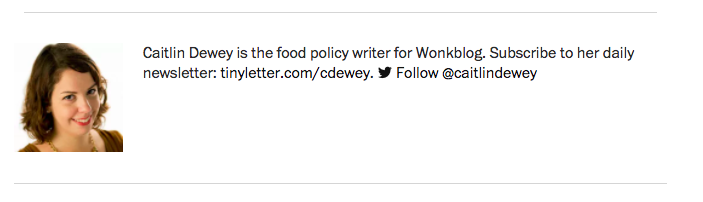
If you’re already writing a promotional plug for yourself or a colleague in a brief bio, it makes sense to throw in a CTA to sign up for the company newsletter, too.
15) Inside-the-Email CTA
If your email newsletter was useful, interesting, and your subscriber wants to pass it along, you’re doing your job. This is why having inside-the-email CTAs is a great idea: people are lazy and have limited time. Make the CTA easy to find.
16) Facebook Promos
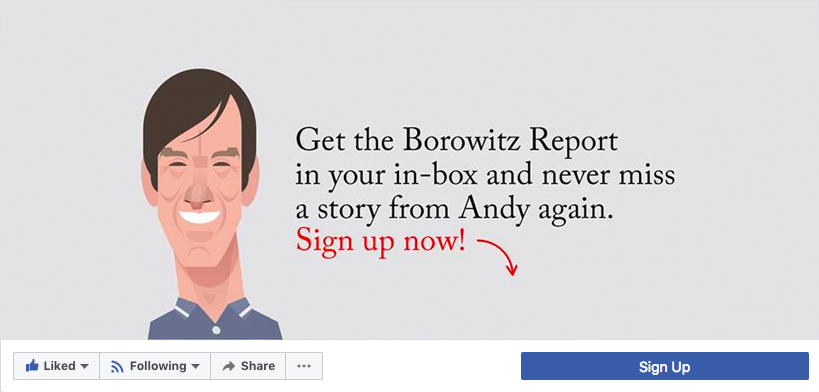
Facebook is a foolproof way of collecting emails. If you have a Facebook Business page, the platform makes it super simple for people who stumble upon your page to sign up for your newsletter.
17) Apple News Units
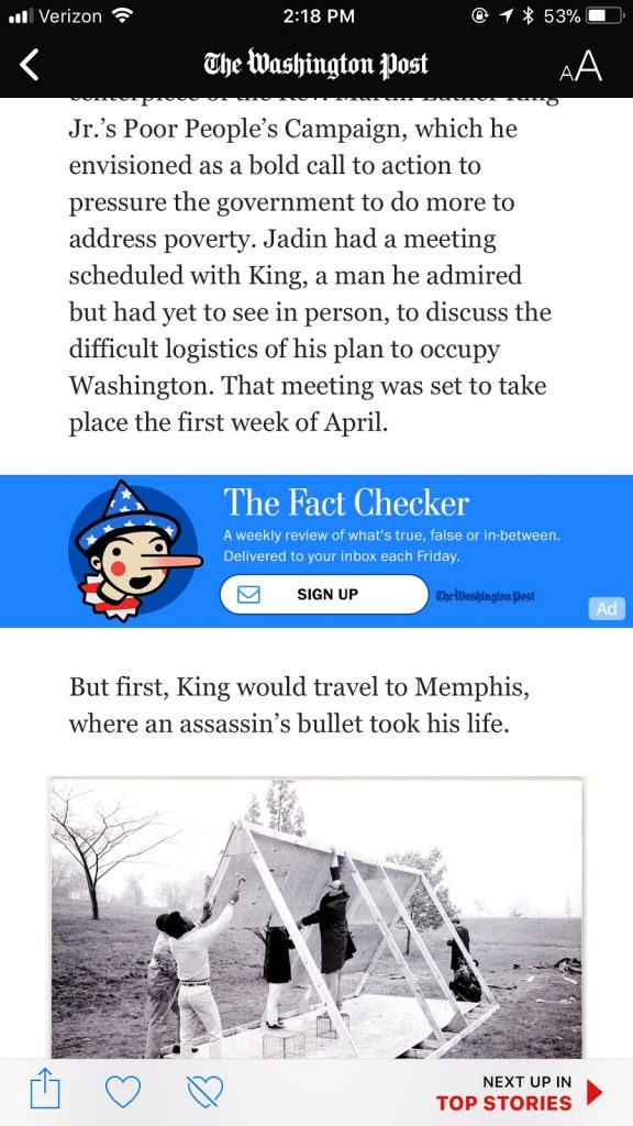
Apple News requires a specific format that could take additional time and effort, but the increased exposure can definitely be worth it.
For example, Vox media is doing a great job at distributing via this channel, competing with the likes of the New York Times and the Washington Post.
After all, there are plenty of people who rely on swiping to check the Apple News headlines throughout the day to keep tabs on big news updates.
If you can position your newsletter sign-up there, you’ll automatically have a large viewership at your disposal.
18) Lead Generation Units
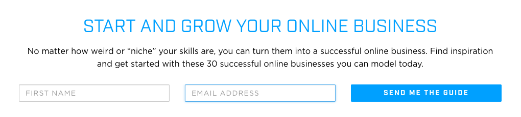
People love free (and useful) content. It’s never a bad idea to offer a reward for signing up for your newsletter by offering some kind of comprehensive ebook or guide.
19) Carousel Units
When you include your newsletter sign up as a part of a carousel on a webpage, it helps to have the carousel feature captivating headlines so that the user is enticed to want to see more headlines like it. You can preface the sign up unit with, “To see more articles like this, subscribe.”
20) Sweepstakes
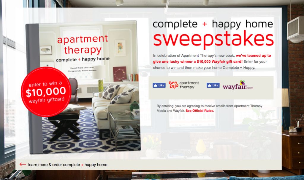
More people than you would think will gladly exchange their emails for sweepstakes entries. If it’s fun and easy for them and productive for you, it’s a win-win.
Just make sure to specify that they agree to receiving your newsletter as part of the criteria to enter the sweepstakes. The last thing you want is a disgruntled recipient who thinks they never signed up for your emails.
Final Thoughts…
Finding places to promote growth in an organic way is more difficult than it might seem. You don’t want to pressure first-time website visitors into signing up when they still barely know who your business/publication is.
Strategically placing your newsletter sign ups to boost your subscription numbers naturally and steadily takes planning and some design savvy. We hope that you found these examples as helpful as we did.
As a digital agency in NYC, Chainlink excels at improving our clients’ targeted email marketing processes and automated multi-channel campaigns. Want to learn more about our agency’s offerings?
Reach out to us below to learn more about how we can help your business grow online. We’d love to give you a free consultation.
Also, don’t forget to sign up for our newsletter for more exclusive tips and strategies that are both effective and easy to follow.