PROMOTIONAL EMAILS
Promotional emails are sent with the intention of driving a consumer purchase or making a conversion. Promotional emails range from one-time offers to full email marketing campaigns, however when done properly provide your readers with more than just one-time coupons and offers.
Table of Contents:
- Special Offer Emails
- Referral Request Emails
- Sales Emails
- Holiday Offer Promotion Emails
- Birthday Anniversary Emails
- Event Emails
- Clickbait Emails
- “Did You Know?” Emails
- Apology Emails
- Invitation Emails
Special Offer Email Examples
Special offers that aren’t that really aren’t that special are a nuisance to your subscribers. It’s best not to overdo it with this genre of email.
On the other hand, if you’re regularly reminding customers and leads of offers that they would be genuinely interested in, then that’s a win for them and your business. The bottom line is to be strategic with these.
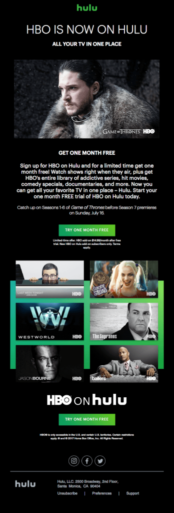
Hulu
Sometimes the right imagery is the strongest asset a newsletter email can have. It’s no accident that Hulu includes all the highlights of the shows people recognize most.
Komoot
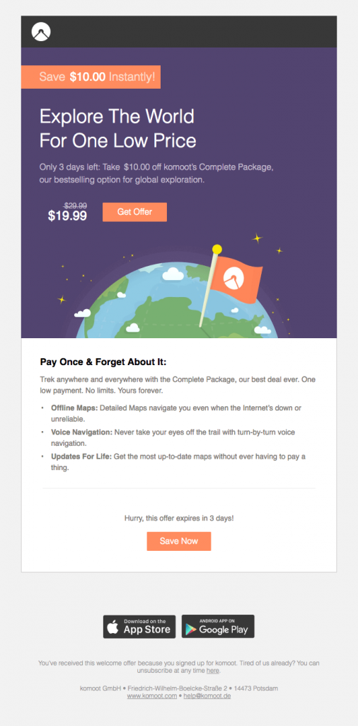
The orange-on-purple contrast works well in this email to emphasize what matters most: the discount-related CTA.
Too many emails distract from their main point… but we love that this entire email is about one thing: getting people to redeem their time-sensitive offer.
Postmates
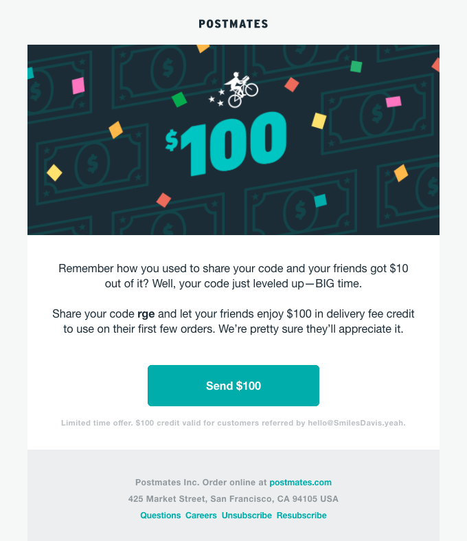
This special offer email also makes it obvious what should grab people’s attention. The fact that Postmates increased their referral reward 10 times is a noteworthy upgrade.
When the promotion is about giving more than it is about receiving, it’s more likely to pique someone’s interest.
A smart move for Postmates considering their stiff competition with Seamless, GrubHub, UberEats and even more food delivery services.
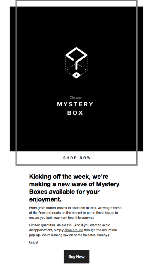
Rye 51 Menswear
The sleek design, the black and white aesthetic, and the element of mystery create a recipe for a successful email for Rye 51 Menswear.
This company succeeds because it’s all about the limited edition, act-now-or-miss-out-forever mentality. Since it’s a key part of the brand’s appeal, the mysterious quality is perfectly effective and on-brand.
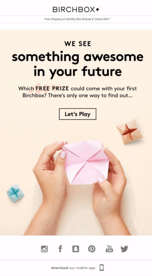
Birchbox
Anything that’s tactfully animated and reflects the essence of your brand is a good idea. Birchbox has a super talented email marketing team.
They make this special offer email irresistible with a free prize offering, a fun GIF with a “Let’s Play” CTA, and by seamlessly incorporating social media icons and an invitation to download their app.
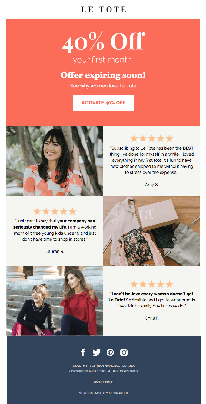
Le Tote
Three elements of this email make it a success: the prominent and generous discount at the top, the convincing testimonials, and carefully selected images and contrasting colors.
Old Navy
Old Navy manages to mention 4 different sales in one email without overcrowding it. A big reason why this email works is because it sticks to only two photographs and an extremely basic color palette. The play on words are great, too.

The Referral Request Email
If you are constantly nagging subscribers to refer you to someone else, it’s not going to help your business. Make sure you send these emails at optimal times (i.e. after you offered a special deal or did some other kind of customer appreciation gesture).
You want it to be a no-brainer for the recipient of your email to find your company worthy of a referral. At the end of the day, no matter the quality of the incentive, it’s the product and excellent customer service that will make people want to spread the word about you.
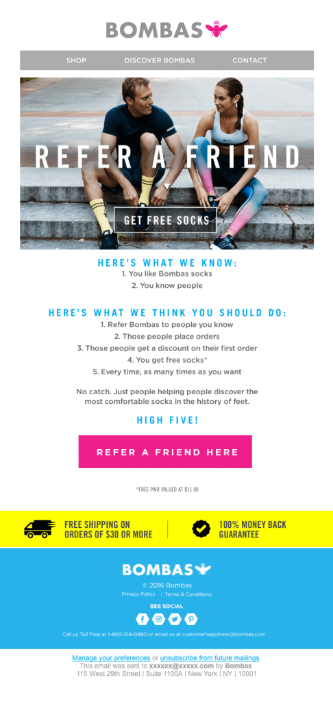
Bombas
The way Bombas splits up the copy of this email into “Here’s What We Know” and “Here’s What We Think You Should Do” is comically simple. The list format is smart because it’s easy for people to skim and digest.
Bombas can get away with the boldness of the claim that they have “the most comfortable socks in the history of feet” because of how well they know their customers enjoy the product. The free socks don’t hurt either.
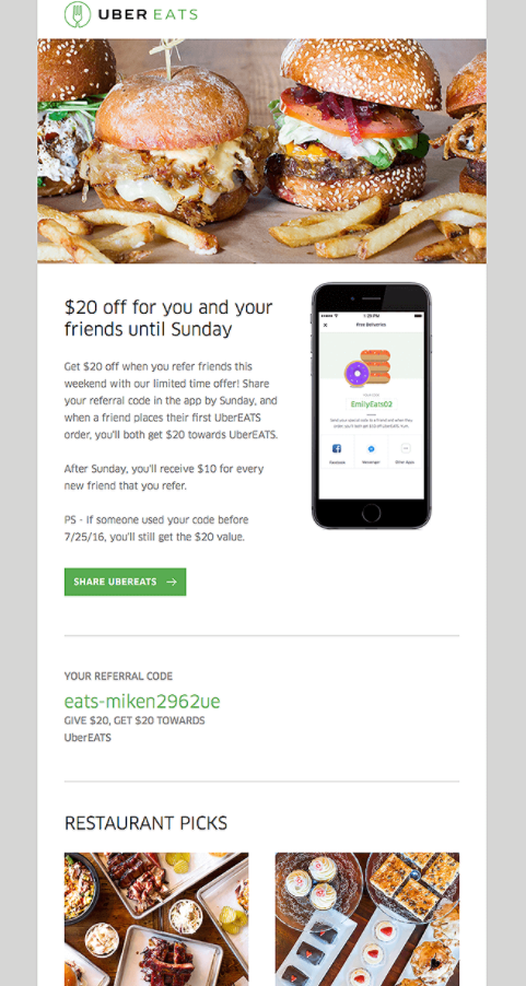
Uber Eats
UberEats does a great job with this referral email by making it super clear what subscribers need to do to redeem (and give away) $20: Share the Code.
Instead of overcrowding the email, the template is streamlined and the green Share button can’t be missed.
The “Restaurant Picks” feature at the end of the email is a great final effort to entice subscribers to take action.
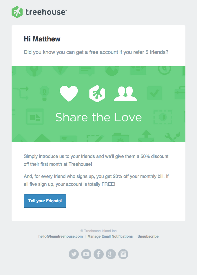
Treehouse
Treehouse frames referring friends as the easiest, most rewarding action ever. If you enjoy their service, you’ll want to keep using it (preferably for free) and you’ll naturally want to recommend it.
It’s this kind of effortless “why wouldn’t you?” message that gets your subscribers to take a minute out of their day to refer your product or service.
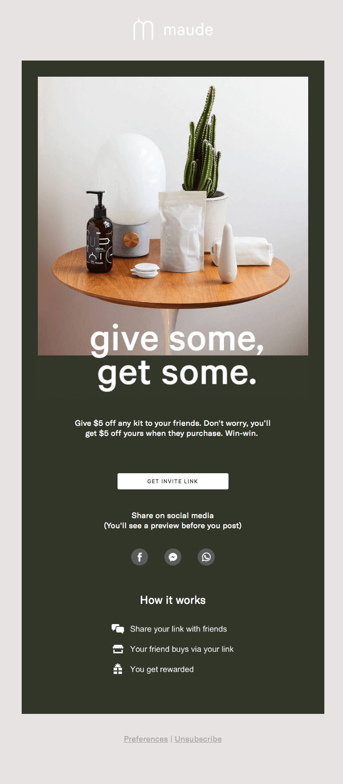
Maude
One reason why someone might not bother to send a friend a referral link is because it seems like it might be a hassle. Maude makes it simple and painless.
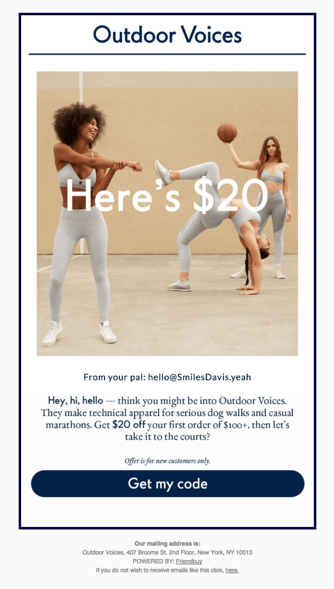
Outdoor Voices
The minimalist design and friendly tone of the email makes forwarding this email seem like a no-brainer.
Sales Email Examples
Don’t ruin your legitimacy by sending spammy sales emails that people don’t want.
Only send these emails to people who have opted in and who actually engage with your emails. Otherwise it’s not worth your time or ruining your reputation.
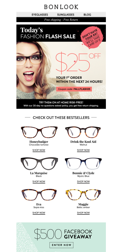
Bonlook
Bonlook draws attention to the most important parts of the email: the $25 off and the deadline.
Another smart move by Bonlook is anticipating and answering a common customer question in corner of the email (emphasized in a bright color).
Code School
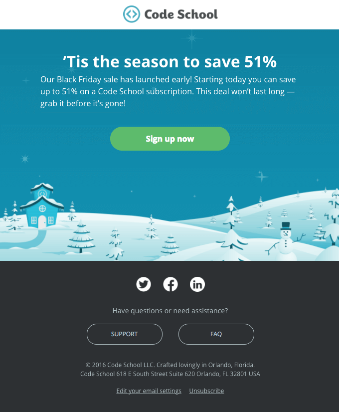
Note how little copy and imagery there is in this email. Code School has the right idea not to add anything they don’t need.
Also, it’s strangely slightly more memorable to make the discount 51% instead of 50%. It might stick in some people’s minds, so it’s worth a try.
Peel
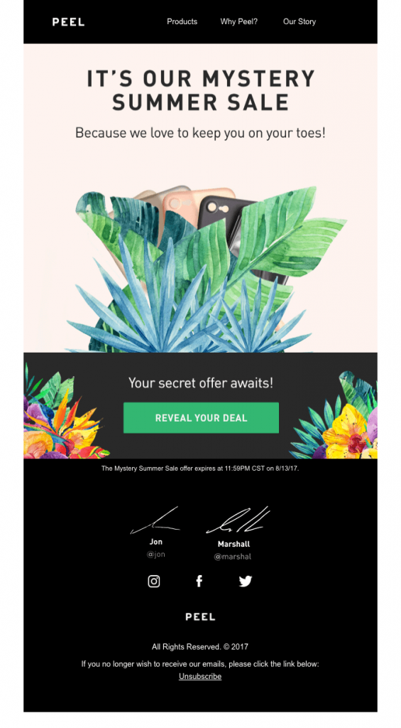
The element of mystery in this email is guaranteed to grab subscribers’ attention.
Plus, if you’ve already purchased a phone case from Peel’s website, then this email will remind you of the delight of the company’s sleek, thoughtful and modern aesthetic right away.
Junique
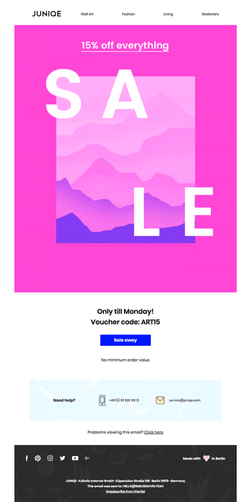
It makes sense that a curated art company would want to have artsy sales emails. The vibrant pink makes this email hard to miss.
It’s also hard to forget the discount because it’s the only thing in the whole email worth noting.
By stripping down a sales email to its bare essentials, Junique gets the job done in a streamlined way.
Legacy Box
The combination of great photos and branding, a generous discount, and a bright orange CTA.
The “Fill, Send, Enjoy” Infographic at the bottom of the email is also a nice touch– proving how easy it is to use the service.
The social media icons are also well-placed with the clever tagline, “Like if you love memories”.

Bellroy
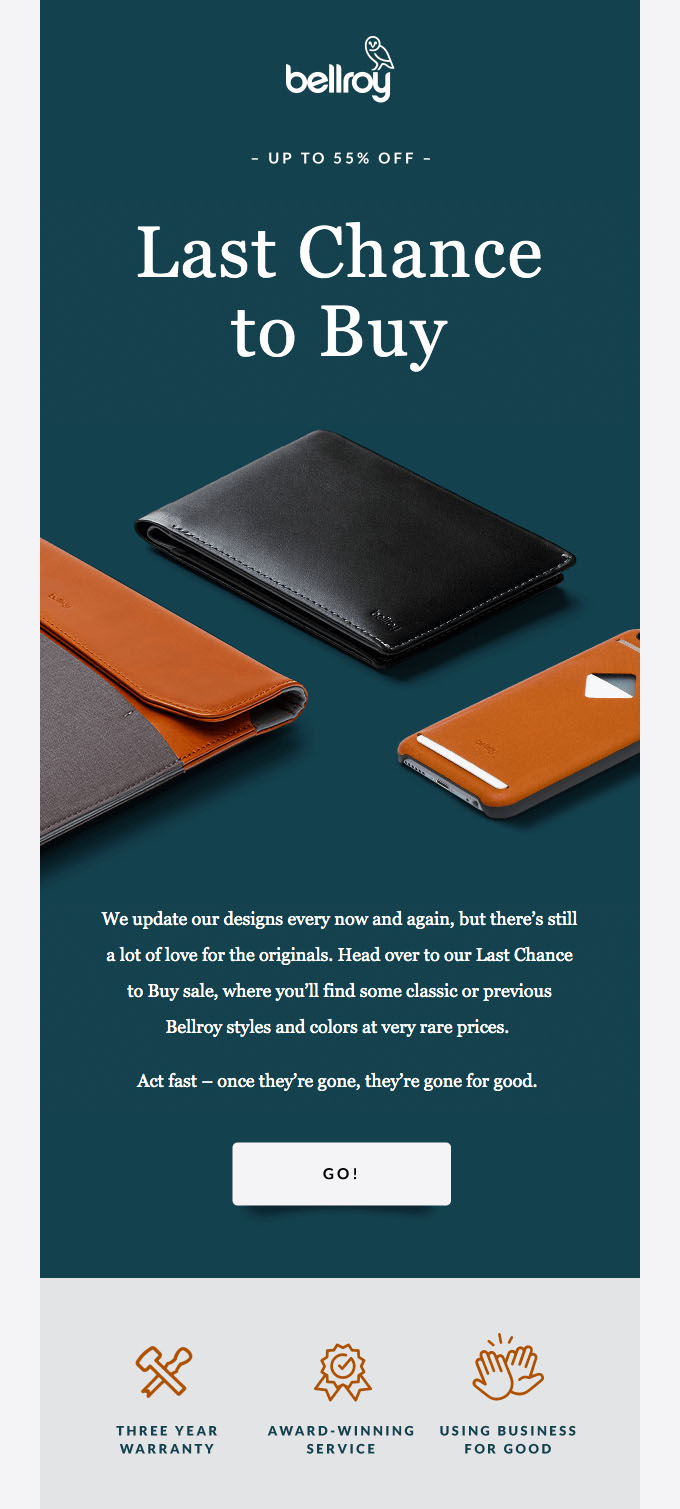
Bellroy knows how to grab customers’ attention by using the phrase “Last Chance.” The big CTA button also contrasts nicely with the rest of the email.
Everlane
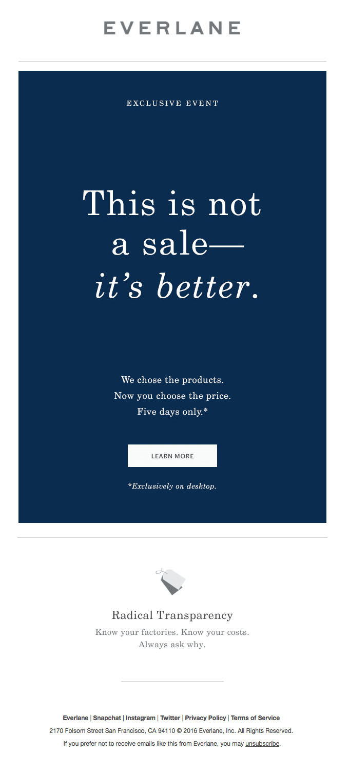
Everlane is known for its “radical transparency”, and in this email it also shows radical simplicity. The email only needs one easy-to-find call to action because the unique “choose-what-you-pay” concept of the sale is enough to make them want to click “Learn More”.
American Eagle
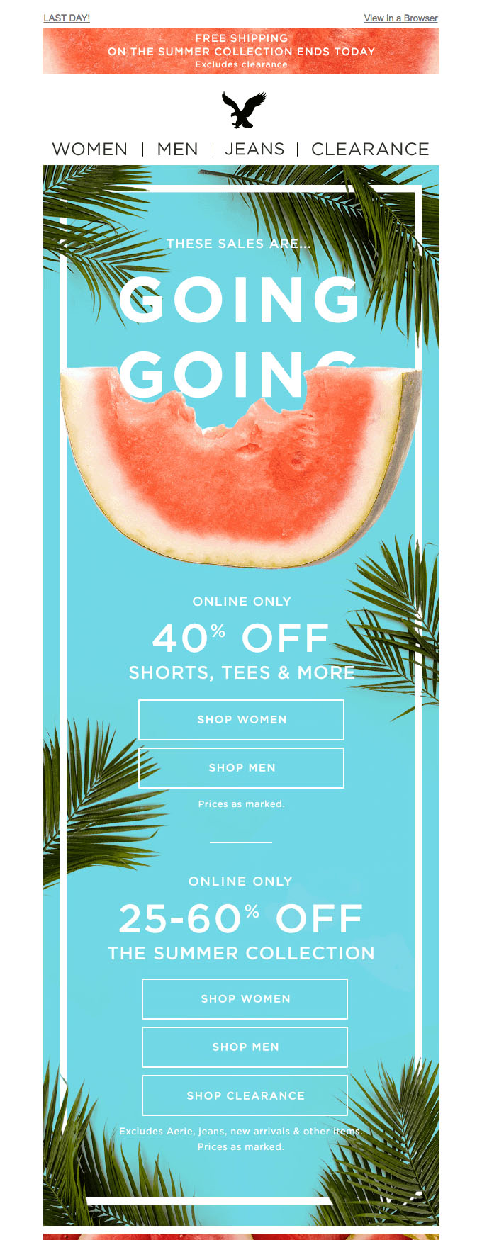
The sale is front-and-center, and the fun, bright, and summery look/feel of this email is perfect for American Eagle’s young target audience.
Holiday Offer Email Examples
These seasonally abundant sales emails are not supposed to aggravate subscribers.
Try to make them particularly enticing to avoid them ending up in the spam folder.
Harry’s
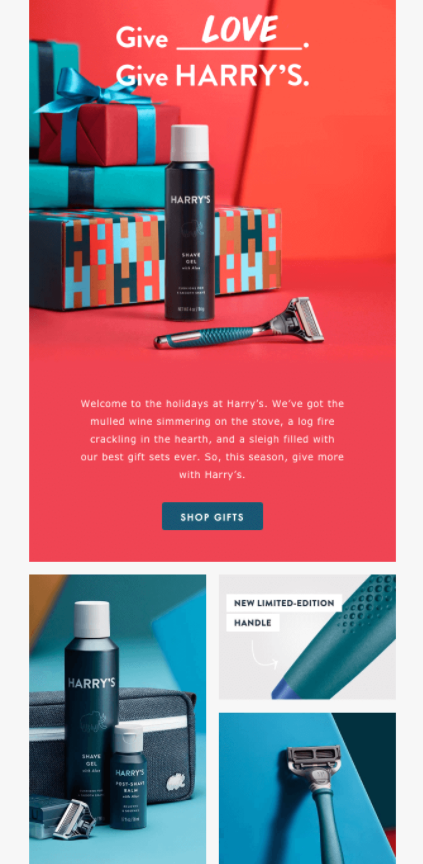
This universally appealing message has the visuals paired with three seamlessly integrated CTA’s makes this holiday email a welcome addition to subscribers’ inboxes.
Also, they cleverly pointed out a new-and-improved feature to help grab their audience’s attention.
Loft
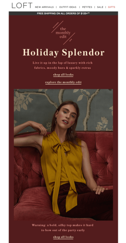
This email also stands out from the technicolor (and often obnoxious) in-your-face holiday sales. It gives the impression of being an editorial newsletter while slipping in 5 CTA’s and a 40% off discount.
Great Jones
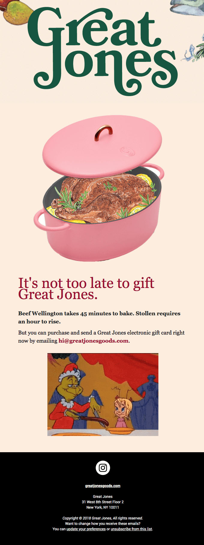
This email is cleverly designed with retro charm, and it serves one simple purpose: to get more last-minute holiday shoppers to purchase electronic gift cards for their friends and family members. This type of email might positively stand out in people’s overcrowded inboxes during the holidays because it’s not over-the-top with loud colors and promotional fluff.
Apple
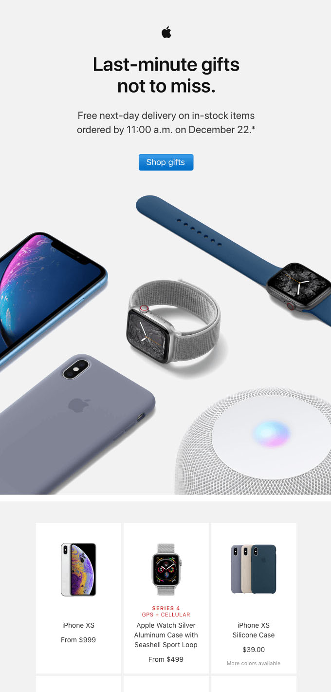
Apple targets last minute shoppers with its typical streamlined design and minimal color palette. Just another example of a holiday email that doesn’t need to be saturated in seasonal colors and design elements to be effective.
Birthday and Anniversary Email Examples
Emails resonate more strongly with subscribers when they feel like individuals.
Acknowledging a birthday, anniversary, or milestone of some kind that is unique to only that particular subscriber has a stronger effect than you might think.
Use the opportunity to nudge subscribers towards taking an action that benefits your company. Use it to your advantage, but don’t abuse it.
Pizza Hut
Pizza Hut puts a funny spin on this birthday email. They seize the opportunity to get more people to use their online delivery system.
Free dessert can never hurt a customer, and if it pushes them to place more orders online, everyone wins.

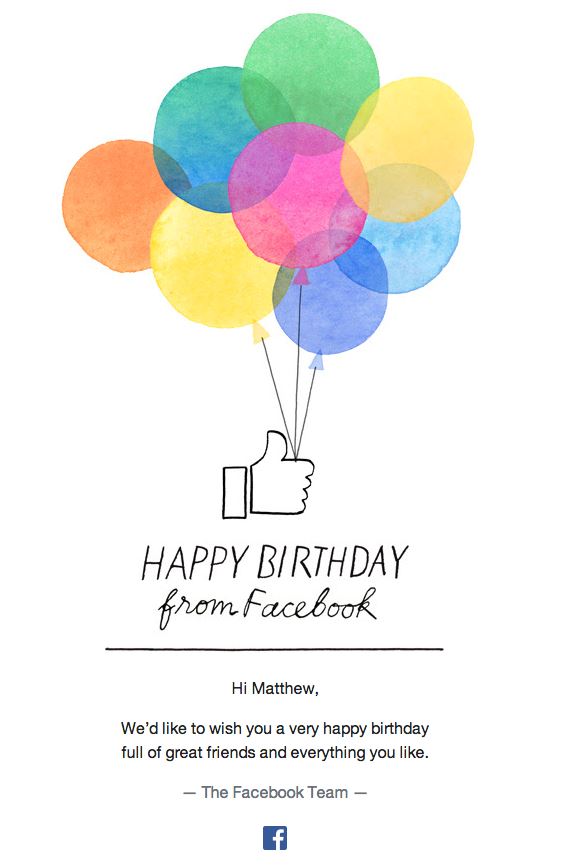
In this email, the goal is to remind subscribers of Facebook’s omnipresence in their lives, especially on their birthdays.
Ben & Jerry’s
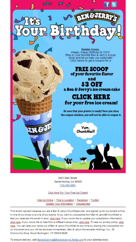
Taking the opposite approach of the simplicity of the Facebook email, this birthday message is colorful and crowded. This works for Ben & Jerry’s youthful brand super well.
Reebok
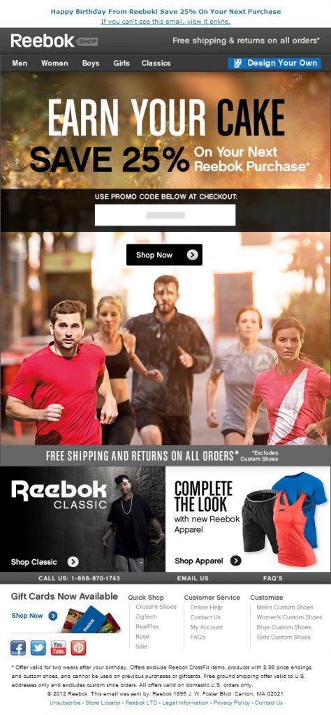
A birthday reward discount along with inspiring imagery a three CTA’s is enough to drive anyone to Reebok’s online store.
Reebok takes advantage of the fact that some people treat their birthdays like New Year’s in terms of making fresh start for a more fit version of themselves.
People are generally is a positive frame and mind and are more impulsive with purchases on their birthdays as well.
Nike
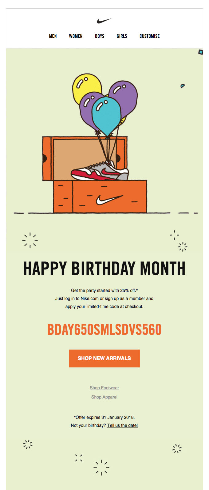
Nike never disappoints with its on-point design. The discount code is prominently placed in the center of the email, and the rest speaks for itself.
Event Email Examples
The format is less important than the content when it comes to event related emails. However, you want to concisely and clearly communicate the value of the event and the key details in a catchy way if possible.
Eventbrite
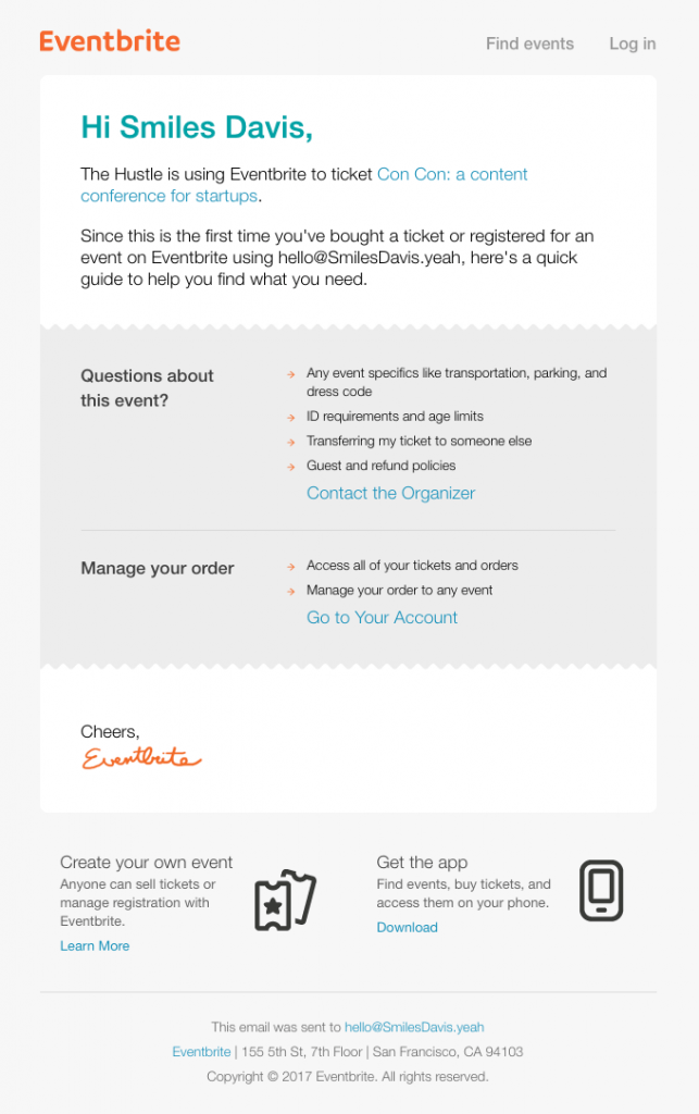
This email is on target in all aspects. The simple but effective design provides the information the attendee needs, anticipates questions, and leaves out the extraneous.
The Future
The balance between colorful, high quality images and descriptive but concise copy makes the announcement for this event perfect.

Apple
The inviting, personal tone to this simple reservation email is very well-executed. They provide just enough event information to remind attendees what to expect without crowding the email with copy.

Stylist Magazine
This event announcement is dedicated to getting people to join who haven’t already. The two beautiful CTA’s match the social media icons.
If social media is a key part of driving awareness or building excitement during the countdown to this event, then definitely make the icons stand out.

Shillington
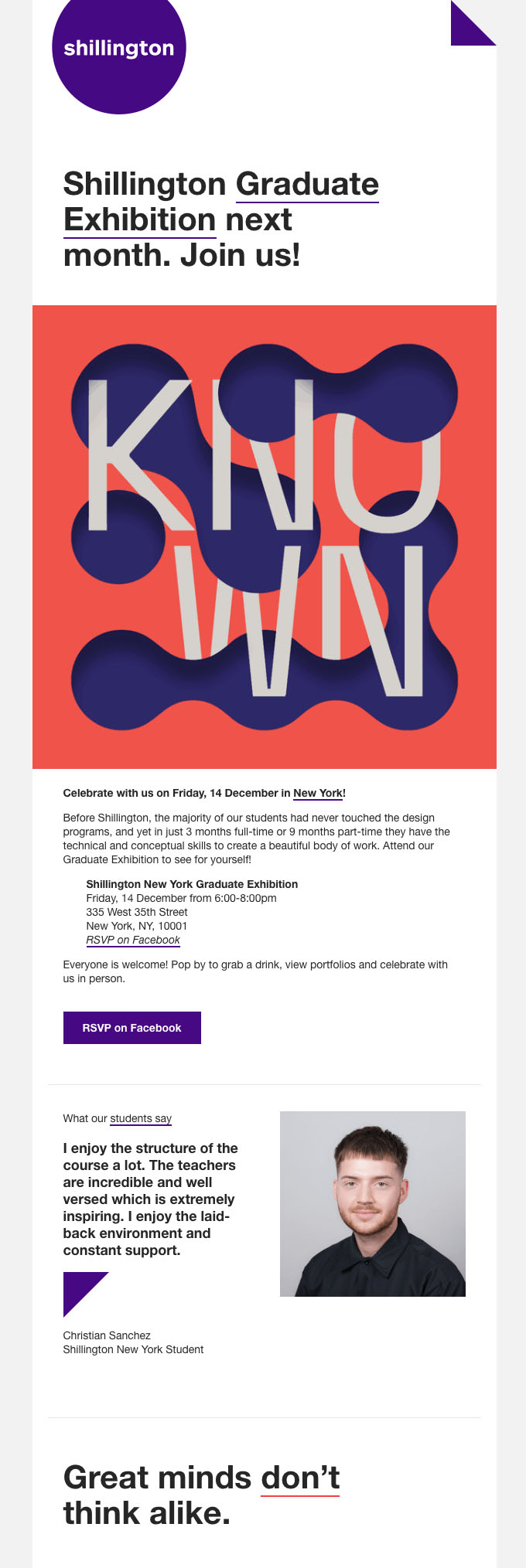
An eye-catching visual, a clear call to action, and a sincere testimonial work together to be the recipe for success in this email.
Circles Co.
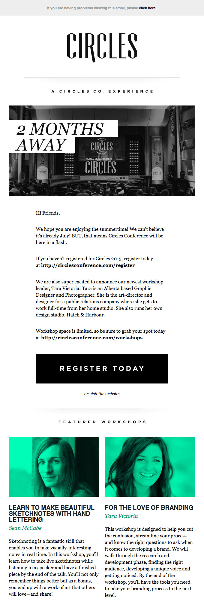
Counting down until the event, offering a better discount the sooner you register, and providing a sneak peek of the featured speakers are all notable aspects of this event email’s success.
Clickbait Email Examples
Don’t set out to make promises that you can’t keep. However, clickbait emails that actually have content that is as irresistible as the subject line are great at attracting and retaining a huge amount of traffic.
Peel
The body of this email lives up to its subject line, “iPhone Chargers that Don’t Suck”. By visually representing the two selling points of their product Peel already grabs your attention. Then, explaining how they’re going to make your life more convenient in a succinct way seals the deal.

5BY
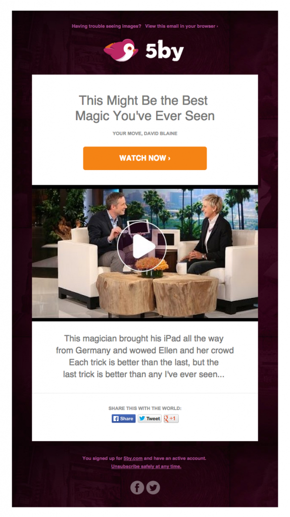
The best part about this email is that it has one simple goal: to drive people to website’s landing page for the video.
Curiosity will get the best of most people and they’ll just click it. It also helps that the email is about viewing content rather than purchasing an item.
Strava
The simple suggestion to “join a club” is attention grabbing in and of itself. People crave group activity and comradery. Strava makes clicking the CTA seem like a no-brainer.

Tilt
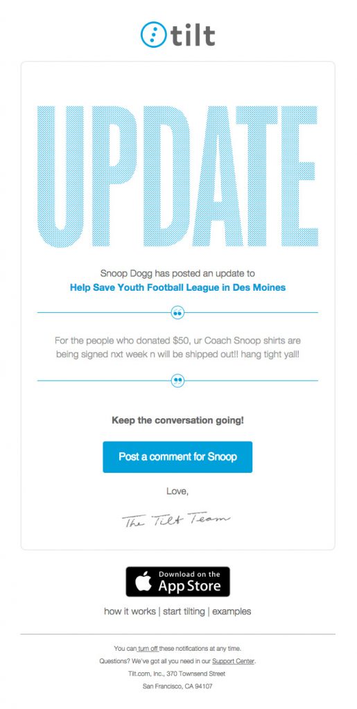
Using a celebrity name in the title almost always seems to put emails in the clickbait category.
Although Tilt has now been acquired by Air B&B (RIP) it certainly had enticing emails when the service was in its prime. The colors, spacing, and personal touch of this email make it great.
Designmodo
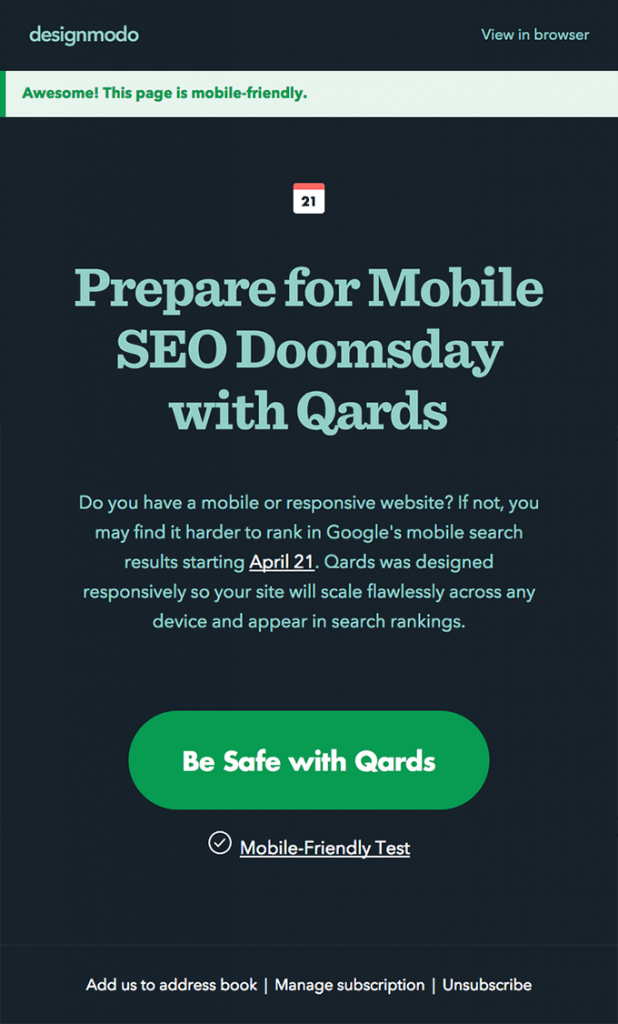
This clickbait email plays the doomsday card but in a funny, practical way.
Anyone using this service would be at least vaguely aware of the Google mobile update and would agree in the gravity of the consequences on a website that disregarded Google’s rules. The big green CTA is perfect in this case.
Adidas
Everyone has had their fair share of wifi issues, so this email catches our attention whether we want it to or not. The funny twist of assuming a broken Internet connection could be the only explanation for not following through with a purchase is guaranteed to get a chuckle or an eye-roll, but nevertheless a reaction. Clickbait at its finest.

Virgin America Airlines
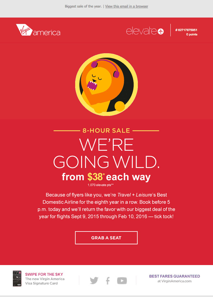
With a ridiculously cheap airfare serving as the clickbait, this simple email serves its purpose perfectly: getting people to click “Grab a Seat” and figure out whether or not the deal is real or too good to be true.
Clear
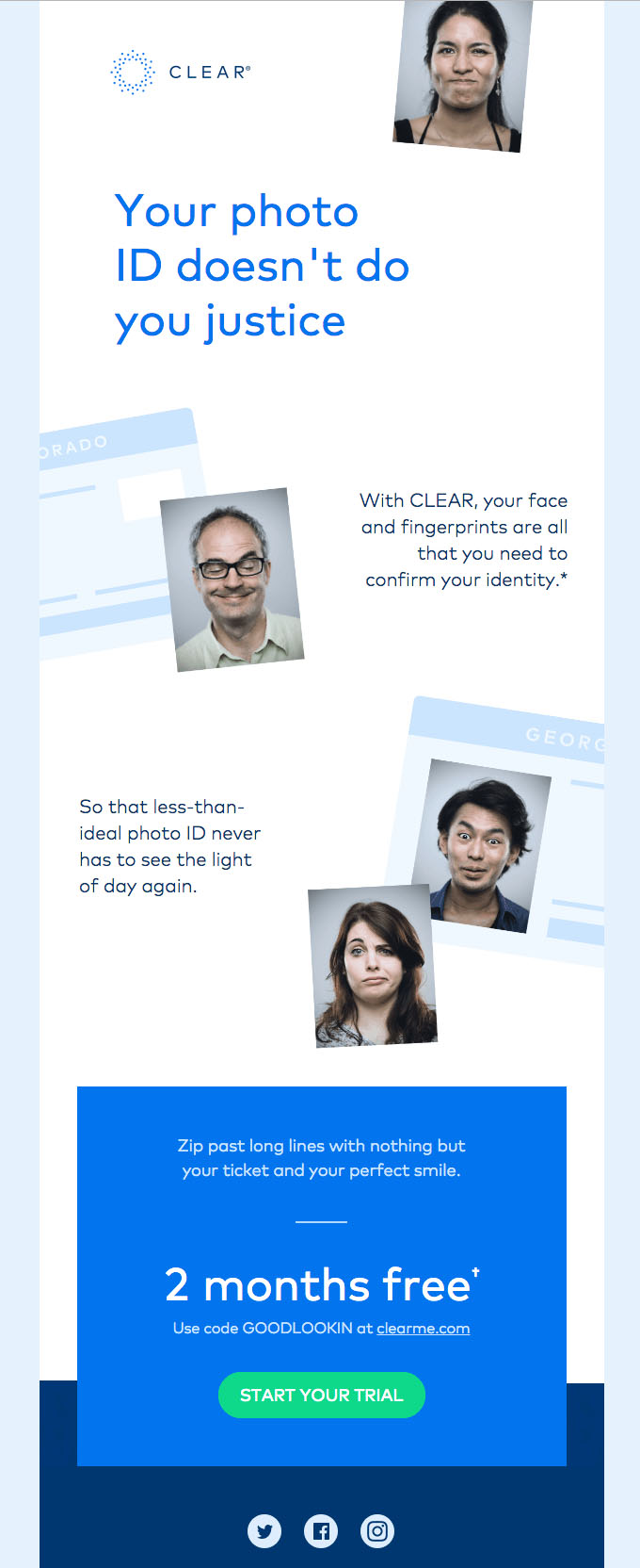
The email is designed to grab your attention and inevitably make you agree with them. Once they have your attention, they follow up with an irresistible deal.
“Did You Know…?” Informational Email Examples
The majority of emails that lead with “Did You Know?” are informational and either err on the promotional or behavioral side. They’re usually used to either re-engage or onboard users. The more highly targeted the email, the more effective.
Squarespace
This email is targeted for re-engagement and highlights the new features that are supposed to draw subscribers in to start using SquareSpace again.
This email is filled to the brim with details about these updates, but of course the CTA is bold, front-and-center.

Dropmark
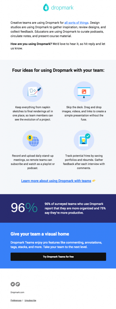
This is a proactive use of a re-engagement email: reaffirming the multi-purpose quality of the product and encouraging people to share why they use it and enjoy it.
This is a forward-thinking strategy to make sure people don’t drop you when it’s time for them to make budget cuts.
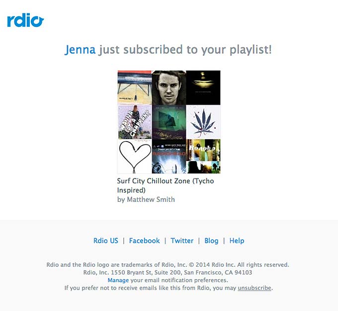
Rdio
This email from Rdio is more of an alert email than a “Did You Know?” email, but nonetheless worth including here.
The fact that Rdio is reminding users of their service by shooting them an email when their playlists get followers is validating for users.
If someone is mindlessly opening emails and stumbles across this one, there’s a chance they might get the sudden desire to listen to that playlist. It doesn’t always work but it’s another worthwhile tactic.
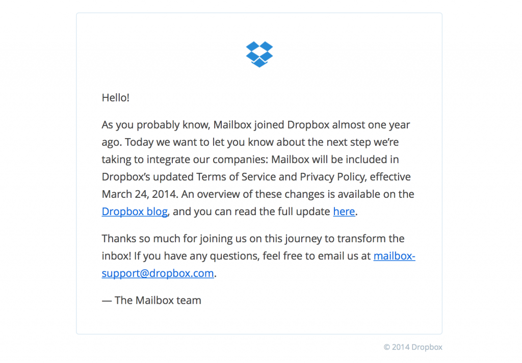
Mailbox
This email uses the opportunity of being acquired to thank their customers, while informing them of the details in a clear, brief statement. People will be grateful for the frank and sincere update.
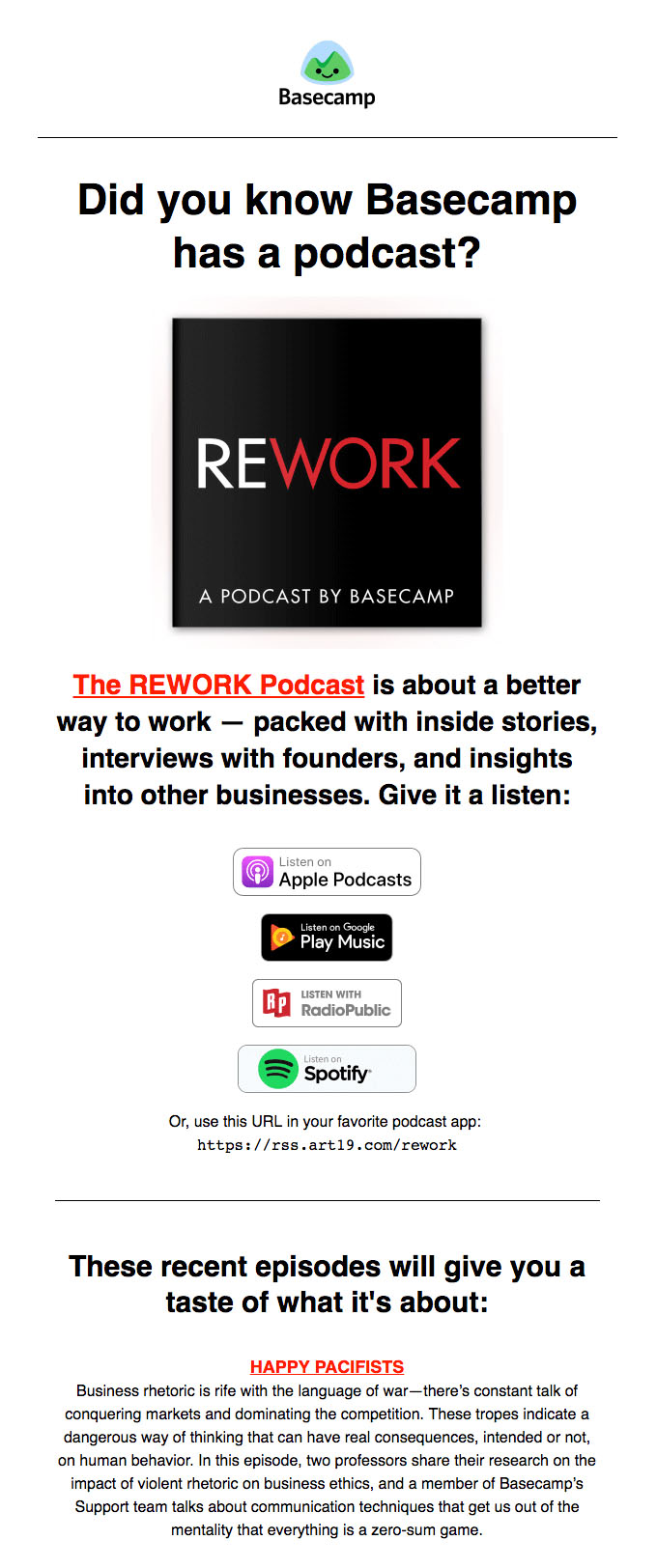
Basecamp
Announcing the existence of their podcast is a great move for Basecamp because it might serve as a useful source of information on some level for prospective or current customers and add to its brand authority.
Apology Email Examples
In the fast paced world of email marketing, mistakes are inevitable, and so are apologies. You can turn saying sorry into a great opportunity to prove he character of your brand as well. Don’t shy away from these emails and spend extra time to make them as close to perfect as possible.
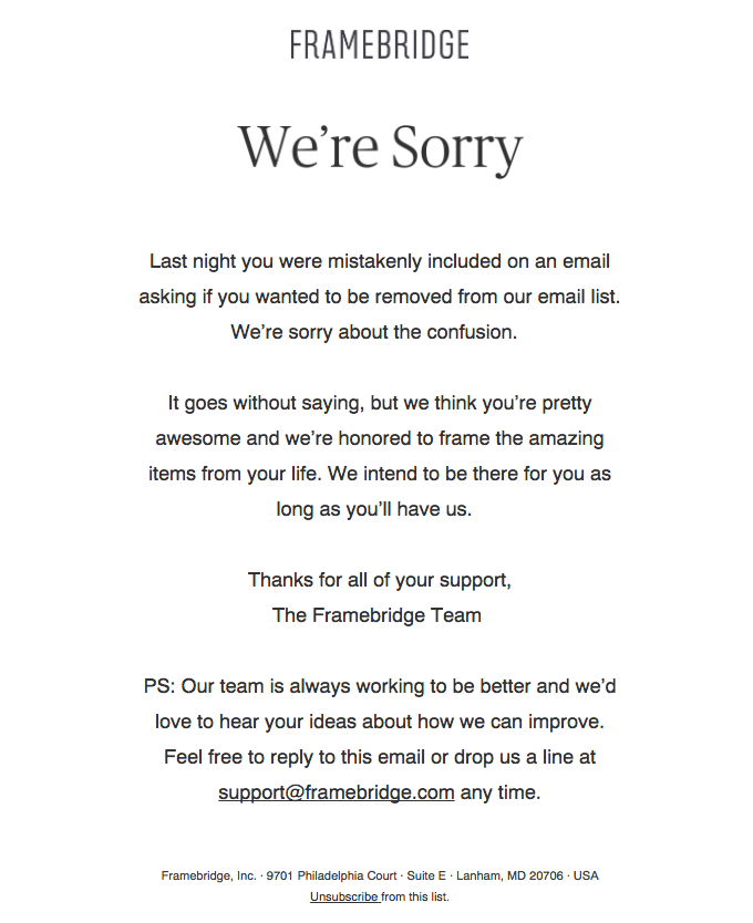
Framebridge
One effective approach to apology emails is super basic design and sincere copy. As long as subscribers can detect a human sentiment behind an apology email, you’ve done your job.
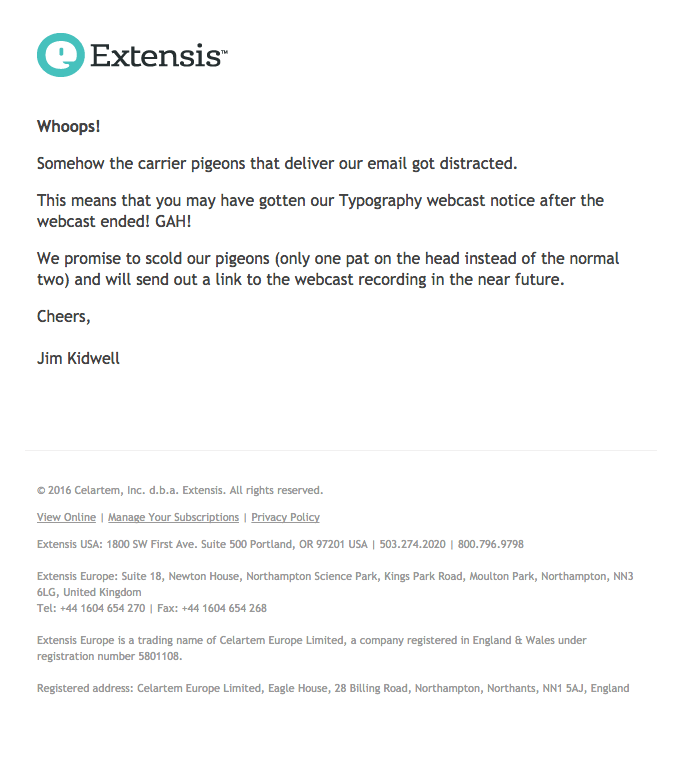
Extensis
Depending on your audience, saying sorry with a sense of humor is the best way for your message to resonate with your subscribers. It also subconsciously minimizes the thing you’re apologizing for if the person is reading it in a comedic light.
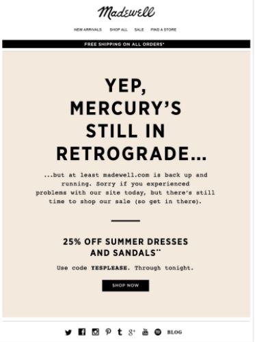
Madewell
When your website crashes, users are going to expect an explanation apology fast, no matter what product you sell or service you provide.
This lighthearted and conversational apology email does the trick for Madewell’s target audience.
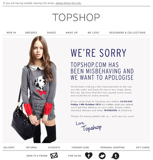
Topshop
Topshop made the right move with this apology email. Using a website glitch as an excuse to give free shipping for a period of time is guaranteed to drive sales and appease the complainers.
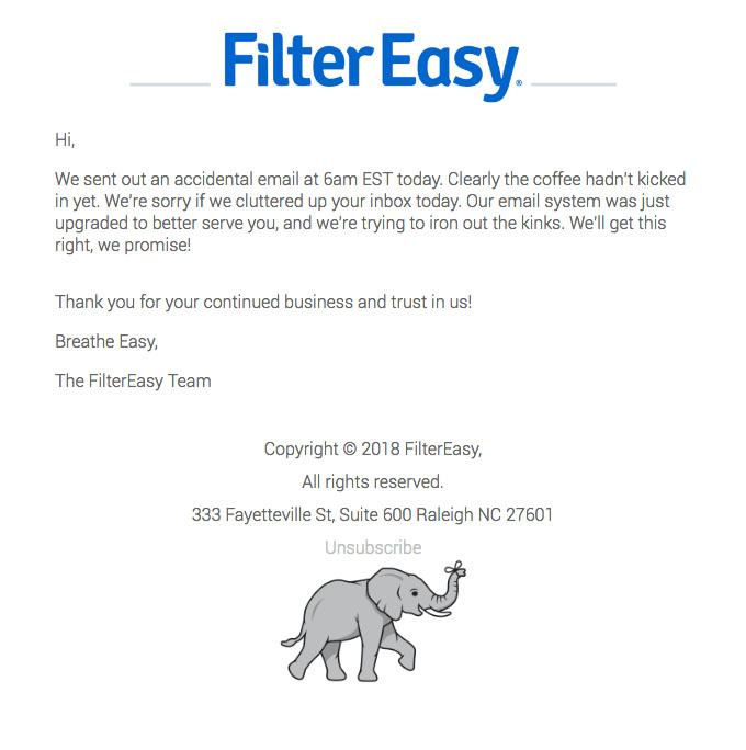
Filter Easy
This apology email for something as harmless as sending an additional email accidentally is a nice gesture. It makes the brand more human and relatable for making a mistake, and adds to its sincerity because the brand opened up about it.
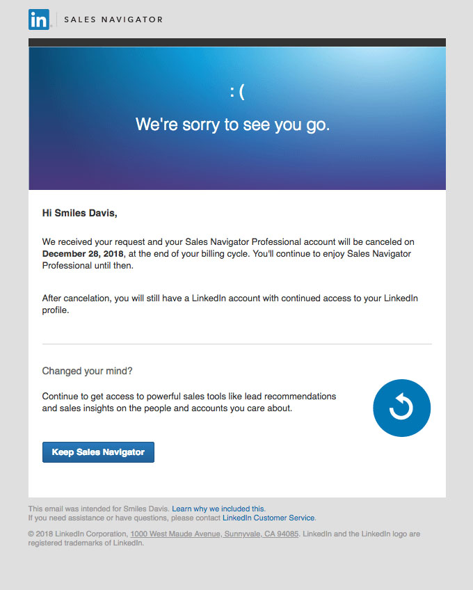
This apology email accomplishes its goal without being pushy in trying to win back a lost customer. LinkedIn expresses regret for losing their subscription to the Sales Navigator Professional service, explains their current account status, and then offers the option to change their mind.
Invitation Email Examples
Email list segmentation is your secret weapon when it comes to invitation emails.
As long as you’re sending the right kinds of invitations to the right kinds of people, you’ll leave a positive impression and boost engagement with your brand. Create segments based on subscribers’ past behavior.
Slack
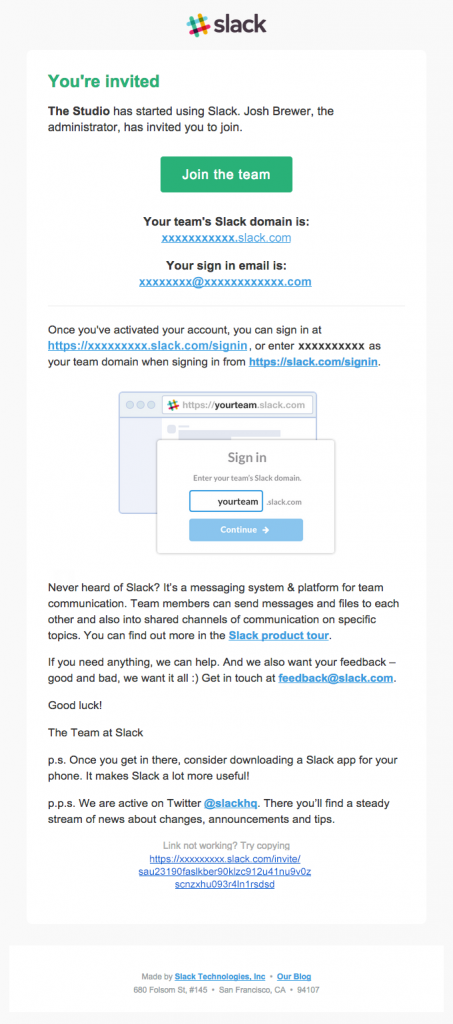
Even though this isn’t an event invitation, it does a great job of making something that should be pretty commonplace (a business messaging channel) into something notable worth joining.
Ello App
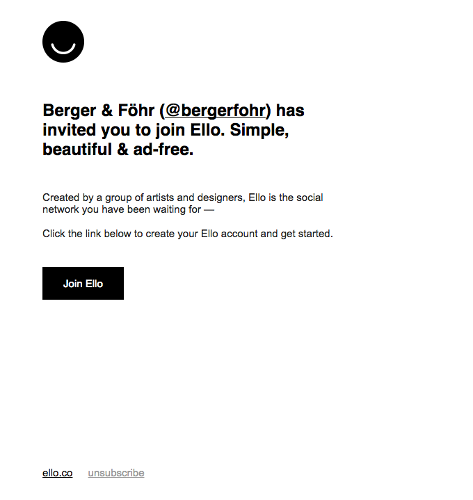
The simplicity and beauty of the Ello platform (a social network of artists and designers) is reflected in this email. Short, sweet, and black and white work well for the app’s aesthetic.
Squarespace Circle
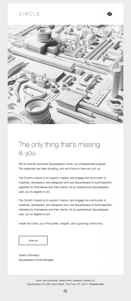
This email makes the invitation to join Squarespace Circle seem exclusive. This exclusivity makes the email more appealing, and helps attract serious, experienced, and dedicated members.
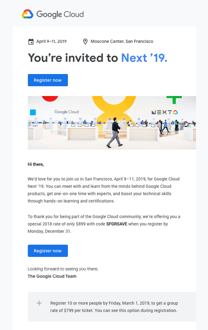
Google includes all of the pertinent information about the event, a clear call to action, and just enough detail to intrigue someone without giving away all the details about the event.
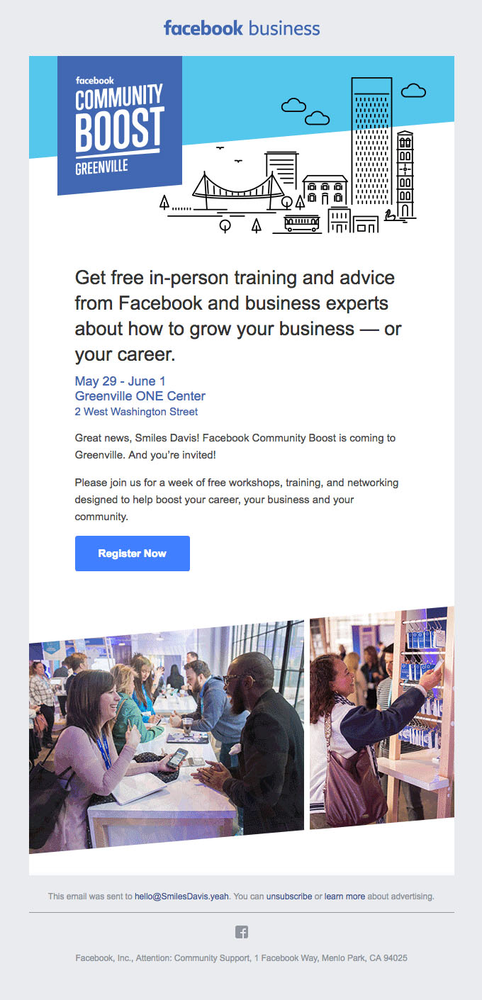
This email announces a great opportunity for members of the community to get free guidance from business and career experts, but instead of looking too plain and professional, the design and photos included are warm and inviting.
