SUBSCRIBER EMAILS
Subscriber emails allow you to maintain an active dialogue with your customers and clients, as they’ve opted in to receive and read your updates. Make the most of each subscriber email effort by providing targeted, relevant content to your loyal subscribers.
Table of Contents:
- New Product Emails
- New Blog Post Emails
- Thank You Emails
- Sign Up Confirmation Emails
- Newsletter Emails
- Round-Up Emails
- Online Course Emails
New Product Email Examples
A new product means a new opportunity for your email recipients to take action and purchase your new product, service, feature, etc.
The more seamless the transition to your store (and the check-out page) the more you’ll be able to sell this new addition to your offerings.
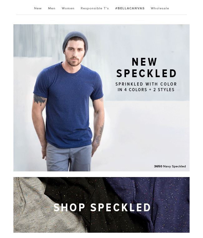
Bella + Canvas
The straightforward nature of this new product announcement is clean and effective.
Sometimes all subscribers need is an email and has one main message and limited distractions. This way, the email has a better chance of leaving an impact.
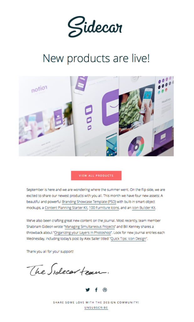
Sidecar
The invitation to “View All Products” and drive users directly to your website expedites the process of driving users directly to your site.
Ultimately you want to get people to your website so they can check out (and hopefully purchase) your new product.
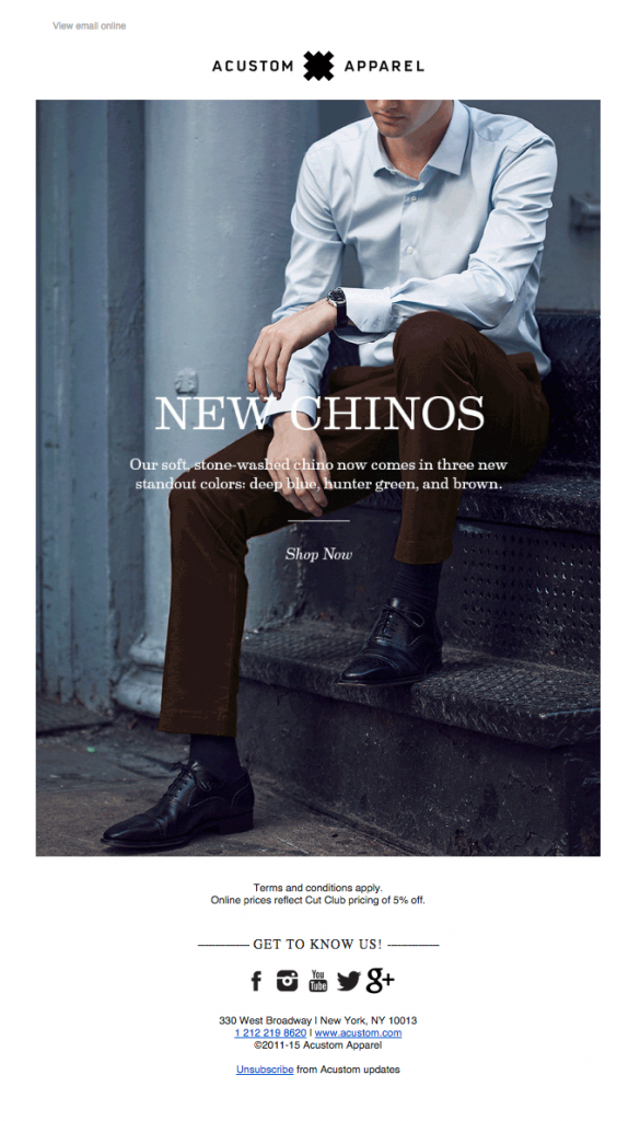
Acustom Apparel
This example shows that sometimes promotional emails don’t need to be loud and fancy if that doesn’t jive with your brand.
By knowing their audience well, Acustom Apparel matches the tone of the promotion with the laid-back yet sophisticated style of their customers.
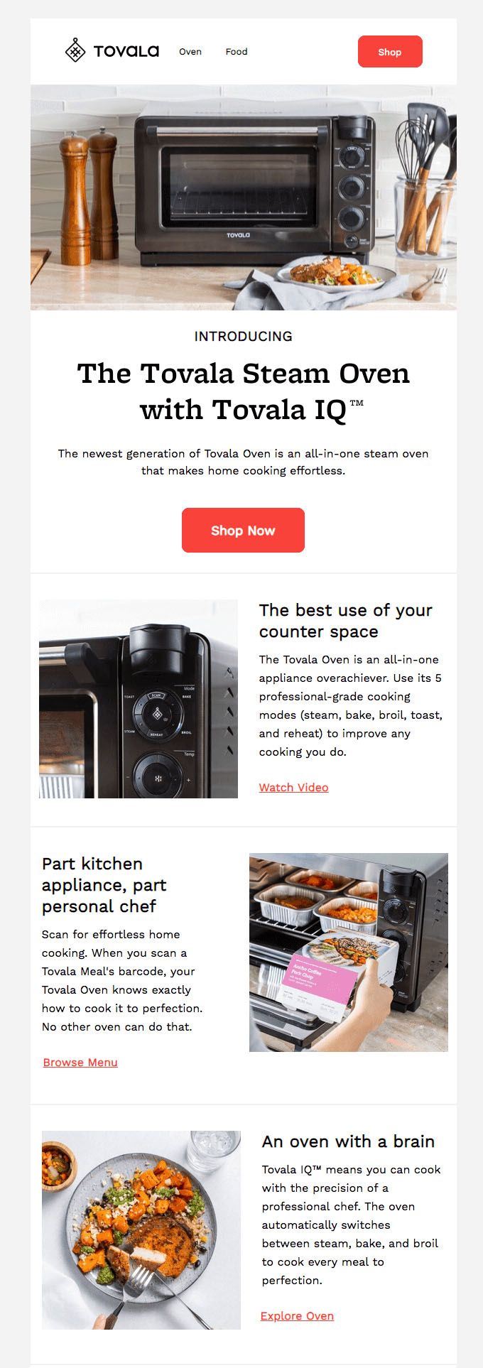
Tovala
With five strategic CTAs that link back to the Tovala site, this email offers plenty of opportunities to learn about a new product that the company portrays as an indispensable and innovative invention.
Sakara
This email has the sole goal of announcing, driving pre-orders for, and building excitement about the latest Sakara product. The brand excels at creating a consistently inviting and crisp aesthetic across email communications, the website, and social channels.

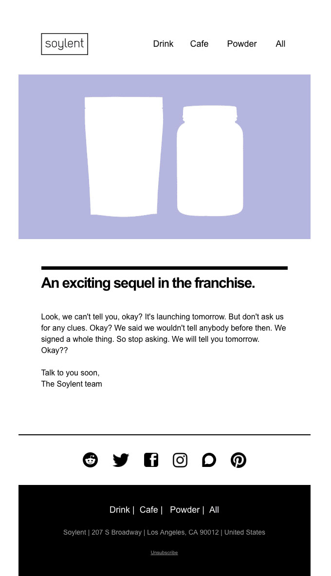
Soylent
Using a brand voice that primarily targets millennials, Soylent leaves an air of mystery about its new product to generate interest in it.
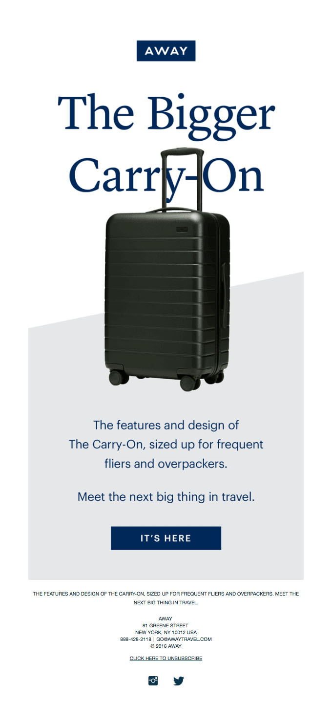
Away
As a young ecommerce brand with a broad audience, Away keeps it simple with a product announcement email with very little text. The product image and brief snippet of text keeps it short and sweet, which is perfect for its audience.
New Custom
This email works because it leads with a call to action and it’s perfectly designed and color coordinated. For a company that relies on the aesthetic appeal of their products, this is perfect.

New Blog Post Email Examples
It’s a small victory that you have subscribers who signed up for blog updates to begin with. Make it fun and interactive (as long as it doesn’t contradict your brand’s voice).
Requesting feedback or asking subscribers to try your product/service is the easy part.
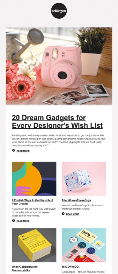
Shillington
This round up of new blog posts balances design with functionality. This email makes it easy to quickly scroll through and make the blog posts accessible.
Campaign Monitor
The design of this email is effective with on-brand design and graphics that don’t distract from the overall goal of getting subscribers to view the latest blog post.

Type E
This no-fluff email is packed with an informative sneak peek of the free-to-read and fascinating blogs on relevant topics in the web design/web font world that Type E offers.

Apple News
The simple format and perfectly highlighted news stories make the Apple News Spotlight email something that people actually want to receive.

Thank You Email Examples
Saying thank you is always a great way to get people’s attention and win their favor. These thank you emails are great examples of doing just that in a marketing-savvy way.
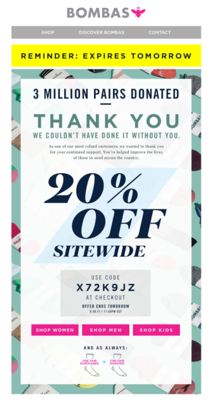
Bombas
A reminder, an impressive milestone, and a discount are great additions to a thank you email that make a significant difference in catching attention.
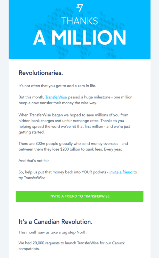
Transferwise
TransferWise also thanks customers for allowing them to reach an important milestone and does so with a fun play on words.
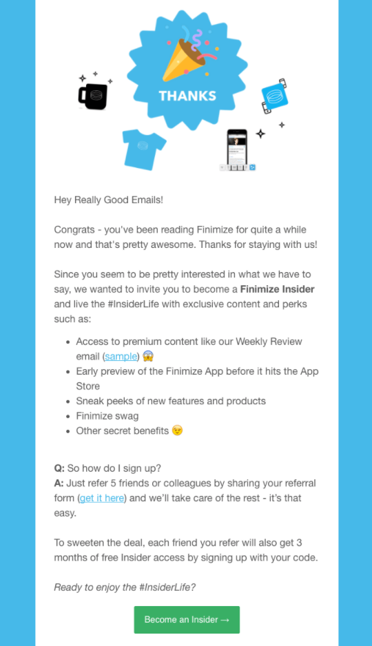
Finimize
Ever thought about combining thank you with congratulations? Being Finimize’s customer is a cause for celebration according to them. Take a hint from the company and make your thank you’s a little more fun.
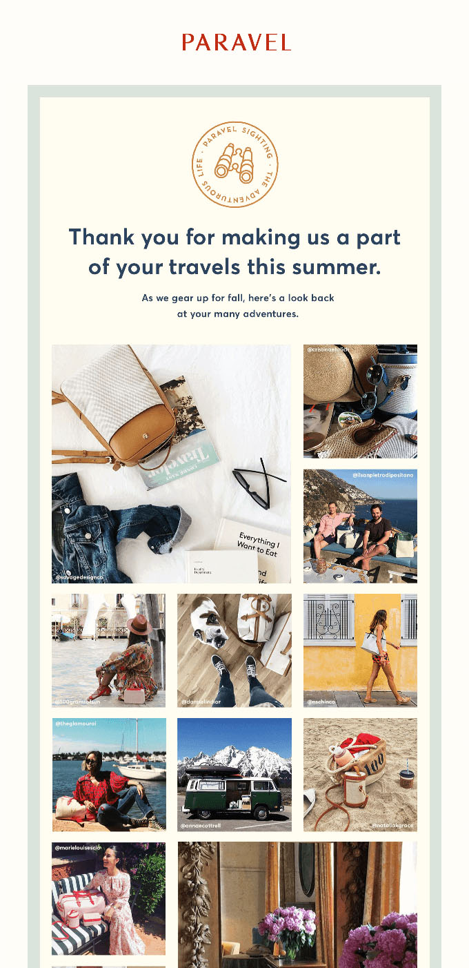
Paravel
Paravel phrases this email in way that immediately captures an email subscriber’s attention. Out of curiosity, users will be eager to see whether or not they’re featured in the selected feed of images in the thank you email.
Ales Nesetril Design
A thank you email doesn’t necessarily need images. This email is effective because it’s sincere and includes step-by-step instructions and tips on how to make the most of the ebook purchased. By doing this, Ales establishes a great rapport with his customers.

Sign Up Confirmation Email Examples
When you let people know they successfully signed up, you don’t want to send a thoughtless email that makes them regret signing up.
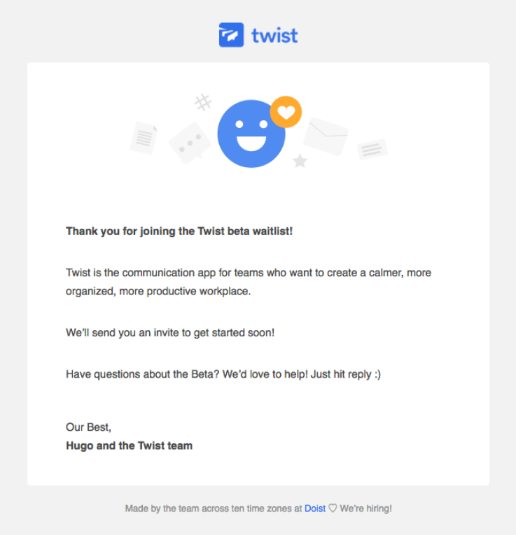
Twist
Twist keeps it short and sweet, which is exactly what most subscribers want. The minimal text and offer for assistance leaves no uncertainty or redundancy.
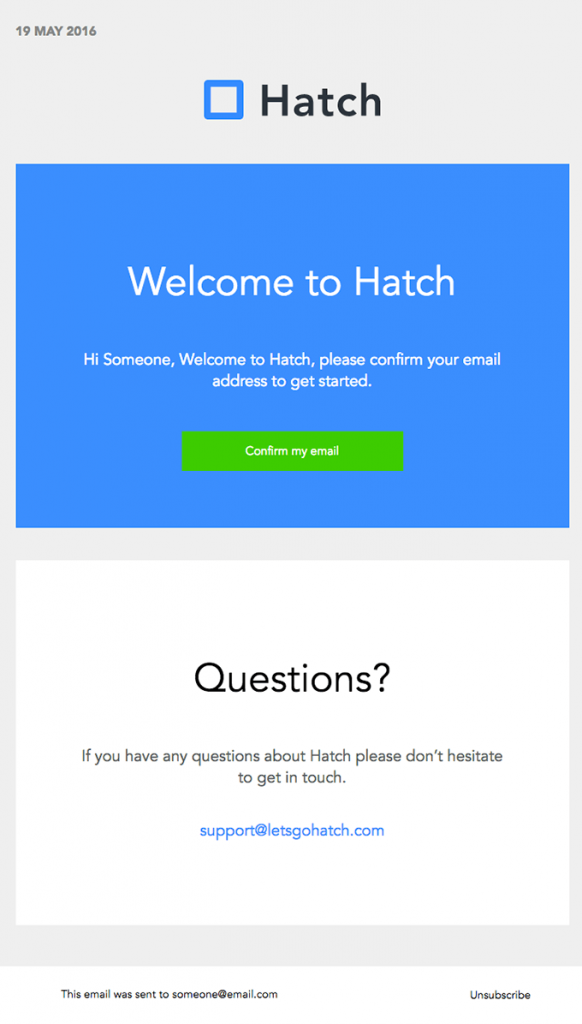
Hatch
The block format of this confirmation email is exactly what the subscriber wants to see.
This design leaves no question about what your next step is. You can either confirm your email on the spot or inquire further about the product.
Skillshare
Skillshare’s choice of embedding a video into its email is interesting and unusual.
Nevertheless, the “Start Watching” button whisks users away to landing page where they can start the course(s) they signed up for. I like this sign up email because it’s memorable and encourages users to get started right away.

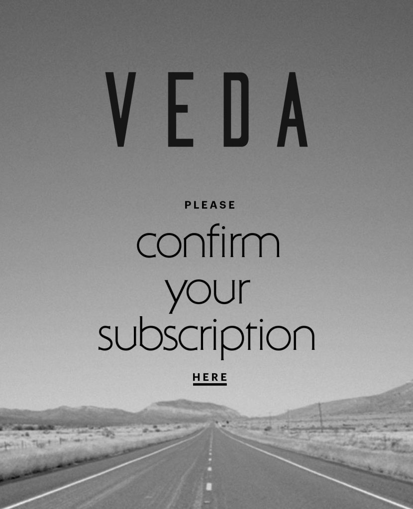
Veda
This email example contains the absolute bare minimum of information and yet succeeds. The black and white vintage quality of the background is a refreshing change from the technicolor emails competing for attention in people’s inbox. Veda was definitely onto something.
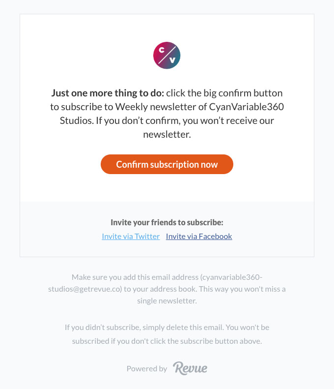
Revue
This email is so short and simple that it only includes a logo, two sentences of instructions, and a CTA button. Sometimes a confirmation email does not need anything else to distract from the goal of the email.
Depop
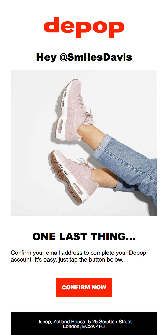
This Depop email does a great job of including a personalized greeting in its short and efficient confirmation email, featuring a product image and “Confirm Now” CTA button.
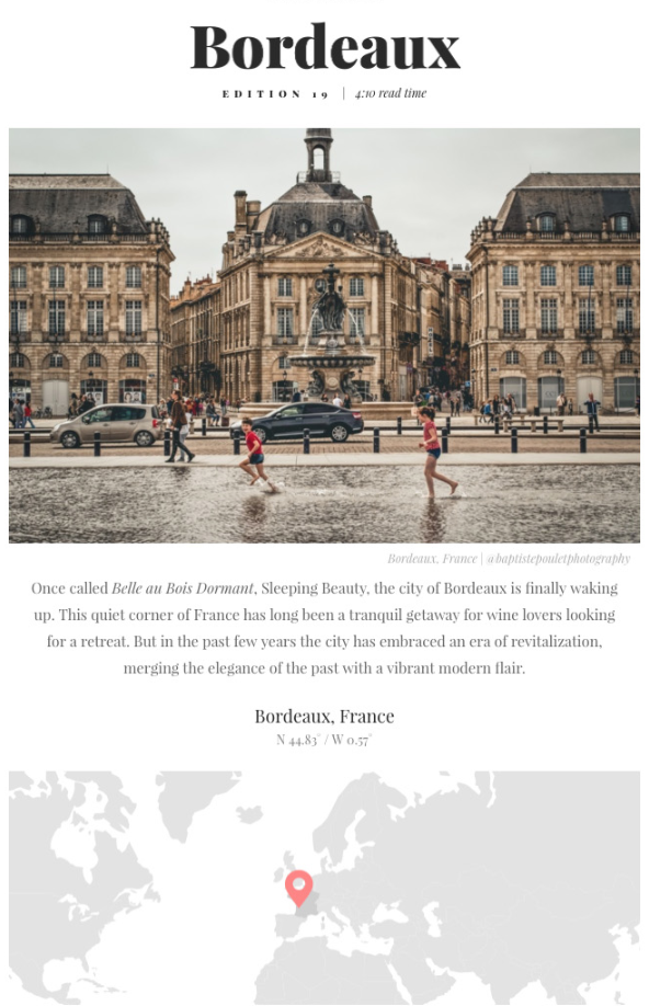
The Discoverer
This perfectly organized travel newsletter provides plenty of content in the body of the email itself, while also driving subscribers to the different events’ landing pages. The way this email directs you to click on their social media icons is seamless as well.
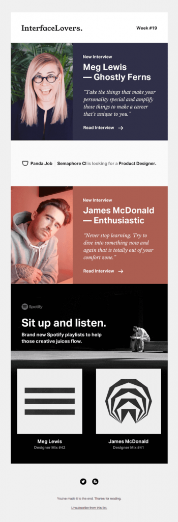
InterfaceLovers
InterfaceLovers proves that quality beats quantity when it comes to the content of a newsletter. This example masters the art of not overwhelming subscribers with too much going on in the body of the email.
The two featured interviews are displayed in an enticing way, and the head shots of the interviewees are perfect.
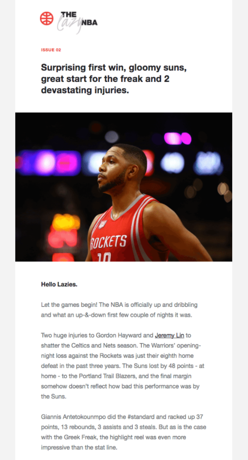
The Lazy NBA Newsletter
This text-heavy newsletter works because it delivers exactly what the audience wants. Like most sports writing, the newsletter reads as more of a spoken narration.
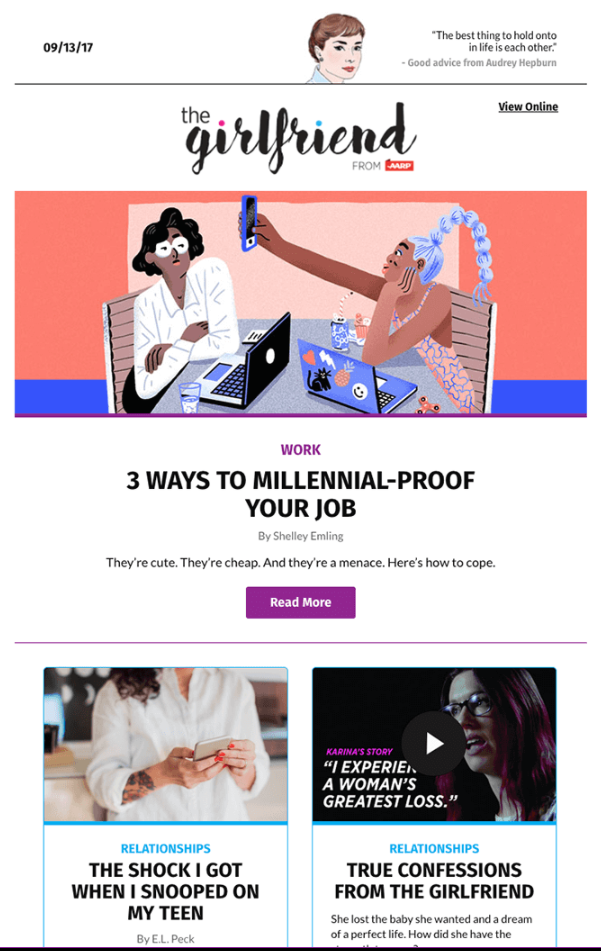
The Girlfriend Newsletter
The user-friendly email format with catchy teasers of each article make this newsletter a success. You can tell by the snippets that this content is something the target audience looks forward to reading.
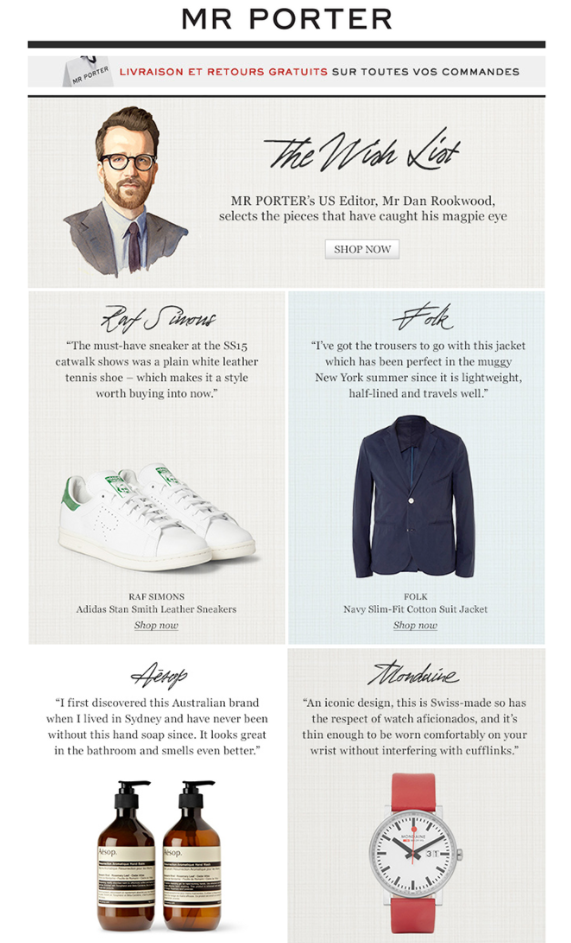
The Mr. Porter Newsletter
The best part about this email is its unique stylistic quality that emphasizes the artisanal nature of this curator. This email does a great job of endorsing products with a subtle dose of persuasion.
WeTransfer
Considering that WeTransfer is essentially just a Dropbox alternative, the SaaS company has to hustle to set itself apart. This beautifully crafted and curated newsletter is not trying to convince subscribers to pay for their service, but rather builds brand trust by speaking to the merits of the brand as a whole.

Dense Discovery
If you are planning on packing your newsletter with text, be sure not to overcrowd it with images, too. This email finds a way to balance a huge block of text with two carefully selected images, keeping the rest of the email simple.

Round-Up Email Examples
Another email subcategory in the family of newsletter emails are roundup emails.
The difference is that the company/brand did not create the content they’re rounding up. These lists can be trickier to curate than they seem, but when done well they can bring enormous value to subscribers.
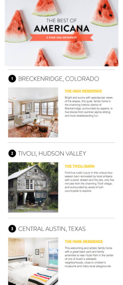
Kid & Coe
What’s nice about this newsletter is that the recommendations for kid-friendly, family-oriented places to vacation around the US offers variety that most newsletters wouldn’t.
Take note that the content is solid but the design isn’t revolutionary: it doesn’t have to be when the content speaks for itself.
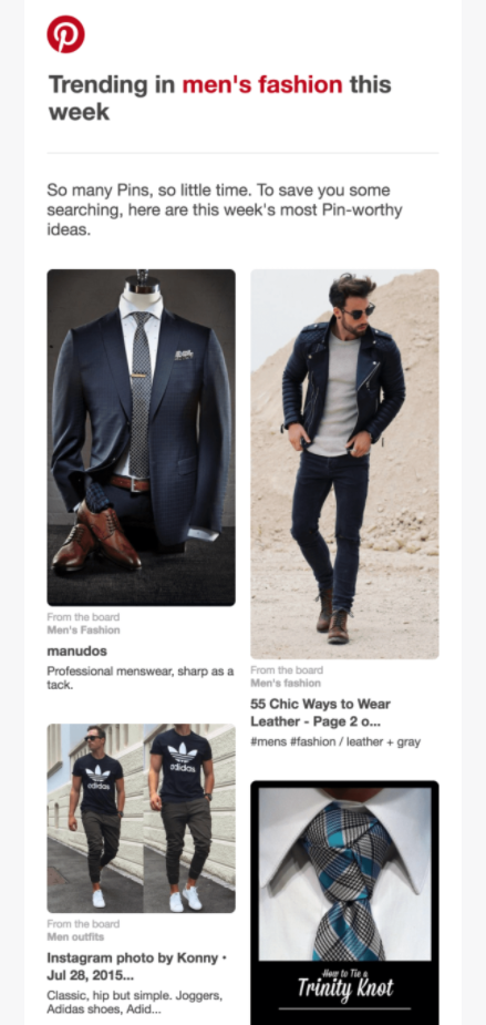
Pinterest is one of the great kings of curated content. Pinterest’s round ups are algorithm based but nevertheless formatted in the ideal way for users.
Their trick is to make the content in the round-up as personalized as possible to the user to drive them back to Pinterest’s platform to find more of what they love/what they were looking for.
Proto.io
The use of white space in his email is genius. It draws the eye naturally where it should be: to the CTA’s.

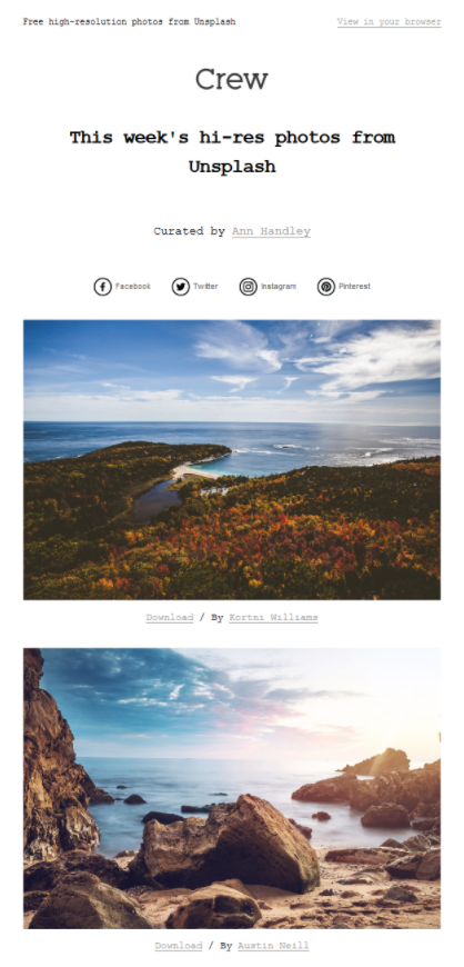
Crew
Some round-up emails don’t need copy to clutter them up. These photos speak for themselves and fit perfectly in a simple template.
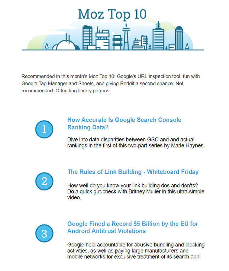
Moz
This is an easy-to-read, no-frills round-up email by a leader in the digital marketing industry. Note the simple colors and design, and the generous spacing.
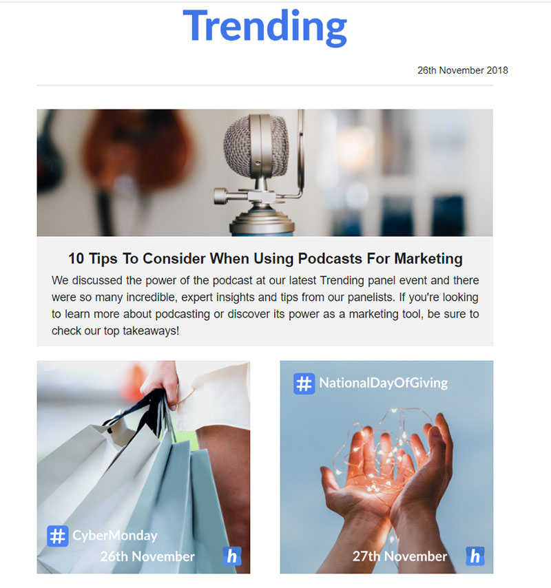
Hopper
Unlike the Moz round-up email, Hopper’s “Trending” round-up relies on visuals. Note how Hopper doesn’t overdo it with branding (sticking to a subtle occasional “h” logo.) Your subscribers most likely look forward to and appreciate the content that you curate, and won’t be in the mindset to be receptive to anything too sales-heavy.
Online Course Email Examples
The amount of online learning material available today is straight-up overwhelming. That’s why it’s unsurprising that course-related emails are so great in length.
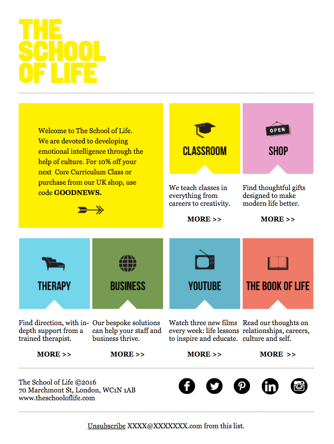
The School of Life
Give people what they signed up for: and give them plenty of it. The School of Life welcome email is straightforward and to the point. Effective and efficient.
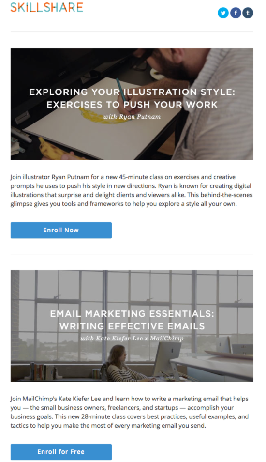
Skillshare
This promotional email for the course is awesome. It doesn’t push its case but it emphasizes what’s important.
Treehouse
Course emails that provide updates on progress are great. They encourage subscribers to take pride in their student status and continue to work towards their goals.

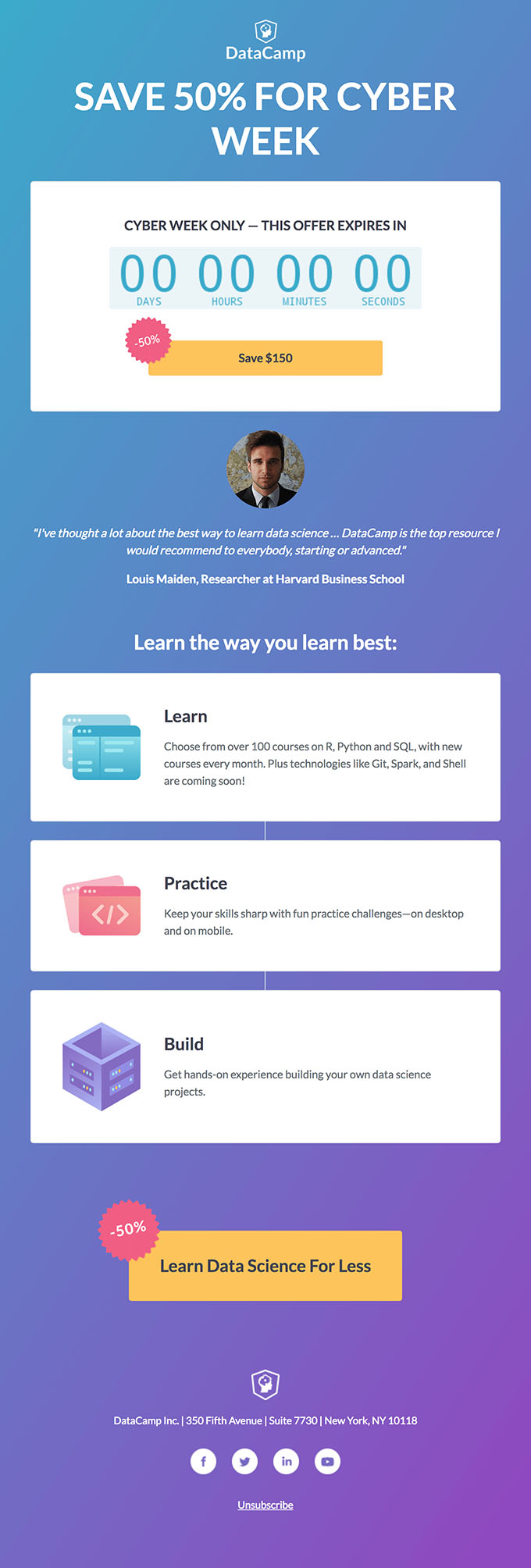
Data Camp
The gradient, color scheme, and countdown timer work together to create a visually appealing email. The discount at the top of the email and the unique call to action button also contribute to this email’s success.
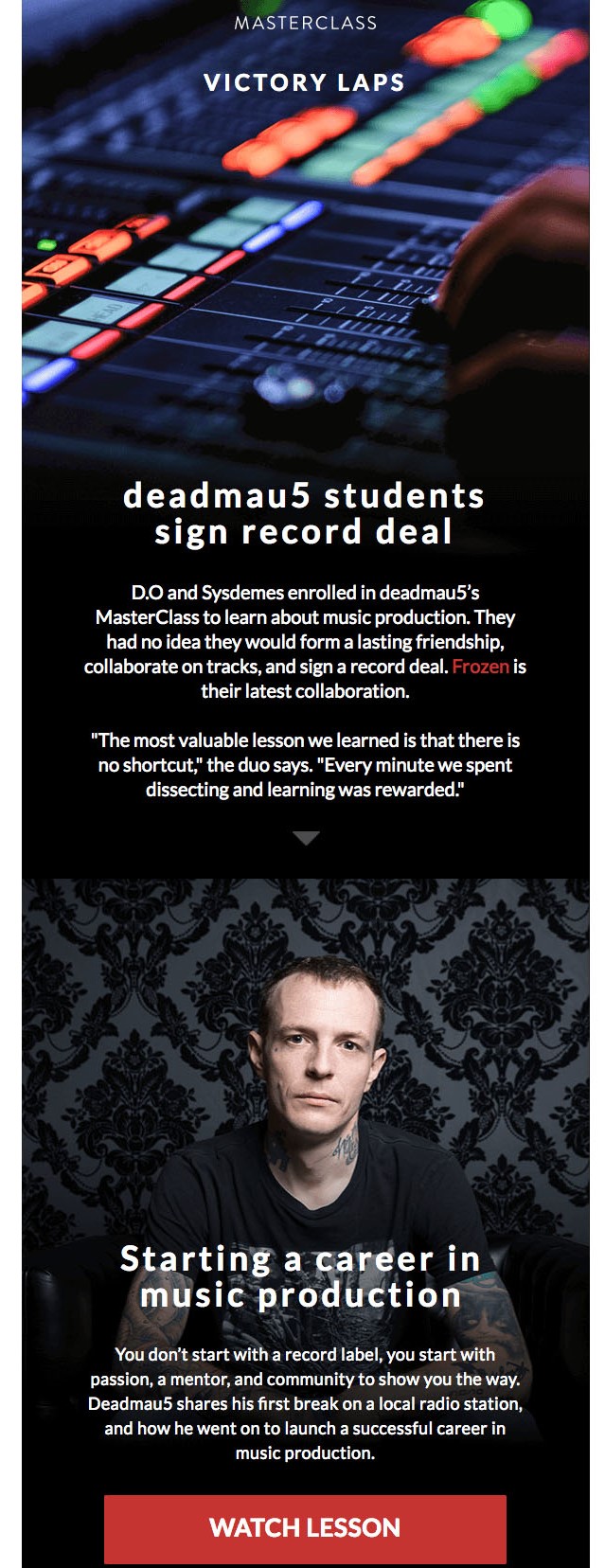
Masterclass
This email does a great job of highlighting one of Masterclass’ success stories and using a recognizable celebrity name. Also, the design is thoughtful, and the dark color scheme of the email helps the red CTA buttons pop.
